Do the hard work to make it simple
...the other day. It reminded me of our fourth design principle, do the hard work to make it simple. The second sentence, "If they don't know how to form the...
...the other day. It reminded me of our fourth design principle, do the hard work to make it simple. The second sentence, "If they don't know how to form the...
Yesterday we published some new design guides in the Government Service Design Manual. GOV.UK elements There's a new guide to styling and coding the basic page elements, with sections on layout, colour, typography, forms, buttons, data, images and icons. This …

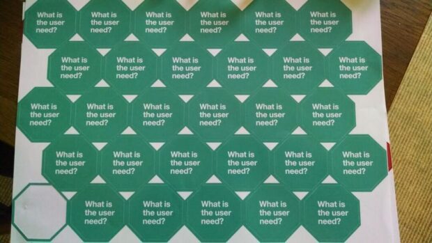
Picture from Jen Pahlka, stickers by us at GDS. The other day Jason Fried wrote a blog post called Questions I ask when reviewing a design. It's a good list. Reviewing design work is never easy. And giving constructive feedback is …
...thought it was better to stick them up here so we have a url to point to. Designers awaiting links. Useful links for new designers www.gov.uk/design-principles The principles on which...

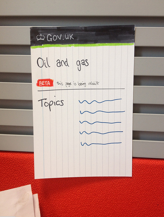
...on paper to help you visualise how things might work and so you have something to show and discuss with colleagues. We do this quite a bit at GDS. Picture...
Providing good services is difficult if we don't monitor how well we're doing. Fortunately, we're building an entire platform to show, compare and provide insight into how well each service is working for citizens. Joining the Dots On every service …
GOV.UK is constantly being iterated and updated and sometimes we need to draw users’ (including departments and agencies) attention to this. We do it by saying something is in 'beta'. Of course, the way we show that something is in …
Desktop thoughts Use GOV.UK brand colour to highlight information. Preserve green for success outcomes of services. Remove related links that dominate page as before. Only two links, now quieter but still prominent. They are of secondary importance, so experimenting with …
At the start of this year a few of us started working on two new guides for the Government Service Design Manual. They're aimed at designers, researchers and front-end developers who are building services for GOV.UK. Design style guide The …
Some recent work on rethinking the travel advice pages. Hoping to work these into some user testing in the coming week/s. One of the bigger questions is around mapping. FCO use cartographers who manually draw the maps and affected regions …