Design in governmentWe believe in working in the open. This blog is for designers across government to share their projects, ideas and concepts, or just to think out loud.2026-06-23T08:00:43Zhttps://designnotes.blog.gov.uk/feed/Rachel Malic - Content Designer, HMRC<![CDATA[Designing services for people who’ve lost trust online]]>https://designnotes.blog.gov.uk/?p=54812026-06-23T08:00:43Z2026-06-23T08:00:00ZIllustration from the Stop! Think Fraud site.
When people trust something, it makes them feel safe. But how do you support users when it’s getting harder to tell what’s real online?
I work on a service which helps people to pay for things, and users’ trust has steadily declined as online scams have become more convincing.
Scams can affect anyone
Scammers work like designers, they iterate based on what works. They impersonate government services, like offering tax refunds, often at times when people expect them. And now they can use AI to attempt to impersonate someone’s voice, face or a government website with worrying accuracy.
Last year, three quarters of British adults said they had encountered a scam of some kind. In our user research, we’ve heard participants say it feels like scams are ruining the internet.
I was the victim of impersonation fraud. Someone phoned me pretending to be from my bank. They knew my debit card number and where I lived. I design digital payment services and think about scams regularly, yet I believed them. When I panicked and stalled, they became intimidating.
I didn’t share any information, but they still managed to take money. I felt undignified and ashamed calling my bank to explain.
Why losing trust is a problem
Being scammed can make you stop trusting yourself, your device, and the internet. We see this in how people behave when paying for things.
Some people:
stop mid-task to check if something is real
phone in a panic to confirm a payment has gone through
abandon a journey if something unexpected happens
avoid paying online altogether
A badly designed form can provoke these feelings quickly and unexpectedly.
It’s not just about paying for things. Many people feel like the internet is too risky to use for everyday tasks like online banking, food shopping, or using online medical bookings. For some people, a bad experience can tip them into a period of digital exclusion.
Three ways of designing for people who’ve lost trust
Designing for safety, not speed
Paying for something can be deeply emotional. We’ve seen evidence from user research that it triggers stress, anxiety and confusion. This is especially true for people who have experienced scams and financial trauma before.
I’ve been learning about trauma informed design, from designers including Rachel Edwards and Jane McFadyen. I’m not an expert, but it’s helped me think differently about how people experience services.
The body’s nervous system affects how we process information when we feel unsafe, and it might take longer to do things. For victims of online fraud, this could mean designing ways that:
allow them to take things slowly
provide reassurance
explain what’s happening
offer offline options
For example, in one digital journey, we ask users to enter personal information including their National Insurance number. We introduced a new screen at the start of this section to explain why we need it and how it will be used.
Even though the journey was longer, it helped people feel more confident. It increased transparency at a point where users needed a pause to sense check things.
We can get hung up on how long a service takes to use, but a slightly longer journey can feel more reassuring for users, and help reduce the feeling of urgency that fraudsters try to create.
Making things clear and transparent
I’ve also found that people want to know what’s happening, as it happens. Presenting information in ‘real time’, such as the status of an action, helps to build trust. This reduces uncertainty and stops most people from needing to call up.
Behind the scenes, it can be complex to do this. I’ve needed to work closely with Business Analysts and developers to decide how to display clear, logic-based content that’s easy to understand.
AI is part of the solution
Even though AI can enable scams, it can also help to prevent them.
Some banking apps can help you spot a scam while it’s happening. If you open your app during a call, it may show a message saying “You’re not on a call with us.” If someone claims to be your bank and you see this message, it’s a scam.
AI is used widely by bank fraud detection teams to detect criminal activity. It can look at hundreds of data points instantly to check if anything looks suspicious.
As we look to advance these processes across government services, designers and security specialists need to work together so that design thinking is at the heart.
What are you doing to help rebuild trust?
Fraud is constantly evolving, and designing for people who’ve lost trust is now a core part of our work.
I am lucky to be part of a community of practice in HMRC where we share findings between us, as a closed, trusted group. I’d love to hear from other designers working in similar ways.
How does low trust change the way people use your service?
What are you doing to help rebuild trust?
It’s our job to prevent scams from ruining the internet.
If you work in government you can join the #trauma-informed-design channel on UK Government Digital Slack. The community runs regular online meetups to share and learn.
You can find more information about fraud and staying safe from scams on the UK government Stop! Think Fraud site.
]]>0Alex Robertson – Lead Content Designer, MOJ<![CDATA[Updating the skills content designers need in government]]>https://designnotes.blog.gov.uk/?p=54492026-06-09T07:59:07Z2026-06-09T08:00:00Z
Content designers - like any large professional community - all bring something unique to their role, and often work in different contexts. Yet like the middle of a giant Venn diagram, there’s a shared centre to our profession. The process of defining that shared centre is what this blog post is about.
The Capability Framework
The Government Digital and Data Profession Capability Framework is a single cross-government definition of “the digital, data and technology roles in government, and the skills you need to do them”. It informs skills assessments, professional development and recruitment, and helps everyone to understand the roles in a multidisciplinary team.
The case for an update
The content designer role description cannot stand still. To be effective, the skills described need to:
reflect current content design practices
adapt to the different contexts in which content designers work
show what we have in common with other design roles
be easy to understand and use for skills assessments
prepare us for the future
Though there had been some iteration, the 6 skills for content designers had remained largely consistent since the Capability Framework was first published in 2017. These 6 skills had given the profession a valuable shared reference, but the role had continued to evolve.
In addition, 4 of the 6 skills - such as ‘Agile working (content design)’ - were modified variants of existing skills in the framework. This disconnected the role from others in the framework, hiding potential career moves from and to related roles.
It was time for a major update.
The working group
In government, it’s no single person’s job to write the content designer skills and keep them current. It needs a cross-government group of willing volunteers to come together and hash it all out, line by line, with the support and assurance of the central Capability Framework team.
Our working group formed in 2024, with representatives from:
Department for Work and Pensions (lead content designer)
Government Digital Service (head of profession for content)
HM Revenue & Customs (head of content design)
Home Office (head of content)
Ministry of Justice (lead content designer)
Together, we brought perspectives from common content design contexts in government:
transactional services
long-form guidance
GOV.UK publishing
intranets
centralised teams as well as embedded content designers
Discovery
We began by reviewing every skill in the framework for potential reuse. The skills for graphic, interaction and service designers were updated in late 2024 - those were high on our list to evaluate for content design.
The framework aims to align with the wider industry and keep an eye to the future. So we also looked beyond government, reviewing external capability frameworks, job descriptions and evolving content design practice.
In total, we longlisted and categorised 54 potential skills, then carefully evaluated their relevance. Some existing skills had clusters of variants, particularly around strategy, delivery methods and communication. Some new skills we’d outlined - such as content operations, content publishing, dynamic content systems - had areas of overlap.
By the end of discovery, we had a shortlist of 8 skills.
Of these, 7 were shared with graphic, interaction and service designers, representing the common foundations across design roles. But to work equally well for content design, they would need iteration in consultation with those professions, to ensure our changes would work for all.
Our group agreed that one additional, unique skill was also needed to reflect the specialisms of content design, particularly around content management and architecture.
Iteration and testing
For the next stages, our working group expanded to reflect a broader variety of content designers, including structured content specialists. We were joined by representatives from:
Department for Business and Trade (head of content design and a lead content designer)
Health and Safety Executive (senior content designer)
Home Office (senior content designer)
Integrated Corporate Services (lead and senior content designers)
Office for National Statistics (head of content design and a senior content designer)
We also enlisted the senior content designer in the Capability Framework team at the Government Digital Service, who provided critical guidance and facilitation throughout these stages.
With this broader group, we held workshops to iterate the 7 existing design skills and draft a new content-specific skill.
For an early sense check, we shared our first draft with two cross-government leadership groups: heads of content design and the working group for graphic, interaction and service design roles. Their feedback informed another round of iterations before wider testing.
It’s vital that the skill descriptions are easy to understand and apply by:
content designers at different levels
those new to government as well as longer term employees
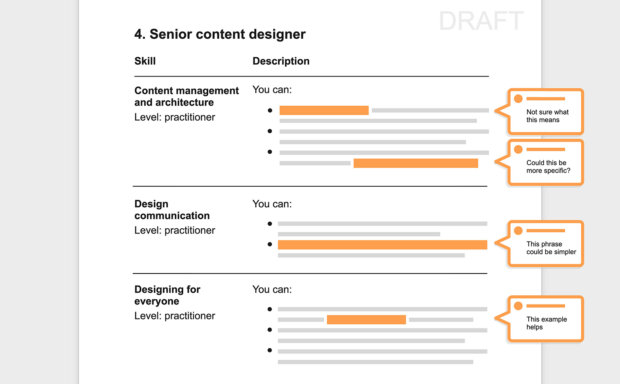
To evaluate this, we prepared a ‘highlighter test’, a document asking participants to highlight any unclear words or phrases, or share general comments.
We shared this test widely across participating organisations, including the working group for other designer roles. After synthesising the feedback, we returned to a final round of iteration.
Finally, the working group reviewed the skill levels - awareness, working, practitioner, expert - set for each role level, to ensure expectations were fair and accurate.
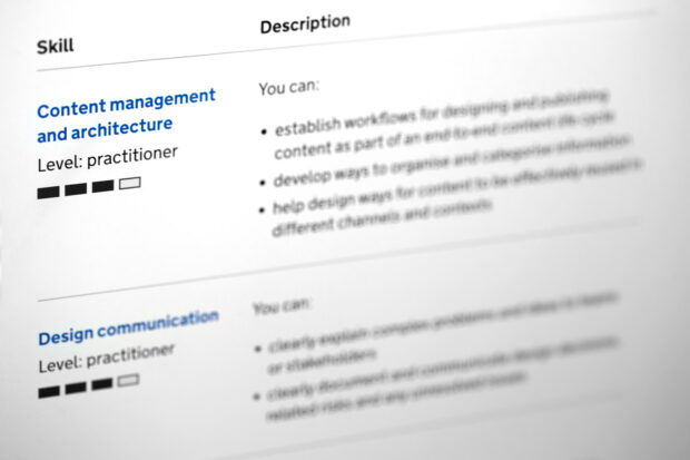
Content management and architecture. Using and developing processes, systems and standards to enable effective, sustainable and reusable content. This includes organising complex information, designing publishing and review workflows, and supporting content reuse across different channels and contexts.
Seven skills shared with graphic, interaction and service design:
Design communication. Effectively explaining and documenting design decisions.
Designing for everyone. Ensuring content and services are inclusive, accessible and environmentally sustainable.
Designing strategically. Influencing and aligning design work to strategic objectives, and contributing to or embedding design patterns and practices across your organisation.
Designing together. Identifying who to include in the design process and working with them effectively.
Evidence-based design. Defining hypotheses to test, and using qualitative and quantitative evidence to inform design decisions.
Iterative design. Continuously testing and improving designs.
Leading design. Supporting designers, coordinating design work and improving design maturity in your organisation.
The shared skills reflect that content design is part of the collaborative, end-to-end design process - not a separate or later stage.
Like the rest of the Capability Framework, these skills can be built upon or adapted for local contexts. To enable this, and to help the framework remain useful over time, you’ll see that specific technologies or content types aren’t prescribed. Instead the outcome is emphasised, such as: “You can help design ways for content to be effectively reused in different channels and contexts”. Those channels and contexts could range from paper letters to AI interfaces - or anything else that emerges in the future.
What’s next
The real test will come when these updated skills are put into practice in capability assessments and recruitment. The working group will continue to gather feedback and prepare future iterations with design leaders across government.
Alongside the skills, each role level - associate content designer to head of content design - is prefixed in the Capability Framework with a brief outline of the typical responsibilities. These remain unchanged in this update, but we’ll be working on them next to ensure they’re accurate and current.
Thank you to everyone across government who shared feedback throughout this process, and to all who participated in and supported our working group.
We’d love to hear your feedback on the skills. What’s working for you and what isn’t? What’s missing? Let us know in the comments or email digitaldatacapabilityframework@dsit.gov.uk.
]]>0Mark Edwards — Head of Design, Customer Experience & Design, Department for Education<![CDATA[When AI answers the question, what happens to the user journey?]]>https://designnotes.blog.gov.uk/?p=54362026-03-31T08:11:41Z2026-03-31T08:00:00ZOver the past few months, something subtle but significant has been happening across several of our digital services in the Department for Education (DfE). We’ve seen a rise in impressions coming from AI‑mediated search, at the same time as visits to our actual pages have flattened or dipped. More people are now receiving answers through Google’s AI Overviews, Microsoft Copilot and other emerging assistants, without ever visiting the services we’ve designed for them. At first, this felt like progress; faster access to information is not something to resist. But as we looked closer, a more complicated picture emerged.
The new reality: answers without journeys
Public services are not just providers of information. They are structured journeys intended to help people make sense of systems they may never have encountered before. These journeys carry context, safeguards, clarifications and next steps that ensure people understand not just a single answer, but the path around it. AI assistants, however, don’t really understand journeys; they understand questions. They extract the answer they think is most relevant, remove the supporting detail around it, and present it as a self‑contained response. The risk is not usually that they are wrong, though that can happen, but that they are incomplete in ways that matter.
What happens when users don’t know what they don’t know?
This incompleteness is especially challenging for the kinds of users many of our services are built to support. Not everyone arrives with a clear question. A teenager leaving school may not know to search for “apprenticeships”, “T Levels” or “vocational pathways”. They just know they need to figure out what to do next. Parents concerned about their child’s online safety often don’t know the terminology of the problems they’re worried about. Care‑experienced young people may not know that certain entitlements or support options even exist. A well‑designed service helps reveal possibilities, not just respond to questions. It helps people articulate what they need (or need to do), especially when they don’t yet have the language for it. AI tools, by contrast, only answer what they’re asked. They meet users where they already are, which can limit discovery and reinforce gaps in understanding.
Should we change the way we work or return to our foundations?
As a design team, we’ve been asking ourselves whether this moment requires us to rethink how we work, or whether it simply calls for a renewed commitment to the principles that have guided digital government for more than a decade. We keep coming back to the same idea: the fundamentals of user‑centred design still hold. If anything, they’re becoming more important. Clear, well‑structured content; journeys that reflect real user needs; collaboration with policy; plain English; transparency; consistency; these are still the foundations that make services trustworthy and safe.
What’s changing is that we now need to design with the expectation that much of what we publish will be read indirectly, atomised, summarised or reinterpreted by systems we don’t control. This means thinking differently about the resilience of the content we produce. If a paragraph on one of our pages is lifted out of context, does it still make sense on its own? Does it say something that’s safe and accurate even when separated from the journey it belongs to? Can it stand alone without misleading someone who might never see the full service? These are difficult questions, because government services are rarely simple enough for a single answer to be the whole story. Yet if AI systems are going to present fragments of our work in isolation, then we need to ensure those fragments are robust.
This also means working more closely with policy colleagues. Much of the nuance that could be lost in an AI‑generated summary is key policy: eligibility rules, safeguarding considerations, rights and entitlements that depend on specific conditions. If we want AI tools to represent this information responsibly, the underlying policy explanations we publish need to be concise, unambiguous and consistent across channels. Early collaboration between design and policy becomes not just useful, but essential.
One area we haven’t explored yet, though it’s increasingly on our minds is testing our services through AI systems themselves. Just as we test journeys with real users, we may soon need to test them with the AI models that interpret our content on behalf of users. This isn’t about validating the AI; it’s about understanding how faithfully our content is being surfaced, where it is being distorted, and what happens when someone relies on an AI answer instead of visiting a service. It’s early days, but it feels inevitable that this will become part of the design and assurance process for public services. We’re interested to see what patterns or guidance may come from GDS’ recent GOV.UK AI Studio work.
What makes this moment particularly important is that it touches the heart of what user‑centred design is for. Much of our work is built around supporting people who do not arrive with perfect knowledge of their needs, who do not know the terminology, who may not understand the system they are stepping into (because they shouldn't need to.) If AI‑mediated agents or answers become the dominant entry point, we need to be sure that people who lack confidence or familiarity are not disadvantaged further. We cannot assume that the most complete and supported experience will be the one users see.
The challenge ahead
This isn’t a challenge any single department can solve alone. The move towards AI‑mediated access is happening across the whole digital ecosystem, not just in pockets. The risks are shared, as are the opportunities. We need cross‑government conversation about what this means for safeguarding, clarity, accessibility, statutory accuracy, measurement, accountability and the way we structure information at source. We need to think about what patterns or conventions might help us create content that is “machine‑interpretable” without losing the human intent behind it. And we need to keep hold of the idea that design in government is not about answers alone; it’s about meaningful, safe and supportive journeys that help people understand their choices and needs.
The shift we are seeing is real, and it will shape the next decade of public services. But if we approach it thoughtfully grounded in our core principles, and open to new ways of understanding how users encounter our work then there is an opportunity here too. AI may change the pathways into government services, but with the right foundations, we can still ensure that what people receive is accurate, trustworthy and rooted in genuine user need. And if we share what we learn with one another, we can navigate this transition together.
If you’re seeing similar patterns in your own services, or asking the same kinds of questions, I’d be keen to hear from you in the comments below. This is a moment for collective learning, and the earlier we begin the conversation, the better prepared we’ll all be.
]]>17Kara Kane – Head of Design for Test, Learn and Grow, Cabinet Office<![CDATA[Bringing together international public designers in Amsterdam, Berlin and Brussels]]>https://designnotes.blog.gov.uk/?p=54172025-12-09T15:12:56Z2025-12-09T09:00:00Z
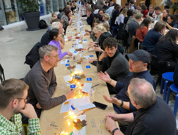
In 2024, the International Design in Government Community returned to in-person conferences after a 5-year pandemic-related break. This year, we've hosted our biggest event since 2019, bringing together hundreds of public sector designers from across the globe. With exciting plans for further events in 2026, here's an update on what's happened recently and what's coming up next.
Gathering in the Netherlands, re-connecting with the User Needs First community
In autumn 2019, we teamed up with our Dutch colleagues for the first time. Their national User Needs First community (Gebruiker Centraal in Dutch) brings together user-centred designers from across the Netherlands and all levels of government. For their 10th anniversary this year, they extended their annual conference to include our International Design in Government community.
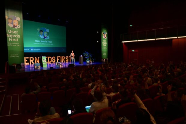
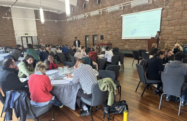
From 9 to 11 April 2025, hundreds of members of our global community went to Amsterdam for the User Needs First International Conference. Over 700 participants gathered for talks, workshops, discussions, excursions, and some special experiences.
The first day of the conference was exclusive to the International community. We (Kara and Martin) led a keynote on Protecting our practice to start the day. In a time of shifting priorities and roles for user-centred digital teams in government, it felt important to acknowledge how to design longevity into our practices so that they endure. The rest of the day was spent on excursions around Amsterdam and Rotterdam. In small groups we went on visits to: City of Amsterdam, Netherlands Police, Ministry of the Interior and Kingdom Relations, City of Rotterdam and Novum, the Innovation Lab of the SVB (Social Insurance Bank).
The next two days of the conference were full of learning, sharing, and reflecting on the state of design and digital in the public service – now that we are established, how do we ensure we’re working on the right things for the right impact?
These international exchanges continue to strengthen design practice in UK government. Insights from the Netherlands on embedding user research in policy development, and Germany's approach to digital-ready legislation, are informing how UK teams work across departmental boundaries. The connections made at these events also support UK civil servants in accessing peer support and shared resources when tackling similar challenges.
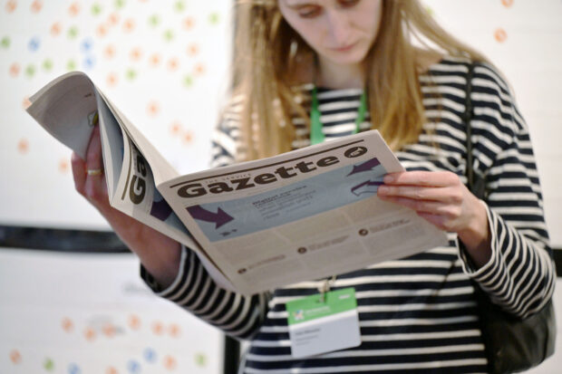
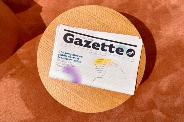
Creating content with the community
Ahead of the conference, we once again invited members of our community to co-create a new printed edition of the Service Gazette - a community-led publication showcasing design work from across the public sector. We created the first issue for the London conference in 2018 and most recently one for the Helsinki conference in 2024.
Practitioners from 7 countries and regions contributed to the newspaper, including the European Union, Germany, Ireland, the Netherlands, Singapore, the United Kingdom and the United States. In the cover story, Hillary Hartley, co-founder of the US digital unit 18F and former Deputy Minister of the Ontario Public Service in Canada, reflects on digital service resilience and what endures when government innovation units close.
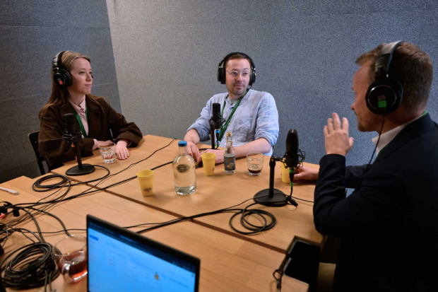
During the conference, community members also co-created content on site. Our Dutch colleagues facilitated the recording of the 'User Needs First Across Borders' podcast. In two episodes (available on the Gebruiker Centraal website), user-centred designers from Denmark, Germany, Italy, the Netherlands, and the UK discuss the themes 'Learning from others' and 'Design in policy'.
Equipped with more great content than time during the event, the conference organisers decided to run a post-conference webinar a few weeks later. We helped with running it. Through 3 talks, the 90-minute session offered practical insights into user-centered design in justice and public services. Presenters from Thailand, Germany, the Netherlands and the UK shared their work on prison, legal data and housing services.
The day after the festival, we partnered with the European Commission’s Policy Lab and ran a workshop hosted by the German government’s Digital Service. We looked at different approaches on design for policy. From the EU’s Policy Lab, we heard about the dynamic effects of design on policymaking culture in the union. German colleagues shared their approach to digital-ready legislation, and the Head of Policy & Service Design from Camden Council, Alejandra Diaz, shared what designing policy with communities looks like.
In subsequent breakout discussions, we looked at different degrees of involvement of designers along the policy cycle, from the stage of identifying the policy need over formulating policy to evaluating policy outcomes. We wanted to hear and share what community members do today and where barriers are to getting involved in other stages of the policy cycle. We shared approaches, failures and hopes. Collectively, we recognised that some of us are involved in short-term lawmaking, others in long-term policy theme exploration. Contexts and setups differ vastly.
What’s next for the community
Several international colleagues have been approaching us to learn about future in-person events. There seems to be a desire for gathering once a year. Community members from multiple continents are currently exploring how they can run smaller and larger events in 2026. You can subscribe to the blog to receive updates.
PolyFutures, Reimagining Policymaking for Europe
In April 2026, the EU Policy Lab team are running PolyFutures, an invitation based conference in Brussels to bring together a community of researchers, designers and foresight experts for exchange and exploration on participation, creative and future-oriented policymaking. We will collaborate with them again on a design for policy session.
For early 2026, we have prepared topics for further community calls. Upcoming themes include designing for AI, developing service patterns, designing for life events and designing public transportation.
]]>Sarah Wickstead - Senior User Researcher, HMCTS<![CDATA[Keeping services alive]]>https://designnotes.blog.gov.uk/?p=53892025-10-13T09:16:34Z2025-04-25T13:38:29ZWhat happens after services go live? What happens once large scale digital transformation programmes end?
We work on live services at HM Courts and Tribunals Service (HMCTS), as part of a multidisciplinary UCD (user-centred design) squad which includes a service designer, user researcher, content designer and interaction designer.
Others have reflected on how continuous improvement for services varies across government once services are live. At HMCTS, we have one UCD squad per jurisdiction: civil, family, tribunals and crime. Each jurisdiction contains multiple live services, for example family includes services like adoption, divorce, probate, family public law, so we work with multiple digital delivery teams, and service managers in a collaboration model.
We’ve been working this way on live services for almost 2 years, and have learned a lot about what works well in our context, as well as from some of our challenges.
Challenges and complexities of working on live services
A ‘live’ service is never finished, it must adapt to changes in policy or law, and design for new user needs. The services we work on are complex, and operational. We see variation in how processes work across services and sites, and an immense range of users whose needs differ and change, from members of the public to staff, professional users and judges.
We pick up work that multiple teams have worked on over years, part of what Kara Kane and Martin Jordan describe as the ‘long slog of design in government’. We’re working on services which often do not have an up to date map of the end to end journey and changes released since the service went live.
We have some dependable tools when we tackle a project on a live service including the Service Standard and the double diamond. However, we reflected on the gap in guidance available for design in government on maintaining services compared to standards and guidance for building services.
What we’ve learned through our work and from others
Using data to prioritise based on what users need is important
We work on problems that will have the biggest impact. To understand this we need to collect data with help from other teams such as Google Analytics and in page survey feedback. We also analyse contact data by listening to calls and analysing emails, which can tell us where the service isn’t meeting users’ needs. We help teams look at their service data with a “qualitative eye” and make sense of it to prioritise service improvements.
We need space and time to explore problems
Discoveries don’t become surplus to requirements once a service is live. We still need time to explore and understand problems fully. Skipping discovery research can be risky. We end up sticking plasters instead of solving real issues. Inevitably we miss things we have to pick up later.
We recently had to re-design a part of the journey where multiple applicants need to agree on a piece of information. Our discovery involved speaking with other government departments that have the same challenge, as well as involving policy at the earliest stages to understand what would be possible to change. The result of these conversations is a strong yet simple journey which our users can confidently complete.
The map of the end to end service is our guide
We need a map of the live service to guide us. This map includes any screens themselves and information about changes which have taken place and when. We need to see it all to understand the journey and address issues where they matter.
We created an end-to-end map of the Probate online application service to understand the user experience. This map was initially just for our UCD team but quickly became a reference for the service team as well as developers. No one in the team had had a visual overview of the journey and all the possible branching within the single application journey.
Having design capacity alongside delivery can be a winning formula
We are embedded in live service delivery, working hand in hand with service managers, delivery managers, business analysts and developers who build our designs into the live environment. This means, even in discovery, small design changes to address problems can be developed and released without waiting for the project to go into alpha.
Given all this complexity, we try to work on only one service at once!
What we learned discussing this topic with international colleagues
Designers are working in lots of different contexts. Not all designers work in multidisciplinary squads with development capacity, not all designers get to work with user researchers (and vice versa).
Funding model constraints can affect project outcomes, especially when funding doesn’t allow for continuous improvement to services or user-centred design once a service is live.
Understanding the differences and impact of designing a service from scratch versus continuous improvement of existing journeys is useful.
Live services can offer teams rich sources of data and will depend on the service itself.
Considerations for this work in the future
How might new sources of data and insight help drive and measure continuous service improvement?
How might live services transform to meet individual needs and changing user needs in the future?
How might automation and new sources of intelligence support real time user feedback and tools for instant process improvements?
In the comments let us know if you are working on live services in government. What is your model for continuous improvement? How are service improvements for live services prioritised where you work?
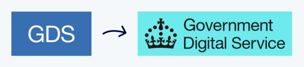
]]>Kuba Bartwicki - Head of Design, Products and Services (GDS)<![CDATA[How we refreshed the Government Digital Service brand, and what we’re doing differently]]>https://designnotes.blog.gov.uk/?p=53682025-04-04T15:56:01Z2025-04-04T15:55:45Z
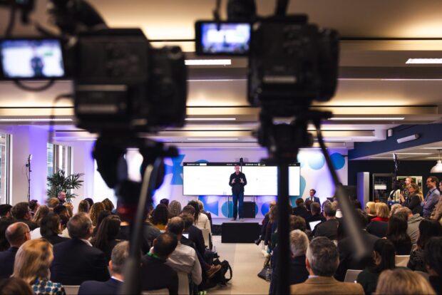
It's been a really busy start to the year in the Government Digital Service (GDS) and in our design team. Just a couple of months ago, we launched the blueprint for modern digital government in an event that included a speech from our Secretary of State, Peter Kyle. The announcement included the news that teams from GDS, the Central Digital and Data Office (CDDO), the Incubator for AI (i.AI) and colleagues from the Geospatial data team and the Responsible Technology Adoption Unit would merge together as the new, strengthened Government Digital Service, within the Department of Science, Innovation and Technology (DSIT).
Ahead of the announcement, we had to work out what the new visual identity was going to look like. This post is about how we approached designing a logo fit for the new digital centre of government. We are sharing how we approached the work, what the final output looks like, and how we’re using it.
The new Government Digital Service
The UK government has a well-established brand identity system that requires departments to use standardised coats of arms, specific colours and logo formats. This simplifies the overall visual identity for government departments, saving taxpayers’ money and reducing the potential for confusion.
It was important that the new Government Digital Service logo visibly echoed this identity system, supporting our new connections with DSIT and placing us within the larger structure. However, we also knew that recognition of the brand is high amongst public sector professionals and people who work in digital (both here in the UK and internationally). We were tasked with maintaining this so that we can continue to attract talent, and to retain the positive associations that have been built up with the Government Digital Service over the years. We had to deliver the work quickly, robustly and at no additional cost.
To meet these objectives, we redesigned our visual identity around three significant changes:
we added the Tudor crown throughout
we adopted the colour palette of GDS's department, DSIT
we created a set of well-formatted, more flexible layouts for the new logo
We believe the outcome works well with the existing government identity system and sits comfortably under and alongside DSIT’s identity. Through retaining the Government Digital Service workmark within the logo, we are able to build on our established reputation, while the visual changes also signal our increased scope, welcome new colleagues in, and create a bold foundation for all of the exciting work we’ve got coming up.
Using the Tudor crown
Working to a brief set by Government Chief Product Officer, Chris Bellamy, we explored various names and visual executions before agreeing with our stakeholders to use the recently redesigned Tudor crown instead of the more traditional coat of arms used by DSIT in most contexts (for example in official publications). We worked with the DSIT Digital Communications team to ensure the new treatments were consistent and complimentary with DSIT’s parent brand. And we worked with the Government Communications Service (GCS) to make sure that any treatment supports their work on the overall government identity.
There are some good reasons for doing this. Firstly, the Tudor crown symbol has very high levels of recognition already, due to its association with GOV.UK, the public-facing website and brand launched in 2012.
Secondly, in a recent change to the overall government identity system, the Tudor or ‘digital’ crown now serves as the single identifier for all government departments in smaller-format digital spaces (including social media avatars and mobile notifications), with differentiation provided through setting it against the relevant departmental colour as a background.
For our new identity we went a step further than this change by integrating the crown symbol into our formal logo, and into the Government Digital Services’s organisation page on GOV.UK too. Doing so creates a connection between our external public-facing and internal civil service identities and pays homage to what the organisation had previously achieved (which remains a source of pride for many) whilst also creating a more approachable, informal and ‘digital’ impression than the more official and heraldic coat of arms.
A bolder, more flexible brand
We knew that our use of colour had to reference the wider DSIT colour palette, so after some design exploration we landed on two main colours: the cyan and the midnight blue. At the same time, we took care to typeset the logo properly and create layouts (‘lock-ups’) that work well across a range of contexts. We have a ‘formal’ version, as well as an acronym version, and a fully spelled-out version.
We’re used to working with the Tudor crown and with Helvetica Neue, so creating arrangements that work was a familiar and enjoyable challenge. Some of the main places you can see variants of the new logo include our GOV.UK page, our slide deck template, and our social media profiles like this one on LinkedIn.
We believe that the new Government Digital Service identity is able to stand on its own better than our previous logo was, and also allows us greater flexibility to appear across platforms and contexts, both now and for the future.
Bringing it into the office
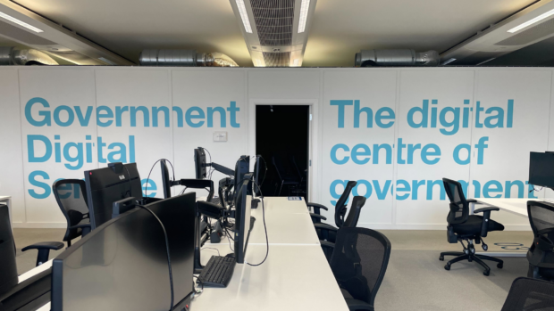
The launch event was a great moment to share assets and guidelines on how to use the identity with colleagues, to welcome them into the new Government Digital Service, give them the opportunity to feel part of what was happening, and to make the overall rollout and switchover more consistent and effective. We also took the opportunity to give our workspace a minor ‘glow-up’, including some refreshed posters showcasing our product line-up framed around the office (available from Github), some tweaks to the on-screen data dashboards that show how people are using our products in real-time, and some impactful vinyl wall decorations in a few judiciously-chosen areas of our office floor.
In some of our assets, you can see that we deconstructed elements of the Tudor crown and use it in the physical space, as well as on some of our social media and on publication covers. We’re still exploring all the ways we might be able to use this, but we like the flexibility it offers and how clearly it references GOV.UK.
How did we do this?
A set of posters showcasing our product line-up in early 2025, available from GitHub
As is frequently the case, we had to work at pace in a small team of designers, together with trusted colleagues. Overall, we had around 8 weeks before the event to do the work, which included the end-of-year holiday period in the middle. This really tightened the cycle of design, critique, accessibility testing, sign-off and installation, and we were only able to move as fast as we did because we were enabled by great support and backing from our leadership. In developing the creative routes, we found it helped to set out all the possible options - including some we wouldn’t normally recommend - at the outset, in order to be able to move quickly in ruling things out with stakeholders and getting to an agreed shortlist as swiftly as possible.
Now we’re on the other side of the official launch, we’re able to start iterating the work based on feedback from colleagues who are actually using the materials day-to-day in documents and presentations. We’re making it easy for people to suggest ideas, and regularly get together as a team to respond to them. We’re keen to build on this start and keep developing this new identity in the months ahead.
]]>Sophie Taylor – Senior Design Researcher, London Borough of Camden<![CDATA[Sharing Camden’s work on Universal Basic Services ]]>https://designnotes.blog.gov.uk/?p=52912025-02-25T14:16:20Z2025-02-18T09:00:00Z
Sharing learning across the public sector is crucial if we’re going to effectively tackle our shared challenges. So we were very excited when, at the end of 2024, we were invited to speak at the Service Design in Government conference in Edinburgh, and then in Helsinki at the International Design in Government conference.
As part of the Strategy and Design team at Camden Council, our design practice spans service and policy design. We get to look beyond service improvement and imagine how we might do things differently into the future, and understand the policy levers that we can use for transformation.
To this end, Camden has been exploring the idea of Universal Basic Services (UBS) as a framework for future public services. UBS is a concept that has been developed by academics at the UCL Institute for Global Prosperity (IGP), which articulates a radical redesign of the welfare state. It sets out how a network of 7 kinds of public services (healthcare, education, legal and democracy, shelter, food, transport and information) could comprehensively meet people’s basic needs, enable them to thrive, and support social resilience in the 21st century.
Camden and IGP have a long-standing collaboration, with written reports on public services and a Camden-run pilot that looked at the impact of free travel and digital services for those seeking employment. At the beginning of 2024, our team had the opportunity to continue developing Camden’s thinking on what UBS could look like at a local level, by running a series of co-design workshops.
Over 3 months we brought together groups of Camden staff, residents, and policymakers through 7 chronological sessions - imagining together what a welfare state that’s fit for the 21st century could look like.
We loved this piece of work and were really excited to be invited to share it with the international design community. Here are some of our reflections on the experience.
Our organisational context in Camden
At both conferences, we had questions about how this work came about and how we had secured permission to explore so broadly. We recognise we’re lucky that at Camden we have a mandate from our leadership to design projects that help move us towards the ‘third horizon’ of public services - work that helps us understand, tackle and transform around some of the big issues of our society, such as housing or care. The ‘third horizon’ framework, developed by the International Futures Forum, helps us think through how we can design services that demonstrate the possibilities of a future system (our third horizon) alongside the ‘business as usual’.
Our work on UBS fits in this framework of designing for the future. Working in a mission-led way inherently invites us to design with our eyes on the horizon and build capacity within our organisation to work with a ‘test and learn’ mindset. Going forward, we’re looking to scale up our testing so we can start prototyping what elements of UBS might look like in the real world through small pilots that will give us and others interested in exploring this idea with us a good roadmap for how we can begin to make this tangible.
Sharing our co-design practice
We also had questions about how we built trust with residents and worked with them throughout the co-design process. Though we worked to build psychological safety through co-creating ‘ground rules’ for how we’d show up together, and compensated them for their time, we still had to navigate the tensions of doing this work as representatives of Camden Council.
Many residents had valid reasons for having low levels of trust in government, and found it hard to trust us when we said we wanted to work with them to redesign the welfare system of the future. Part of our role was in knowing how to hold the tension between recognising we need to fix things now, but also to begin creating something that will work for future generations.
Learning from shared challenges
In Helsinki Kara Kane and Martin Jordan gave a keynote speech about the “long slog” of design in government. They argued that whilst many designers come from the private sector where work can be delivered in fast-spaced “sprints” - design in the public sector is tied to policy, funding cycles and parliamentary terms, which hugely slows things down. Generations of designers will pass down their work and ideas in an “ultramarathon baton relay” in the hope that the time will be right for ideas to make an impact. This really spoke to our work on UBS and the way we had to navigate engaging residents in this process. The hope is that the work we do now to shape a vision will have an impact when the right conditions are in place.
We were also inspired by David Martens from the EU Policy Lab’s talk on the role of design in making things more intimate and beautiful, and we recognise how important this can be in our work around UBS when looking to build stories and ideas that will inspire many others to join us as we create a different future.
Our main takeaway was a sense of solidarity with international colleagues facing such similar challenges, and a renewed sense of the value of design for bringing new energy, creativity and thinking to the public sector. Although it may sometimes feel like an “ultramarathon,” employing design thinking in government spaces feels so much more meaningful when you know you’re not alone. The value of sharing at and attending conferences like these shouldn’t be understated.
If you’d like to read more about our work on UBS and our other work at Camden Council, check out our blog series at Change by Design.
Services Week is coming up next month from 17 to 21 March 2025. It’s a great opportunity to share and learn across the public sector on public service design. Check out the Services in Government blog for information on how to get involved.
]]>Kara Kane – Head of Design for Test, Learn and Grow, Cabinet Office<![CDATA[Progressing international design discourse in Helsinki, Amsterdam and beyond]]>https://designnotes.blog.gov.uk/?p=50882025-01-13T19:17:41Z2025-01-14T09:00:00Z
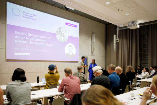
In October, almost 250 people from over 30 countries representing more than 90 public sector organisations got together in Helsinki, Finland. It had been 5 years since the International Design in Government community met at an in-person conference. The 2-day event discussed the theme ‘Systems change and futures’. For the first time since our community ran the first event in 2018, we also opened the doors to colleagues from academia to add yet another valuable perspective on design in government.
The conference planning over spring and summer became an unprecedented collaborative community effort, organised and coordinated by Julkis-muotoilijat, the Finnish government design community, and supported by colleagues from the City of Malmö (Sweden), the City of Helsinki (Finland), designers from the City of Tallinn and the Estonian government, and Aalto University.
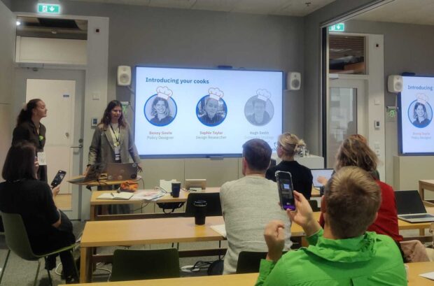
The conference leads, Anni Leppänen, Eze Montenegro, Julia Isoniemi, and Tuire Suihkonen and their team of volunteers, did an incredible job organising and running the conference. They created 7 conference tracks: case studies of change-making, systems, futures, ethics and behaviour, sustainability, Design for Government (with Aalto University), and dialogues—formal and informal networking.
Day 1 opened at Kalasatama, a City of Helsinki building, with a keynote from Aalto alum David Martens on ‘Design for policy – experiments in between futures, systems and behaviour’. In the evening we gathered at Aalto University for Dinner and Stories — a format run by Anni and Sabine Junginger. It allowed participants to speak in depth beyond the fast paced conference sessions. Guided by prompts, the dinner guests started sketching their organisational design setups on the paper table cloth after the main course.
For day 2, the conference moved to Aalto University. Núria Solsona, Marco Steinberg and Seungho Park-Lee, former and current educators of the Design for Government course, started the day with a panel on ‘Design for Government, looking back and forward’.
The organisers carefully designed the participant experience and created a conference participants Slack channel and ran social events pre and post conference. After the conference they created a booklet with links to all talk and workshop materials and recordings, and a Miro board with key takeaways from every session. This all helped create an inclusive, participatory feel and has kept participants engaged and sharing post-conference, too.
Discussing the role of community in long-term service transformation
In an opening session, we continued last year’s investigation and discussion on the long slog of government transformation. Reviewing examples from the UK and from community members from other countries, we collected patterns of community functions. By going through illustrative cases, we demonstrated how the national and international community work of user-centred design colleagues serves various purposes:
supporting knowledge management in the organisation
Co-creating the first English-language version of the newspaper since the Rotterdam 2019 conference, we invited 15 more international public designers to reflect on their practice. The contributors offer a broad perspective ranging from service archaeology to making business cases for service design and from designing digital-ready legislation to ensuring full inclusion for vulnerable groups in service delivery. The edition tells stories and shares reports from Belgium, Canada, Cyprus, Japan, Finland, Germany, the United States, and the United Kingdom.
Our biggest International Design in Government conference to date took place in Rotterdam in 2019. It was organised by Gebruiker Centraal, the Dutch User Needs First community of Dutch public sector professionals.
Celebrating 10 years of their national community exchange, Gebruiker Centraal is inviting international colleagues to another global event. Organised in collaboration with the Dutch Ministry of the Interior and Kingdom Relations and our International Design in Government Community, they welcome design-minded public servants to Amsterdam from 9 to 11 April 2025. The event is open to anyone working on better government services, including policy officers, senior public servants, designers, developers, and user researchers.
The organising team has an open call for contributions, asking for ideas for workshops, presentations, training or panel discussions. Potential topics include accessibility and inclusion, proactive and cross-channel services, behavioural design and user research. We are expecting some 800 participants from around the world – matching the size of the 2019 Rotterdam event. So far, more than 500 people have registered interest in attending. There will be several keynotes, more than 30 breakout sessions, and excursions to Dutch government organisations across several sites.
Over the years, multiple organising teams have run smaller and bigger events in different parts of the world. We collect, document, and help share good event practices to support future organisers. Preparing for the Amsterdam event, the Dutch colleagues already have had an exchange with the Helsinki conference organisers.
Other ways to get involved
Beyond the Amsterdam event in April, more international colleagues have expressed interest in running events in 2025 and 2026. We are currently working with them to shape their ideas. If you’re interested in running an event, get in touch with us: intl-govdesign-team@digital.cabinet-office.gov.uk
For those less able to travel internationally, we have plenty of ideas for more community calls for 2025. If you have a topic of interest or a proposal for a talk, email us about it. Please also tell your colleagues and co-workers about the community by pointing them to the community page.
]]>Kara Kane – Head of Design for Test, Learn and Grow, Cabinet Office<![CDATA[Updating design skills in the Government Digital and Data Capability Framework]]>https://designnotes.blog.gov.uk/?p=50672024-12-02T17:42:04Z2024-12-03T09:00:00Z
The Government Digital and Data Profession Capability Framework (previously known as the Digital, Data and Technology Profession Capability Framework) was first published in 2017. The ‘user-centred design’ group of roles included service designer, interaction designer, graphic designer, content designer, content strategist, technical writer, and user researcher. Accessibility specialist was added in 2022. As of April 2024, there are about 2,400 user-centred design practitioners in government.
The 12 skills for designers have largely stayed the same since they were first published. We use them to guide our recruitment criteria and they are the basis for capability assessments.
Through using the design skills for recruitment and capability assessments over the last several years we’ve spotted:
what needs to be updated or changed
what language around skills is best understood by designers
what is no longer relevant
Various departments have also made their own iterations for internal use, and so it was time for a refresh!
Goals for the update
The ‘heads of design across government’ group meets every month to discuss progress on shared objectives, share challenges and support each other. This year we agreed to work on an objective to iterate the skills in the Capability Framework.
Since January 2024 a sub-group has been meeting regularly and working with the Capability Framework team in the Central Digital and Data Office (CDDO) to update the design skills.
The group included:
Andy Jones, Head of Design at Department for Education
Antony Poveda, Senior Content Designer at CDDO
Jeff Allen, Lead Service Designer at Ministry of Justice (MoJ)
Kara Kane, Head of Design at the Government Digital Service
Nikola Goger, Head of Design at MoJ
Paul Moran, Head of Service Design & User Research at Driver and Vehicle Standards Agency
Ross Gower, Head of Design at the Department for Business and Trade
Pablo Charro de la Fuente, a lead designer in the cross-government community presented to the Capability Framework Design Council to make the case for an update. After getting the go ahead to make changes, we kicked off the work. We started with a workshop to identify what work needs to be done and how to approach it, and to agree our goals.
We agreed to make sure the skills for designers were:
relevant and up to date—for example, by reflecting the core skills you would want when hiring a new designer in government now
easier to understand and use for self-assessment and progression—for example, by reducing the number of skills and using clearer language
Co-writing new skills
In subsequent workshops we compared our internal iterated versions of the framework skills we were using with the originals to agree on a new list of skills. Facilitated by Antony from the CDDO team, we worked to reduce the number of skills by reducing overlap and being more concise in each skill.
Once we agreed on the revised, shorter list of skills, we started drafting the content. Over many sessions, the group has come together to dig into each skill description and define 4 proficiency levels (awareness, practitioner, working, expert) for each one.
We continued to sense check the skills, skill names, and how they sit alongside other roles in the framework, as well as other frameworks such as the Public Policy Design community’s 7 universal design practices.
Testing with our users—designers across government
Once we had a draft we were happy with, we started to share it with our teams across government to gather feedback. To achieve breadth and scale in getting feedback from the cross-government design community, we asked all of the heads of design in our group (50 people now!) to run a specific session with their teams.
The sessions introduced the new skills and skill level descriptions, and asked teams to consider how they would evidence their own capability, so designers could give feedback on specific aspects of the draft content.
We got feedback from 8 organisations including MoJ, MHCLG, DVSA, DfE, HMCTS, UKHSA, and GDS. A cross-government group of content designers also reviewed the skills and provided feedback with the aim for their role to adopt them in 2025.
The final stage was to incorporate the feedback from the community to create the final versions of each skill and then map the skill levels to role levels.
The new skills and which roles use them
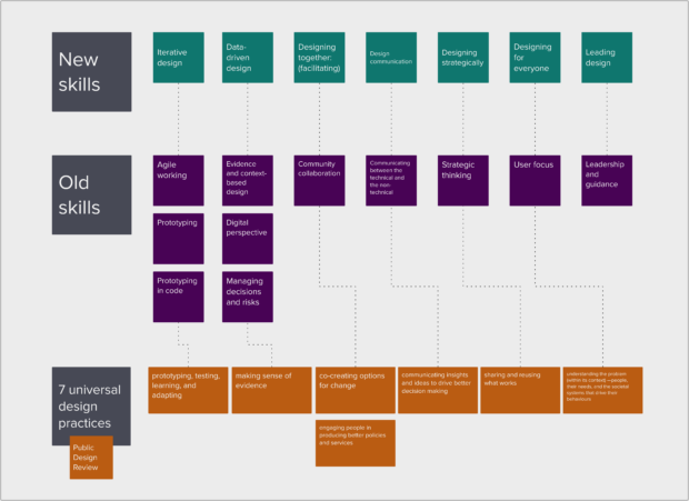
The new skills are:
iterative design
evidence-based design
designing together
design communication
designing strategically
designing for everyone
leading design
The new skills are now published on GOV.UK and used by:
The framework is for designers working in government, but anyone hiring and managing designers can use the framework.
What’s changed
The skills are not dissimilar to what was published before. For example, the new skill: iterative design replaces the old skill: agile working. Iterative design now also covers the old skill: prototyping.
We’ve removed prototyping and prototyping in code as separate skills and moved them into iterative design because prototyping is often interpreted as using the prototype kit which can:
alienate some service designers where this is not a part of their role
stop people from applying for a job in government for not having confidence in this particular skill
However, prototyping can encompass a range of activities so we hope that removing the specific skill definitions helps designers to understand and evidence their skills and abilities more easily through the new iterative design skill.
We’ve changed the design skills so the 3 design roles now all have the same skills. Whereas before there was an additional skill for service design: managing decisions and risks; and for graphic design: tools and software. Tools are now covered across multiple skills for all designers, and managing decisions and risks is required for all designers and covered in the skills: design communication and designing strategically.
While the skills are the same across the 3 roles, how the skills are weighted by skill level is different. And the skill definitions provide flexibility for the skills to be approached and evidenced in different ways. We think this makes these skills more inclusive and work better for the different contexts we work in.
We’ve introduced new things around environmental sustainability to the skill designing for everyone. The old skills: user focus and digital perspective covered designing for assisted digital and meeting the needs of all users. This new skill explicitly covers accessibility, inclusion, equity and sustainability—skills needed by all designers to design products and services fit for purpose in a world where climate change, artificial intelligence, and disability are increasing design factors.
Feedback and further iteration
The Department for Education rolled out the new skills recently and with help from the Head of Design, Andy Jones, completed the first capability assessments in the department using the new skills framework. Designers have said the new framework is simpler, more relevant to the design profession, and easier to understand.
Our next steps are to gather feedback on their use to iterate again in 2025. The heads of design group will collaborate and work with the CDDO capability team to create internal guidance for designers on how to evidence the new skills.
Finally, we’d like to thank Antony Poveda who did an outstanding job of collaborating with us to iterate the framework and write the new skills.
We’d love to hear your feedback on the new skills. What’s working for you and what isn’t? What’s missing? Let us know in the comments or email Government Heads of Design: government-heads-of-design@digital.cabinet-office.gov.uk.
]]>6Al Robinson – Interaction Designer, formerly Valuation Office Agency, HMRC<![CDATA[How can we test our designs with Welsh-speaking users?]]>https://designnotes.blog.gov.uk/?p=50242025-10-13T09:12:20Z2024-11-14T13:11:59Z
I worked in a team supporting the Welsh Government’s Council Tax reform programme alongside Abbie Foxton, who wrote about our approach to designing the content for the service bilingually in their blog post “How we’re designing a bilingual service for Wales, from the start.” This blog post complements Abbie’s, focusing on the interaction design part of the process and the key question: “How can we test our designs with Welsh-speaking users?”.
Until now, public services have typically been designed and tested only in English, excluding Welsh. Services are usually designed in English and then translated to Welsh just before going live. The Welsh user experience isn’t considered until the end of the process, making it an afterthought. We can change this.
The ability to test our designs bilingually lies within the functionality of the GOV.UK Prototype Kit. This is groundbreaking because, as far as I know, it hasn't been done before. Through this work Welsh speakers can now participate in user research during the design process, ensuring inclusivity for an often underserved demographic. First, let’s explore why it's important to include Welsh speakers in testing...
We aren’t meeting the language needs of people in Wales
At the 2022 National Eisteddfod of Wales, the Centre for Digital Public Services (CDPS) shared research on how Welsh speakers use services in Welsh. Joanna Goodwin, Head of User-centred Design at CDPS, wrote about this in the Trio Writing handbook:
“The research found that people could not trust or rely on services that are provided in Welsh.”
“When people cannot easily understand our services and the content does not meet their needs, they are often forced to contact us, or just give up. This results in a bad experience – and may negatively impact the quality of life of the person trying to access the service. It is also more expensive for us to operate services when users contact us when they shouldn’t need to.”
“Make Welsh language content central to the development of your service from the start. Do not start to consider Welsh language aspects of the service after the design process. Test Welsh language content with users as early as you can. The Welsh you use, and the way users access a Welsh language service, need to form part of your usability test plan.”
So, how can we do this?
Inclusive Prototypes: Integrating bilingual functionality for user research
During usability testing, users navigate a prototype that replicates the live service, providing realistic experiences for meaningful feedback. Prototypes must allow users to easily toggle between English and Welsh to ensure an inclusive, and realistic experience. But how can this functionality be incorporated into a prototype?
A more inclusive Welsh language toggle
Most public body service prototypes are built using the GOV.UK Prototype Kit, usually by an interaction designer. There are Welsh language toggles available on various government design systems, but to my knowledge, they have not been used in research with Welsh-speaking users, they are included in prototype journeys without functionality.
I identified that the way current toggles have been designed could cause issues during usability testing and are difficult to iterate and maintain. The prototype would need separate journeys for English and Welsh, leading to navigation problems and duplicating efforts during iterations.
To overcome this, with support from colleagues and the HMRC Design System team, came up with a simple yet effective way to build prototypes. It lets users easily toggle between English and Welsh during usability testing. Each page displays both languages, showing the chosen one and hiding the other. This approach solves navigation issues and makes it much easier to iterate the prototypes.
The impact of the new Welsh language toggle
This toggle allows Welsh-speaking users to take part in usability testing during the design phase. We can design content in both English and Welsh using Trio writing and test how users experience it with this toggle.
If you're reading this and can influence a design team currently creating journeys only in English, please share this blog post with them. It's straightforward to enable prototypes to be designed in both English and Welsh, and it significantly improves accessibility for Welsh speakers.
Instructions on how to implement the toggle into your prototype
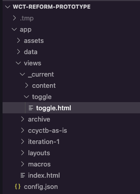
In your code editor, go to the page where you want the toggle
In the example below, I want the toggle to display on the page called toggle.html
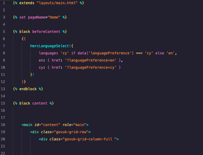
In this file, copy and paste the following code before the {% block content %}:
{% block beforeContent %}
{{
hmrcLanguageSelect({
language: 'cy' if data['languagePreference'] === 'cy' else 'en',
en: { href: '?languagePreference=en' },
cy: { href: '?languagePreference=cy' }
})
}}
{% endblock %}
like this:
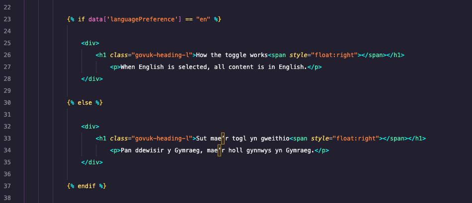
4. To enable users to switch between English and Welsh, wrap the content you want to toggle in an if statement. Place the English text inside the first set of <p> tags and the Welsh text inside the second set. Copy and paste this code snippet into the area of your code where you want the content to switch between languages.
{% if data['languagePreference'] == "en" %}
<div>
<p>English content to go here.</p>
</div>
{% else %}
<div>
<p>Welsh content to go here.</p>
</div>
{% endif %}
5. Repeat this process wherever you want the content to switch between languages.
At the time of publishing this blog post, plans to change the navigation bar, including the Welsh language toggle, are in progress. Once the update is live, join the Welsh language toggle discussion on GitHub to explore solutions.
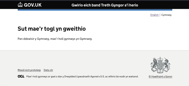
Sut gallwn brofi ein dyluniadau gyda defnyddwyr Cymraeg?
Al Robinson, dylunydd cynnwys rhyngweithiol, gynt yn rhan o Asiantaeth y Swyddfa Brisio, CThEF
Gweithiais mewn tîm yn cynorthwyo rhaglen ddiwygio Treth Gyngor Llywodraeth Cymru ar y cyd ag Abbie Foxton, a oedd wedi ysgrifennu am ein dull o ddylunio’r cynnwys ar gyfer y gwasanaeth yn ddwyieithog yn ei blog “Sut rydyn ni’n dylunio gwasanaeth dwyieithog i Gymru, o’r cychwyn cyntaf.” Mae’r blog hwn yn ategu un Abbie, gan ganolbwyntio ar ran o’r broses sy’n ymwneud â dylunio cynnwys rhyngweithiol a’r cwestiwn allweddol: “Sut gallwn brofi ein dyluniadau gyda defnyddwyr Cymraeg?”.
Hyd yma, dim ond dylunio a phrofi gwasanaethau cyhoeddus yn Saesneg sy’n nodweddiadol o ddigwydd, gan eithrio’r Gymraeg. Fel arfer, mae gwasanaethau’n cael eu dylunio yn Saesneg, ac wedyn, cân nhw eu cyfieithu i’r Gymraeg yn union cyn mynd yn fyw. Dyw profiad y defnyddiwr Cymraeg ddim yn cael ei ystyried tan ddiwedd y broses, sy’n troi’r cyfan yn ôl-ystyriaeth. Gallwn newid hyn.
Mae’r gallu i brofi ein dyluniadau yn y ddwy iaith yno yn swyddogaeth Pecyn Prototeip GOV.UK. Mae hyn yn torri tir newydd oherwydd, hyd y gwn i, does neb wedi gwneud hyn o’r blaen. Drwy’r gwaith hwn, gall siaradwyr Cymraeg nawr gymryd rhan mewn gwaith ymchwil defnyddwyr yn ystod y broses ddylunio, gan sicrhau cynhwysiant i ddemograffeg sydd yn aml heb wasanaeth digonol. Yn gyntaf, gadewch i ni archwilio pam mae’n bwysig cynnwys siaradwyr Cymraeg yn ystod gwaith profi...
Dydyn ni ddim yn bodloni anghenion pobl yng Nghymru o ran iaith
Yn Eisteddfod Genedlaethol Cymru 2022, gwnaeth y Ganolfan dros Wasanaethau Cyhoeddus Digidol (CDPS) rannu ymchwil i sut yr oedd siaradwyr Cymraeg yn defnyddio gwasanaethau drwy gyfrwng y Gymraeg. Ysgrifennodd Joanna Goodwin, Pennaeth Dylunio gan ganolbwyntio ar y defnyddiwr yn CDPS, am hyn yn y llawlyfr Ysgrifennu Triawd:
Roedd y gwaith ymchwil wedi darganfod na allai pobl ymddiried na dibynnu ar wasanaethau sydd wedi’u darparu yn y Gymraeg.
Pan na all pobl ddeall ein gwasanaethau’n hawdd ac nid yw’r cynnwys yn bodloni eu hanghenion, gan amlaf byddant yn gorfod cysylltu â ni neu’n rhoi’r gorau i’r hyn maent yn ei wneud. Mae hyn yn arwain at brofiad gwael – ac efallai y bydd yn cael effaith negyddol ar safon bywyd y person sy’n ceisio cael mynediad at y gwasanaeth. Mae hefyd yn ddrutach i ni weithredu gwasanaethau pryd y bydd defnyddwyr yn cysylltu â ni pan nad oes angen iddynt wneud hynny.
“Gwnewch gynnwys Cymraeg yn ganolog i ddatblygu’ch gwasanaeth o’r dechrau. Peidiwch â dechrau ystyried agweddau Cymraeg ar y gwasanaeth ar ôl y broses ddylunio. Profwch gynnwys Cymraeg gyda defnyddwyr cyn gynted ag y gallwch. Mae angen i’r Gymraeg a ddefnyddiwch, a’r ffordd y mae defnyddwyr yn defnyddio gwasanaeth Cymraeg, ffurfio rhan o’ch cynllun profi defnyddioldeb.”
Felly, sut allwn ni wneud hyn?
Prototeipiau cynhwysol: Gwreiddio swyddogaeth ddwyieithog ar gyfer ymchwil defnyddwyr
Yn ystod profi defnyddioldeb, mae defnyddwyr yn gwe-lywio prototeip sy’n efelychu’r gwasanaeth byw, gan roi profiadau realistig er mwyn cael adborth arwyddocaol. Mae’n rhaid i brototeipiau alluogi defnyddwyr i newid rhwng y Gymraeg a’r Saesneg yn hawdd i sicrhau cynhwysiant a phrofiad realistig. Ond, sut gall y swyddogaeth hon gael ei chynnwys mewn prototeip?
Togl iaith Gymraeg mwy cynhwysol
Mae rhan fwyaf o brototeipiau gwasanaeth corff cyhoeddus yn cael eu hadeiladu gan ddefnyddio Pecyn Prototeip GOV.UK, fel arfer gan ddylunydd cynnwys rhyngweithiol. Mae toglau iaith Gymraeg ar gael ar amrywiaeth o systemau dylunio’r llywodraeth, ond hyd y deallaf i, dydyn nhw ddim yn cael eu defnyddio yn ystod ymchwil defnyddwyr gyda defnyddwyr iaith Gymraeg, cân nhw eu cynnwys mewn teithiau prototeip heb y swyddogaeth.
Gwnes i ganfod y gallai’r ffordd bresennol o ddylunio toglau achosi problemau yn ystod y cam o brofi defnyddioldeb, a’u bod yn anodd eu hailadrodd a’u cynnal. Byddai angen teithiau ar wahân ar y prototeip ar gyfer y Gymraeg a’r Saesneg, gan arwain at broblemau gwe-lywio a dyblygu’r ymdrechion wrth ailadrodd.
I ddatrys hyn, gyda chymorth gan gydweithwyr a’r tîm Systemau Dylunio CThEF, wnaethom ddyfeisio ffordd syml, ac eto, effeithiol o adeiladu prototeipiau. Mae’n galluogi defnyddwyr i newid rhwng y Gymraeg a’r Saesneg yn ystod y cam o brofi defnyddioldeb. Mae pob tudalen yn arddangos y ddwy iaith, gan ddangos yr iaith o’ch dewis a chan guddio’r iaith arall. Mae’r dull hwn yn datrys y problemau gwe-lywio ac yn ei gwneud hi’n llawer haws i ailadrodd prototeipiau.
Effaith y togl iaith Gymraeg newydd
Mae’r togl hwn yn galluogi defnyddwyr iaith Gymraeg i gymryd rhan mewn profi defnyddioldeb yn ystod y cam dylunio. Gallwn ddylunio cynnwys yn y Gymraeg a’r Saesneg gan ddefnyddio ysgrifennu triawd a phrofi profiad defnyddwyr gyda’r togl hwn.
Os ydych yn darllen hwn a gallwch ddylanwadu ar dîm dylunio sydd ond yn creu teithiau yn Saesneg ar hyn o bryd, rhannwch y blog hwn â nhw. Mae’n rhwydd galluogi dylunio prototeipiau yn y Gymraeg a’r Saesneg, ac mae’n gwella hygyrchedd i siaradwyr Cymraeg yn sylweddol.
Cyfarwyddiadau ar sut i roi’r togl ar waith yn eich prototeip
Yn eich golygydd cod, ewch i’r dudalen lle’r ydych chi eisiau’r togl i fod
Yn yr enghraifft isod, hoffwn i’r togl ddangos ar y dudalen o’r enw toggle.html
Yn y ffeil hon, copïwch a gludo’r cod canlynol cyn y {% block content %}:
{% block beforeContent %}
{{
hmrcLanguageSelect({
language: 'cy' if data['languagePreference'] === 'cy' else 'en',
en: { href: '?languagePreference=en' },
cy: { href: '?languagePreference=cy' }
})
}}
{% endblock %}
fel hyn:
4. I alluogi defnyddwyr i newid rhwng y Gymraeg a’r Saesneg, amlapiwch y cynnwys rydych chi eisiau toglo mewn datganiad ‘if’. Gosodwch y testun Saesneg y tu fewn i’r set gyntaf o dagiau <p> a’r Gymraeg y tu fewn i’r ail set. Copïwch a gludo’r darn hwn o god i’r maes, yn eich cod chi, lle’r hoffech i’r cynnwys newid rhwng y ddwy iaith.
5. Ailadroddwch y broses hon lle bynnag yr hoffech i’r cynnwys newid rhwng y ddwy iaith.
Ar adeg cyhoeddi’r blog hwn, mae cynllun ar y gweill i newid y bar gwe-lywio, gan gynnwys y togl iaith Gymraeg. Unwaith bod y diweddariad yn fyw, ymunwch â’r drafodaeth am y togl iaith Gymraeg ar GitHub er mwyn archwilio datrysiadau.