How can we test our designs with Welsh-speaking users?
How to add a Welsh language toggle to your prototypes so you can better test with Welsh users.
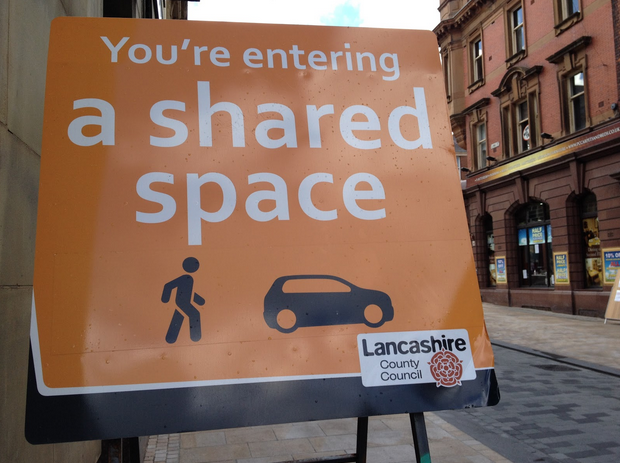
Most traffic engineers will approach a problem with a road by adding something to solve it. This means new signs, traffic lights, or road markings. All attempts to influence driver behaviour. The Dutch traffic engineer Hans Monderman challenged this thinking …
Yesterday we updated our guidance on using the GOV.UK headers and footers. There are teams all over the UK developing services for the government. We're often asked by those teams whether or not their services should look like GOV.UK, what should go in …
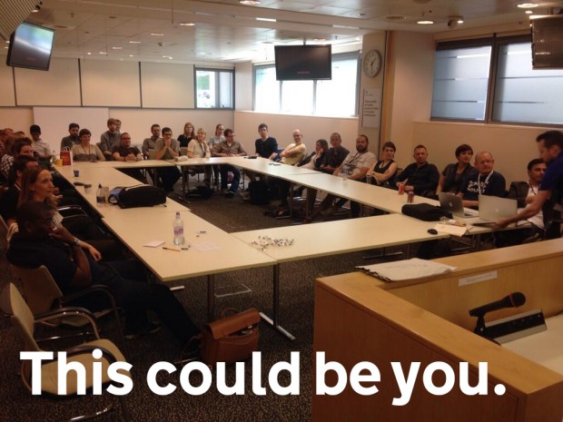
This is a picture of designers working at DVLA, MoJ, HMRC, GDS and HO meeting up at the Home Office last week to share design patterns. This is something we do regularly as a design community. As we transform more …
This is apparently a slide from a Google engineer highlighting their focus on the user. I don't know who the quote is from but it was tweeted by Paul Frampton the other day. It reminded me of our fourth design principle, …
Yesterday we published some new design guides in the Government Service Design Manual. GOV.UK elements There's a new guide to styling and coding the basic page elements, with sections on layout, colour, typography, forms, buttons, data, images and icons. This …
Picture from Jen Pahlka, stickers by us at GDS. The other day Jason Fried wrote a blog post called Questions I ask when reviewing a design. It's a good list. Reviewing design work is never easy. And giving constructive feedback is …
When we welcome new designers to growing digital design community in government we often send round a bunch of useful links. In the spirit of Mike's 'publish don't send' I thought it was better to stick them up here so …
When designing a new service, a product or just a simple page it is often best to start with a sketch. Or a scribble. Something you can quickly put down on paper to help you visualise how things might work and …
Providing good services is difficult if we don't monitor how well we're doing. Fortunately, we're building an entire platform to show, compare and provide insight into how well each service is working for citizens. Joining the Dots On every service …
GOV.UK is constantly being iterated and updated and sometimes we need to draw users’ (including departments and agencies) attention to this. We do it by saying something is in 'beta'. Of course, the way we show that something is in …