Most traffic engineers will approach a problem with a road by adding something to solve it. This means new signs, traffic lights, or road markings. All attempts to influence driver behaviour.
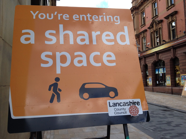
The Dutch traffic engineer Hans Monderman challenged this thinking with his idea of “Shared Space”. His concept was simple. Remove all traffic lights, signs, and road markings. The results were the opposite of what most people expected. The traffic moved slower, people paid more attention, and accidents ultimately declined.
His ideas have now spread across Europe. I’m reminded of this every day as the project we’re working on for Carer’s Allowance is based in Preston – there’s currently a shared space scheme being developed right across the city centre.
When it comes to solving problems the same goes for designing products and services. We often try to solve a problem by adding something. It’s important to recognise that adding something isn’t always the answer when we’re designing for user needs.
As well as asking ourselves what users need we should also be thinking about what we can do to get out of the way.
Progress Indicators
A good example of this is how our user research showed us that the progress indicator we had designed wasn’t being seen by most users. In fact, those that did notice it were getting confusing about what it did, and others were even feeling intimidated when seeing it.
With this in mind we removed the progress bar as an experiment on the live service. We then measured the difference in our completion rates. We found that without a progress bar, completion rates stayed exactly the same while other key metrics, like time to completion and the total amount of online applications, were also unaffected.
This was a reminder to do less. Adding this feature didn’t make things clearer. We can create simpler and clearer services by removing any features that don’t meet user needs.
If you want to learn more about how we do user research at GDS, check out the User Research blog.

6 comments
Comment by James Abley posted on
Great to hear this.
I'm presuming that the experiment was statistically robust. Can you share the numbers?
Comment by Irene posted on
Hello,
I agree that a progress bar (5%, 35% etc) doesn't offer much value, but I think that removing all progress indicators would be a mistake.
The user still needs guidance to orient themselves around a form, for instance by knowing how many pages long the form is, in what page they are at a given moment, and clear ways to navigate between pages on a form.
Thanks,
I.
Comment by Caroline Jarrett posted on
We had some discussion around whether to use the term 'progress indicator' or 'progress bar'. I asked Ben to use 'progress indicator' because that seems to be used more often for the thing that sits at the top of the page and changes step by step, whereas 'progress bar' mostly seems to be used for a simple bar that fills up rather like a thermometer (most often seen when downloading something).
Seems like the usage of the terms isn't quite as clear as I hoped - particularly as I notice that Ben opted for 'progress indicator' as a heading but then refined it to 'progress bar' in the text.
If you'd like to join in our discussions, please come to the Design Patterns Hackpad - I've put the link as my website in my comment, so you should be able to click on my name in the comment to get there. Or use this link directly:
https://designpatterns.hackpad.com/Progress-indicators-3AOrLoia9Us
Comment by Ben Holliday posted on
@James
We're still evaluating the data. This wasn't an A/B test so we'll keep looking at the data until the next release (we usually work on 2 week release/sprints).
The original numbers we ran are discussed in the design hackpad - https://designpatterns.hackpad.com/Progress-indicators-3AOrLoia9Us. We've now had over 5000 claims in almost 2 weeks since the change to remove the progress indicator went live - the data we're seeing is still consistent (in fact completion rates are now up slightly but that's not significant as they fluctuate a small amount over time).
RE: statistically significant - we believe this data is sufficient for us to be confident that the progress indicator isn't needed by users in order to complete the transaction.
@Irene
We're still looking at alternatives to progress indicators. We think there's a user need, but more around how much work is required (or remaining) to complete the application. We've been testing percentage indicators, and solutions like 'Section X of X' in recent prototypes as part of our user research.
Comment by Jessica Enders posted on
Thanks so much for sharing this valuable research.
It does seem clear that there's very little to support the progress indicator you had on that particular form. But before we leap from that one experiment to a conclusion for all web forms, would be helpful to get some more detail. In particular, can you please post a picture of the progress indicator that was removed, let us know whether it was clickable, include the actual stats (before and after) and include some info about the user population (before and after)?
It would be good if this info was in the post itself, rather than responding to comments or on Hackpad, as to share this widely having the data all in one, easy-to-read post would be best.
Thanks!
Comment by Henna Lund posted on
great to see, that the shared space idea also hit the UK !
this guy here was the inventor of it and i like his visions about shared space: http://smart-magazine.com/space/the-miracle-of-space/
personally I believe it is a great approach !