Making the GOV.UK Frontend typography scale more accessible

The GOV.UK Design System team plans to update the typography scale in the Design System making it better for users and service teams.

The GOV.UK Design System team plans to update the typography scale in the Design System making it better for users and service teams.
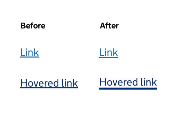
We are making some visual improvements to links on GOV.UK to make them more accessible and easier to read.

We've made some changes to the GOV.UK Design System, to make sure everything it contains meets the new public sector accessibility regulations. Here's what you need to know and what you need to do.
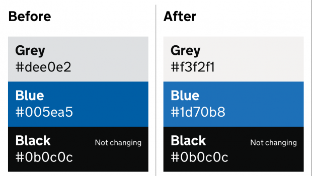
We've updated the colour palette on GOV.UK, as well as the way the GDS Transport font is served. Here's more about those changes.

We carried out research to look at how the GOV.UK Design System can work with other design resources across government. Here's what we found out.
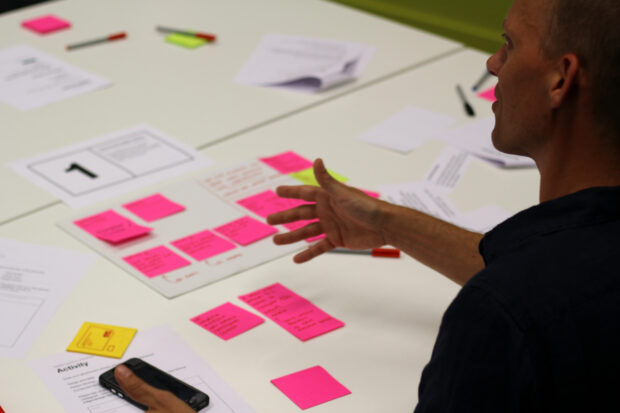
The Design System contains styles, components and patterns to help teams in government create user-centred digital services. Here's how we developed the documentation that explains how to use them.
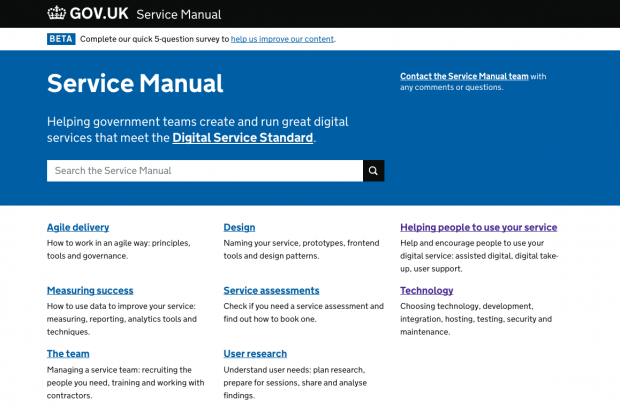
Last year Ed Horsford made a copy of the entire Service Manual for some user research. In this blog post he looks at to use the Wget command line utility to create copies of large amounts of content.
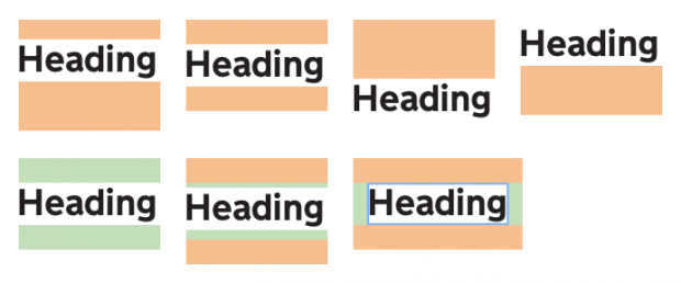
The Design System team at GDS have updated how typography and spacing is defined in GOV.UK Frontend, the new frontend codebase which will replace Frontend toolkit and GOV.UK Elements. Here’s exactly what they did.
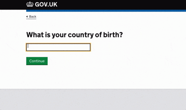
We're building an autocomplete – we've started by building one for users to provide country and territory information. Here's why we're developing it and what we've done so far.
Paul Smith, a frontend developer at DWP, writes about why it's so important to make our work open and how we can all help make this happen.