
The GOV.UK Design System team is constantly iterating the Design System to make sure it remains as usable as possible for service teams and people using government services.
The typography scale gives service teams a standardised set of font sizes, which they can use to style headings, paragraphs and other pieces of text. The typography scale helps teams make sure text looks consistent within their own service and across all services on GOV.UK.
The font scale was introduced in 2012 and reflected the web design standards of the time. It was improved in 2018 when the team did some work to improve the original typography scale.
In 2023 we will be reviewing and improving our typography standards to make sure they’re up-to-date and as accessible as possible for users and service teams.
Why we’re changing the scale
To provide the most benefits to users and service teams, we want to make sure the typography:
- is as accessible to as many users as possible
- scales properly taking into account changes in screen size
- remains at a good size for visibility across all device types
Through investigation with our community since the last review of the font scale, service teams have told us:
- it’s no longer standard for smaller screens to use a smaller font size than on a desktop, as this negatively impacts those with visual impairments
- smaller font sizes (14px and below) are bad for accessibility and should not be included as options in the typography scale
While large font sizes becoming smaller on smaller screens can be ok (in fact it might make them easier to read on smaller screens), making small font sizes smaller on small screens is not good for visually impaired users. There isn’t a minimum font size mentioned in the Web Content Accessibility Guidelines (WCAG), but it does note in 1.4.4: resize text and 1.4.12: text spacing that text should be configured to be resizable by users.
It is possible to resize web pages built using GOV.UK Frontend, and therefore possible to bypass the smaller font sizes, but this causes more work for service teams who have to make sure our styles work for their service and users. By making these changes to our typography scale, service teams will not have to spend time on adjustments to make sure it’s accessible for their users. The changes will also make it easier for service teams to use best practices such as avoiding fonts that are too small using GOV.UK Frontend.
Other evidence to support the case against smaller font sizes includes the British Dyslexia Association’s recommendations on font size which are to not go below 12pt, the rough equivalent to 16px or 1rem.
What changes we’re making
First, we’re making 4 specific changes to the values in the scale:
- Remove 14 on the font scale entirely (which used 14px on large screens and 12px on small screens).
- Set 16 on the font scale to not drop to 14px on small screens but stay at 16px across all screen sizes.
- Set 19 on the font scale to not drop to 16px on small screens but stay at 19px across all screen sizes.
- Review all the line heights for all our possible font sizes
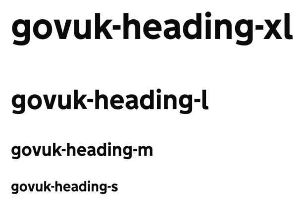
We’re also updating the size of our typography classes. Our typography class suffixes, sometimes known as ‘t-shirt’ sizes, are the letters that appear at the end of our classes to signify the text size the class will apply to an HTML element. For example, users can use ‘govuk-body’ to get the standard body text styling, the classes ‘govuk-body-l’ for larger text and ‘govuk-body-s’ for smaller text. The issue we’ve identified is with size consistency. Different typography CSS classes will produce different text sizes when using the same suffix. For example, ‘govuk-heading-l’ is a different size to ‘govuk-body-l’.
To solve this problem, we will be aligning our typography class suffixes to produce the same sizes regardless of class prefixes. Ensuring that our class suffixes are aligned will mean that all our typography classes will reliably have the same size on the typography scale associated with the same semantic suffix. For example, headings, legends and labels will all display typography scale value 36 when they use the “l” suffix. This will make our typography classes more consistent and therefore easier to use.
What’s next?
We will be testing our proposed implementation against our own components and making any necessary adjustments. After this we will be reviewing our guidance to make sure it’s in line with our changes.
As this is a significant update to one of our fundamental styles, we’ll split the changes up into smaller major releases. One GOV.UK Frontend release will include the changes to font scale and alignment of semantic suffixes in GOV.UK. Another release will include the removal of 14. We expect these releases to be ready across 2023.
What should I do to prepare for these changes?
If you are working on a service that uses the GOV.UK Design System, we advise doing the following:
- Avoid using font sizes below 16px in your designs
- Look for instances of below 16px in your live services and remove them
- Look for instances in your service where a design could be negatively impacted by the font not dropping to a smaller size on a smaller screen and amend as necessary.
If you’d like to investigate this work further and assess the potential impact on your service, please get in touch with the design system team.
