We've published the check before you start pattern

We're publishing new patterns looking at the ‘tasks’ or elements of a service. This blog post is about our new ‘check before you start' pattern.

We're publishing new patterns looking at the ‘tasks’ or elements of a service. This blog post is about our new ‘check before you start' pattern.

We're publishing new patterns looking at the ‘tasks’ or elements of a service, rather than trying to create patterns for the service or license as a whole. This blog post is about our new ‘naming your service’ pattern.

Paul Smith, a frontend developer at DWP, writes about why it's so important to make our work open and how we can all help make this happen.

...build design culture in their teams and departments. Things like show and tells, retrospectives, meetups and even team lunches and outings. Other practices include shared language and collective actions such...

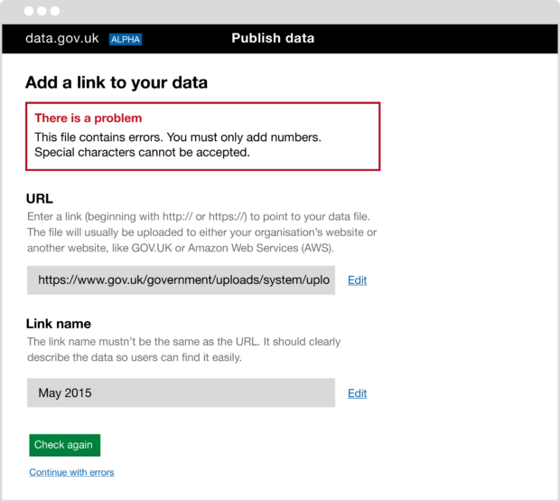
We've collected examples from around government of services that require users to upload something.

We're planning to set up an international government design group, bringing together practitioners to talk about our work, share best practice and discuss some of the common issues we face.

On 9 March, GDS will host a day for students interested in finding out more about design in the public sector.

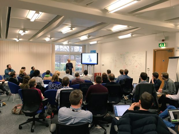
We held a show and tell in Leeds to look at the different design systems around government and to talk about how to move to a more collaborative way of working.

We recently updated the colours used by the alpha and beta phase banners on GOV.UK. The primary reason we made the change is for accessibility.

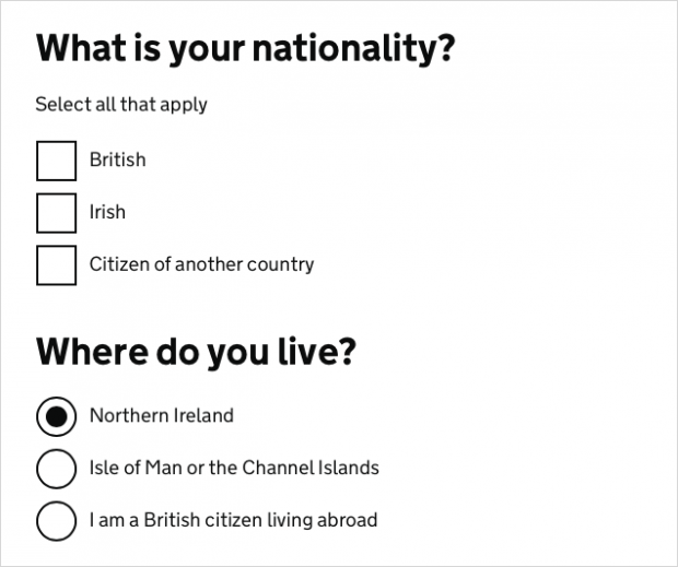
Last week we updated the styles for radio buttons and checkboxes on GOV.UK. This post explains why we’ve done this. Our old radios and checkboxes looked like this: The new ones look like this: We’ve removed the grey boxes and …