Last week we updated the styles for radio buttons and checkboxes on GOV.UK. This post explains why we’ve done this.
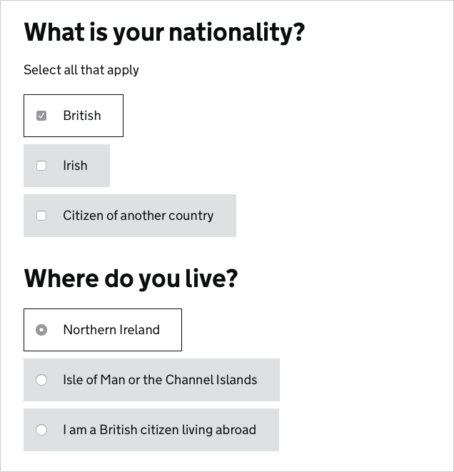
Our old radios and checkboxes looked like this:
The new ones look like this:
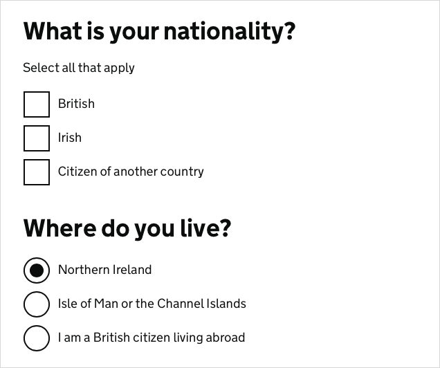
We’ve removed the grey boxes and increased the size of the controls. To understand why we’ve done this it helps to know what problem we were trying to solve with the grey boxes.
The problem
Early in the development of GOV.UK we observed in research how a majority of users would click on radio button or checkbox controls rather than on their labels, despite the fact that the labels are much bigger and therefore easier to click (see Fitt's Law).
We reasoned that this was because users didn’t know whether or not they could click on the labels. Many websites don’t let you click on labels, so choosing to always click on the control is perfectly rational user behaviour.
The solution
Iteration 1 - grey boxes
First we thought we’d try to make it really obvious that you could click our labels, so we coloured them grey and made them respond to the mouse hovering over them.
We thought this would work, so we rolled out the design across services on GOV.UK. We saw again and again though in lab research that most users still clicked on the controls.
Iteration 2 - bigger controls

In our next iteration we decided to support the existing user behaviour, so we increased the size of the controls to make them easier to click.
Unfortunately it turns out that native browser support for bigger radios and checkboxes is very patchy. Nearly half the browsers we tested didn’t support these bigger controls.
Still, we rolled out the change for those that did and raised bug reports for those that didn’t.
Iteration 3 - custom controls
In our latest iteration we’ve replaced the native browser controls with custom ones, which all our supported browsers will get.
We’ve also removed the grey background, as it did not have the effect on user behaviour that it was intended to.
The new controls are more in keeping with the rest of GOV.UK and are the same height as our text fields, which improves the vertical rhythm on form pages and allows for better horizontal alignment of form fields.
The results
The new styles have been piloted in a number of services, including high-volume ones like GOV.UK Verify. So far they’ve tested really well. In research, people of all confidence levels are clicking these controls quickly and easily.
The code has been tested extensively and works across the full range of supported browsers, even if the user has customised their colour scheme. You can read Robin Whittleton's post about how we implemented the styles for more information.
We’ll continue to monitor them though - if you’re implementing these styles in your service then we’d be very keen to hear either way how they’re performing.
How to get the new styles
Designers can get the new styles by using version 5.0.0 or up of the GOV.UK Prototype Kit. Developers will find them in version 2.2.0 or up of GOV.UK Elements.
Thanks
We don’t make global changes to GOV.UK styles lightly. This has been the culmination of a lot of work by a lot of people, but especially Joe Lanman, Ed Horsford, Caroline Jarrett and Robin Whittleton.
Thanks also to the service teams in DWP and NHS who agreed to pilot early versions of these styles in their prototypes and services.

66 comments
Comment by H.Lippisch posted on
Change the size by all means, but you also changed their appearance. They're flat, and no longer look like radio buttons or check boxes. What was the rationale for that?
Comment by Tim Paul posted on
We've not observed users having any issues with the custom styles in research. They're actually very similar to the native styles for later versions of Internet Explorer and Edge on Windows machines, so they'll be familiar to lots of people.
Comment by Adam posted on
Are users still clicking the radio/checkbox instead of the label on the new version?
Comment by Tim Paul posted on
Yes people still click the controls, but many will find it easier now that they're larger across all browsers.
Comment by David Waterman posted on
Are there any form elements for which users will tend to click on the label? When I read your rationale for removing the grey around the label (and control), my first thought was along the lines of - you're trying to turn them into buttons, to why not actually just do that so it is obvious to users that they can click it all. Perhaps you can even remove the control until it is clicked - ie just add a 'tick' to the label.
Comment by Tim Paul posted on
Hi David. This is actually something we tried on the Claim Carer's Allowance service. It did work in most cases - people clicked the labels. However it also created a few new problems - how to distinguish between radios and checkboxes for example. In the end we decided to go with the approach described here.
Comment by Joe Lanman posted on
We also tried removing the input completely on Verify. The issue was people were confused and worried that clicking might take them away from the page, as a button would normally do, as opposed to selecting an answer, and allow them to interact with the rest of the page.
Comment by gavin posted on
Are services going for assessment from now on going to be expected to use these new controls? Would research showing that they are not working for the particular users be take into account?
Comment by Tim Paul posted on
Hi Gavin, another good question. If a team can show that they have a plan for updating their styles within a reasonable time period then that would satisfy an assessment panel. I'd hope that all services would try to refresh their styles shortly before coming for an assessment anyway. Point 5 of the standard is probably most relevant here.
To answer your second question, we'll always consider evidence coming in from service teams - you're a crucial part of the feedback loop. But a service assessment is probably not the best place to have that conversation - better to publish your findings and tell us on the usual channels (Slack, mailing lists, Hackpad, Github etc.)
Comment by Mike posted on
Does your pattern include styles for disabled checkboxes and radios, and was that tested?
Comment by Tim Paul posted on
That's a really good question - no they don't. We generally discourage use of disabled form elements as they can be quite misleading, and often they've been greyed out to the point where any text is no longer accessible.
However, I've raised an issue and we'll definitely discuss this soon. Thanks.
Comment by Jay spanton posted on
Hi Tim, did you ask the browser makers if they would allow resizing of native controls in future e.g based on font size of label? Would guess this is a very, very widespread problem (small screens, accessibility etc).
Keep up the good work and published explanations.
Cheers Jay
Comment by Tim Paul posted on
Hi Jay, yes that was the first thing we tried. Sadly, all but one of them ignored our requests. Robin Whittleton will be blogging very soon about the fun they had implementing accessible, cross-browser custom form controls 🙂
Comment by Jonathan Hartley posted on
Thanks for sharing. Are forms using the custom controls still usable using keyboard only (i.e. no mouse)?
Comment by Tim Paul posted on
Yes they are. All our forms are keyboard accessible, with visible focus states.
Comment by Pete Smith posted on
I row of the new check boxes does have some affordance that they are boxes to be ticked. Personally I'm not a fan of totally flat as I think we should help users see interative elements more clearly with some design hints. The browser form element furniture does this on many operating systems, But if flat is working, that's all that matters, I guess.
Have you texted single check boxes in isolation? e.g: 'Confirm you agree'. Or do you try to avoid using single check boxes like this?
My point is that the single flat check box may have a lot less affordance.
Comment by Tim Paul posted on
Hi Pete. Affordance is something we were concerned about as well, but the research we've done has reassured us that this design works. You make a good point about single checkboxes though - we don't encourage their use but I'll make sure we test them.
This is a pure reckon, but I wonder if users are slowly becoming more habituated to a less skeumorphic design? As the web becomes mainstream perhaps we can rely less on those visual metaphors.
Comment by Luke posted on
They definitely have a lot less affordance. They also look near identical to two-digit input boxes. I don't think testing for these will have been on a large scale.
Comment by Jonas posted on
I am a bit puzzled. Where exactly lies the problem? Your checkboxes are wrapped with the labels. I does not matter where you click, if you try to hit the small check box and fail, it will be checked regardless because you hit the label. So on the ux side of things it does not matter.
Or was it a bigger problem that the checkboxes weren't clicked at all?
Comment by Tim Paul posted on
Hi Jonas. It wasn't that users were failing to hit the smaller controls, it was that it was taking them more time and effort to hit them. Dragging a mouse cursor over a smaller region is just more difficult. By making the controls bigger we made their default behaviour easier.
Comment by Sarah posted on
I disagree that there wasn't a UX problem. The X in UX is of course 'experience', just because a task can be completed doesn't mean the experience was as good as it could be. As the author states, if things are confusing and take extra time or effort than they could then the UX has room to improve.
Great job as usual by the GDS
Comment by James Cliburn posted on
Because you've replaced the native components with custom ones, how is the performance with voiceover software on desktop or mobile? Didn't see any mention of them in the article or comments.
Comment by Tim Paul posted on
Hi James. Yes, we tested the new code and also had the Digital Accessibility Centre test it for us. We uncovered issues with labels not being read out: in VoiceOver using Chrome version 53 and on version 13 of Dragon NaturallySpeaking. Both of these were general issues, not caused specifically by our code. Both issues have been fixed in later versions of those browsers.
Comment by James posted on
Affordance wise, I'm a supporter of the "flat" aesthetic in this instance as it's a direct representation of a physical form and maps better to users mental models of a typical form filling experience. It feels like you should use a pen, but you don't have a pen, you have a click, so you click it. Rather than making it look like a thing you could click, which is much more uncertain for many users, this approach makes it look like a form they've seen for many years prior to web use. This facilitates a re-shaping of said mental models when more and more users use online forms in the future. A nicely timed bridging of expectations across generations. 🙂
Not only this, radio's are circles and check boxes (ticks to many) are square. Regardless of Fitt's Law, mapping and feedback are clear winners here. Nice work!
Comment by Tim Paul posted on
Thanks James. We actually considered making both controls squares (the square/circle convention isn't universally understood), but if felt like a step too far at this point in time.
Comment by avangelist posted on
This is stupid.
I mean, well done, but come on. You haven't solved any problem the user had.
A problem would have been if they weren't able to complete the form because they were clicking on the wrong radio, or check. They weren't.
This is some bugbear from someone, not a problem.
Labels have been clickable with the correct code since their inception near enough - that's almost 30years. The fact that so many people fail to write the correct code is the problem.
Comment by Tim Paul posted on
Hi Andy. You're right that it's poorly coded websites that have caused the issue - people justifiably don't trust that they can click on radio or checkbox labels. And you're right that it's not a deal breaker for most people - it just means that it takes them slightly more time and effort to use a form.
But for a minority of people with very poor motor skills it will be significantly harder to click a smaller control. Given that making the controls bigger doesn't make the experience worse for anyone else we thought it was worth the effort to help that group.
Comment by Luke posted on
By this argument, you should scale up buttons as well, surely? Given that relative scale (of elements to each other) is a useful signifier, might this be considered in future?
Comment by Tim Paul posted on
Hi Luke,
I think there's a law of diminishing returns. Beyond a certain point you're no longer adding much benefit and may in fact be making things worse in other ways.
Comment by Bayes posted on
Does leaving inline checkbox unstyled wasn't confusing for users? The big ones are the same on every system but the inline ones are different.
Comment by Tim Paul posted on
The intention is for the new controls to be used everywhere. We try to avoid lots of inline form controls as they're harder to scan. However there are some cases where inline controls are appropriate (some administration systems for example). It's possible that a future iteration of these styles will include different sizing options to support those cases.
Comment by Lewis Cowles posted on
* It looks nice, works on mobile and PC.
* I see you've used CSS transforms to make a border into a tick and are making use of positioning, top, left & margins. Did you consider going easier with a picture background?
* This also uses JS to style... Did you consider using sibling selectors and just CSS?
* Is the government going to release data from research?
Comment by Robin Whittleton posted on
We did initially consider using an SVG, but this approach was easier to iterate the design on and works fine in every browser we’ve tested in.
It would have been nice to achieve the look we needed without JS, however we didn’t want developers to have to update every use of the existing markup pattern to adopt the new style. If the :has pseudoclass was available in every browser we test in then we could have done it without JS but we’re not there yet.
Comment by Sam Toms posted on
At first my reaction was that you went backwards in terms of usability. It is interesting that you can make it so easy for users to complete a task and still they will click the area which is the most difficult.
Comment by Tim Paul posted on
Yes, I think the lesson here is that people's past experience on other websites has a big effect on their behaviour on your site.
Comment by Ed posted on
Hi, will this change affect inline checkboxes?
"large hit areas aren't always appropriate"
I'm curious why the need to have large hit areas is removed when the checkbox directly relates to an input field. Would having 2 different types of checkbox not confuse some users?
Comment by Tim Paul posted on
We tend to discourage lots of inline form controls as they can be harder to scan, especially if you're using a screen magnifier. There are a few exceptions which the new design supports - simple 'Yes/No' radios for example.
Comment by jack daniel posted on
Your previous big grey box look pretty good UX. About your findings, what I would have done rather is to remove the checkbox altogether and only when the user clicks the box, show the check mark.
Maybe to further indicate that the box should receive an input, in the non-active state make the checkbox look like a small dot or any such plain shaped symbol. So when someone selects the grey box, the plain shaped symbol transforms to a check mark.
Comment by James Grumish posted on
Has your team gone through a similar process with select elements? I'd be very interested in what you arrived at using.
Comment by Tim Paul posted on
Our recommendation is to avoid select boxes where possible, because they hide choices and are really hard for some people to use. We've prototyped a few custom select boxes before that address some of these issues, but we'd need to do more research before including one here.
Comment by Ed posted on
If a user know's what the choices will be (i.e pick a day of the week), then nothing is being hidden as the user already knows what to expect when they click it.
Comment by Tim Paul posted on
Yes that's true, but there's still the issue of some users struggling to interact with the control itself (I didn't really believe this happened until I saw it myself). As with most things it's difficult to give 'always do this, never do that' type answers - you have to know your users and exercise judgement.
Comment by @popmugart posted on
Read the tweet. Came to have a look. Fascinating. Choosing to always click on the control is perfectly rational user behaviour because it conforms to people’s behaviours learned in relation to paper. Think vote! You’re taught to make/write/put your tick/cross IN the box. This is what we do generally. And such general applicable knowledge naturally gets transferred to the digital representation as well. So, I guess, make them bigger is always better! Remember ratio of finger size to box size in relation to smartPhone/tablet! Plus an explicit instruction, like: tap/click in the box will help.
Comment by Dan posted on
Your solution to people always clicking on the circles and boxes instead of labels was to.. make it easier for people to click the circles and boxes?
Why not teach the users instead? People (usually) know things like hyperlinks, so did you try things like showing a hyperlink underline when users hover over both the label and the box/circle, giving the hint that the label is clickable too?
Comment by Tim Paul posted on
We tried changing the hover state with a border and background effect - and were surprised when it didn't have much of an effect on user behaviour. I think hyperlink underlines are worth trying, though it's not going to work for many touch devices. As always, we're never done - if we have an opportunity to test other ideas we will.
Comment by mfreeman posted on
These are simplistically wonderful. Used hand in hand with other form elements, I can't see how anybody can misunderstand that these are interactive. The other form elements set up a UI pattern that seems crystal clear to me. They are a fair chunk bigger than a standard checkbox but size definitely matters nowadays with tappable regions and large resolutions. Very nice.
Comment by Sik posted on
Honestly those custom controls look a lot like their paper counterparts. No wonder that people don't seem to have much trouble with them.
Comment by Ryan posted on
I figure this would be nicer without the js, but I can't get it to work properly. Why does this not work to show the check in the box?
input:checked + label:after {
opacity: 1;
}
http://codepen.io/anon/pen/NbYXQZ
Comment by Andrew posted on
@Ryan: I posted an example yesterday containing a css only solution, that I put on jsbin. But the comment was removed for some reason.
Comment by Angus Montgomery posted on
Hi Andrew, that link had triggered a malware warning on WordPress so I'm afraid we had to remove it.
Comment by Tim Paul posted on
Hi Andrew, we'll be taking a look at your example though - thanks for posting it.
Comment by Ryan posted on
Andrew, is it possible you can try to forge the jsbin link in the comment? I'd like to see what it looks like.
Comment by mfreeman posted on
I think for that to work you would need the label to be after the input. I'm guessing this is why the JS solution has been used although I've not looked at it in detail.
Comment by Tim Paul posted on
You're right, we wanted a solution that didn't require service teams to re-code their HTML.
Comment by Ryan posted on
mfreeman, you're right. If the label is moved to after the input everything works properly. Thanks!
Comment by Ali Langarizadeh posted on
Interesting ...
but a question:
In your assessment, do you understand which kind of your users have problem with "standard controls" (I mean age, sex, nationality, ... for example)? And how many of them (%)?
Thanks (and excuse me for my bad English language)
Comment by Tim Paul posted on
Hi Ali. Our research has been lab based and more qualitative than quantitive, so we don't have percentages. But we saw enough evidence to be confident that making the change would be worth it.
The increased size of the controls will benefit anyone who has impaired motor control - whether that's permanent or temporary.
Regarding people's tendency to click the control rather than the label - it's not limited to novice internet users (I've watched colleagues do it as well). I think this is because it's not about a lack of awareness, it's a response to the unpredictable nature of form labels on the web.
Comment by Jason Rogers posted on
Overall the size of the text and controls on GOV.UK is way too big. I realise that there are some users who need / wish for bigger text.
Overall the site is like railway ticket machines - the majority of rail users need to bend down to use the machines, reducing usability and increasing errors (visit a major railway station to see this in action) yet the vast majority of users are not in wheelchairs.
Why can't we have a simple switch between "standard" size and "increased" size of text etc?
For context, I am aged over 50 and do need reading glasses - so don't think I am a youngster. Equally, do not think that I do not know about these issues - I have been involved in user interfaces since before the World Wide Web!
Comment by Tim Paul posted on
Hi Jason, thanks for your reply. We try to make GOV.UK easy for as many people as possible to use, so we err on the side of larger text. GOV.UK is coded so that you can change the size of the text to suit your preferences. For example, in Chrome you can make the text smaller by pressing CMD and the minus key. Unfortunately, lots of people are unaware that you can do this - it's something we're looking at.
Comment by Miklos Philips posted on
"We thought this would work, so we rolled out the design across services on GOV.UK." ha, really? Do you mean to tell me you did NOT do any user testing before your rolled it out? 🙂
Comment by Tim Paul posted on
We did some research but it was inconclusive so we decided to roll it out. Our reasoning was that the only way we'd be sure either way was to use the checkboxes in multiple services and see how they performed.
Comment by Andrew Welch posted on
https://govuk-elements.herokuapp.com/form-elements/example-form-elements/ is a dead link.
Comment by Tim Paul posted on
Thanks Andrew - I've raised a bug and we'll fix it as soon as possible.
Comment by Jo Goodwin posted on
Hello, Have you tested checkboxes on the right versus checkboxes on the left? For mobile, tablet and desktop? We'd be interested in the results if so.
Comment by Tim Paul posted on
Hi Jo, thanks for your comment. No, we didn't test with right-aligned checkboxes - we decided to stick with the left aligned convention. Some mobile devices have a convention of right-aligned toggles, which are functionally equivalent but tend to carry a slightly different meaning (on/off versus yes/no). There's an interesting debate about checkboxes versus toggles here: https://ux.stackexchange.com/questions/63884/checkbox-vs-toggle
Comment by shojib islam posted on
good post dear