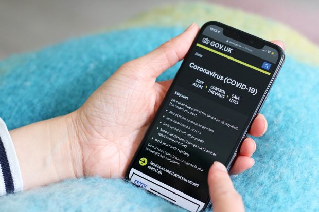
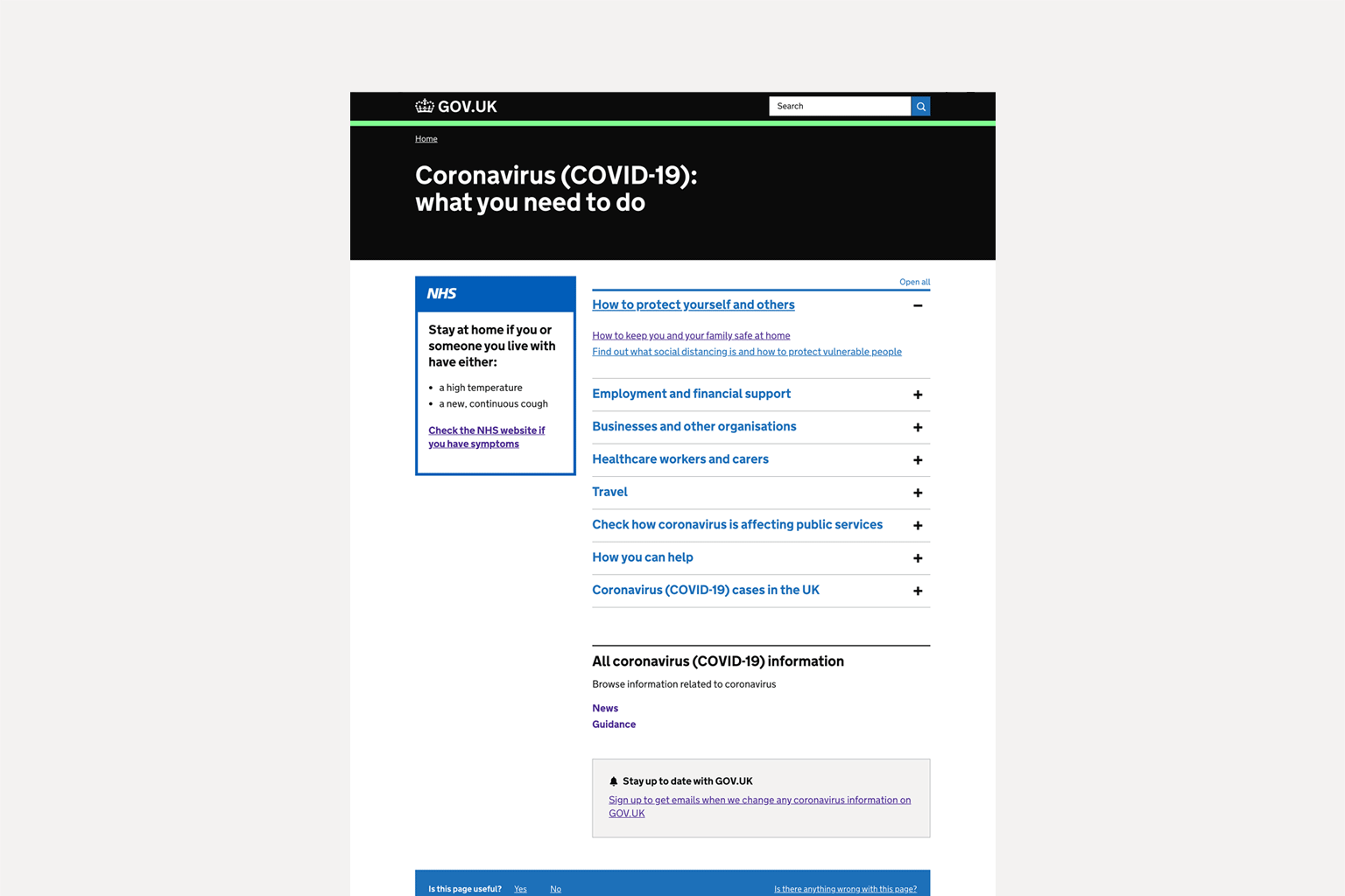
The GOV.UK coronavirus page, gov.uk/coronavirus, is the definitive source of government guidance and support related to COVID-19. Government information is split into clear categories like health and wellbeing, or housing and accommodation. You can use this page to find out how your business can offer support, how to protect extremely vulnerable people, or how to get tested.
A multidisciplinary team designed, built, and shipped the page in under 5 days. Since going live on 20 March, the page has received tens of millions of views and helped people find the answers to important questions.
The page design and content remain under constant review so it stays responsive to user needs.
In this blog post, we discuss the design decisions behind the page, how we built it, how it’s been iterated, and how it’s performed under huge site traffic.
Going from brief to live
Our brief was to design a page that would help people quickly find the coronavirus content relevant to them. It had a tight turnaround time, needed to be accessible and easy to use, and stand up under large, potentially record, page views.
We knew our designs needed to appropriately reference the branding of the wider government public information campaign, which is different to GOV.UK’s content-focused style. Our design also needed to incorporate NHS branding. This was crucial as we needed to prominently signpost users to urgent healthcare content.
The page was therefore a mix of needs: getting users to urgent information, making sure it was recognisably part of the wider public information campaign whilst ensuring navigation and branding was joined-up with the rest of GOV.UK. We solved this using the GOV.UK brand colours and interaction elements with minimal changes, adding the campaign-related lime green as an accent.
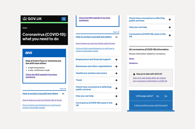
We used an accordion pattern for the page, which lets people show and hide sections of related content on a page. This pattern was previously tested in the GDS user research lab so we knew it would help people navigate through a content-heavy page.
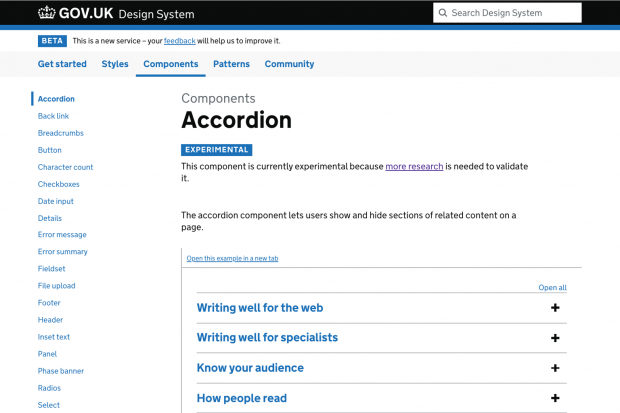
We relied heavily on the GOV.UK Design System – a collection of styles, components and patterns – to build the page at pace, ensure a consistent look across GOV.UK, and know our work would be accessible. Everything in our design system meets Web Content Accessibility Guidelines (WCAG) 2.1 Level AA so it was invaluable for creating the page. In addition to this, we had an internal accessibility review with users who had access needs to remove unnecessary obstacles to our content.
We also used the NHS Design System for inspiration for things that are not yet in the GOV.UK Design System, like the action link component. This component was adapted to create a stronger call to action link that did not rely on being a Start button.
Mobile first
The coronavirus landing page is designed for mobile first, with the desktop view as an alternative.
We know the majority of the traffic to GOV.UK is from mobile devices. In February 2020, 62.03% of users accessed GOV.UK through mobile and in March 2020 this increased to 70.63%.
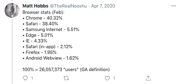
• Chrome - 40.32%
• Safari - 38.40%
• Samsung Internet - 5.51%
• Edge - 5.01%
• IE - 4.33%
• Safari (in-app) - 2.12%
• Firefox - 1.95%
• Android Webview - 1.62%
100% = 26,057,373 "users" (GA definition)
This influenced our graphic design approach and required us to be strict in our prioritisation of content. The extra space available on desktop is more forgiving, and can lead to visual compromises being made. These then make things difficult when it comes to mobile. Designing for mobile first forces you to make the difficult decisions about information hierarchy upfront, making the subsequent work for desktop much simpler.
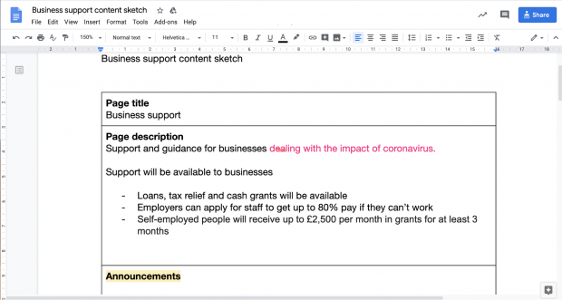
Designers and content designers worked together on the designs using what we’ve named ‘content sketches’. These are a single column table in a Google Doc, split into rows where each row represents different content. This lets content designers make decisions on the priority order and importance of various elements. This sketch then informs the page design, rather than content designers having to fit their words to available design components.
Iteration
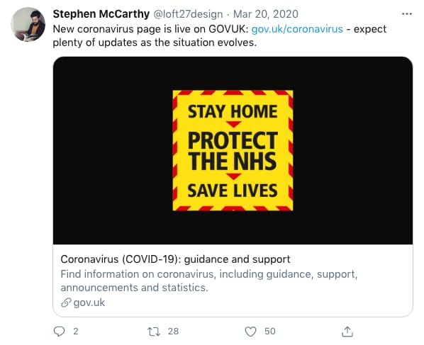
As Stephen’s tweet mentions, we knew this page design would need to evolve rapidly based on feedback from user research and performance analysis, but also to accommodate the growing amount of guidance and new services being made available.
Our first live iteration put government announcements at the top of the page to reflect the early public interest in the announcements of new rules and financial support. However, our research and analysis confirmed that the underlying need, and most interaction, was with the guidance and support itself. Our subsequent re-organisation of the page reflected this better understanding of the frequency and urgency of user needs. So, we moved guidance and support to the top and provided simple, clear labels for each section of the page. As the page grew, this made it easier for users to skim and get quickly to part of the page they needed.
The most important piece of guidance we wanted users to find was the social distancing rules. Our performance analysis quickly showed these weren’t being found as often as we hoped. As a result we introduced a clear call to action to the header, using the Action link arrow element adapted from the NHS design system. This made the route to this guidance simpler and increased click-throughs. We also added the arrow element to the sitewide coronavirus banner, which helped increase the number of users coming to the page.

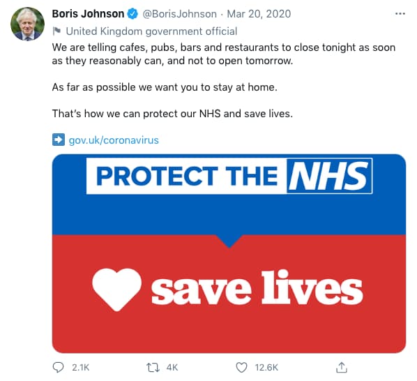
At the same time the graphic assets – the icons saying ‘Stay at home, Protect the NHS, Save lives’ – were moved up to sit alongside the page title. This meant campaign messaging could be included and given prominence, but without taking focus from the content or the call to action. These can be updated as government messaging evolves.
The page colours changed from lime and black to yellow and black as the government public information campaign evolved. We also changed our use of white text on black in the header area. Whilst our initial design met accessibility standards, feedback from some users said that the very high contrast paragraph text was proving difficult to read, particularly for those with dyslexia. This was updated to white on dark grey in the next version.
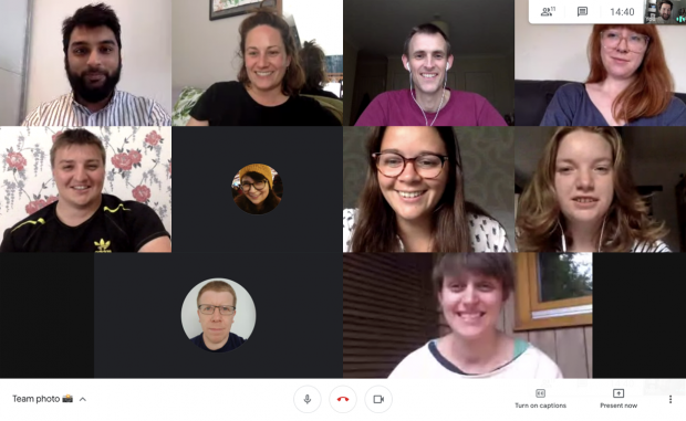
Working as a multidisciplinary remote team
This was the first time GDS has been fully remote. Previously when designing under a tight deadline, everyone would work in the same room using laptops, walls, post-its and lots of discussion to develop products quickly.
This time we needed a new strategy and new tools. We used Figma, a collaborative design tool, to work together on designs as it was easy to share and discuss. We kept in touch via Slack, Google Hangouts and phone calls to make sure everyone was kept in the loop.
Being a multidisciplinary team was essential to getting the page live so quickly. It meant decisions could be implemented and tried quickly. It was also helpful that most of the team were experienced members of the GOV.UK programme and had worked together before.
Since going live, we still use Figma to collaborate and make design decisions, mocking up new iterations so they can be shared and signed off where needed, and then used by front-end developers to build or update page elements.
Using data to inform our designs
In the first 24 hours of going live, there were more than 750,000 views of the page. And on 24 March there was a peak of 9.2 million views, a record for the biggest spike in GOV.UK traffic and more than double the previous record set in November 2019 on the deadline to register to vote in the last general election. In its first month (20 March to 20 April) there have been at least 26.4 million page views of the page. Our analytics only count users who accept cookies that measure website use, so the true figures would be even higher.
The traffic spikes often corresponded with press conferences and the Prime Minister’s announcements. The record peak followed a text message with the web address being sent out by every mobile phone network in the UK. Throughout we worked closely with our colleagues in Number 10 and Cabinet Office to make sure our designs and infrastructure were ready ahead of these announcements.
As far as possible we want you to stay at home.
That’s how we can protect our NHS and save lives.
http://gov.uk/coronavirus
For users who accept cookies that measure website use, we also use anonymous data to inform improvements to the page. Specifically we use Google Analytics event tracking to see, element by element, what is being clicked on. This way of seeing how people use the site allows us to make evidenced-based decisions about how to iterate the page, for example, moving elements around or redesigning them if they are being overlooked.
What’s next
Coronavirus is continuing to affect all our lives. It is crucial that GOV.UK remains the trusted home of government guidance, services and support during the pandemic.
This means we will continue to iterate and adapt our designs as our user needs change, while maintaining the Government Design Principles.
Related blog posts:
Podcast: GOV.UK’s initial response to coronavirus

7 comments
Comment by Gary posted on
This was a very informative article and very relevant to my role as a UX analyst. I would welcome more articles like this going forward. Your focus on evidenced rather than opinion based changes is exactly what I am trying to advocate in my organisation.
Comment by Dapo George posted on
Agree with you Gary, and that evidence comes from conducting proper in-depth research and performance analysis.
Comment by Connor Gurney posted on
Out of curiosity, why did you originally adapt the global banner, as opposed to using the emergency banner?
Comment by Sam Dub posted on
Hi Connor, good question!
The early versions of the banner needed to summarise the social distancing rules (mirroring the page header on gov.uk/coronavirus). For this task, the emergency banner was pretty limited in terms of layout and design, and it wasn’t feasible to adapt it within the time we had. The global banner is completely customisable and gave us flexibility in other ways, for example: allowing users to dismiss the banner, and for us to hide it on certain pages.
Comment by Andrew Parker posted on
I've been looking for a GOV.UK Figma component library - is there one available anywhere?
Comment by Martin Jordan - Head of Service Design, GDS posted on
Hi Andrew,
I have asked around and indeed there is. Joe Horton has developed one.
As far as I understand, it hasn’t been established how it’s going to be maintained. But you can find it here: https://www.figma.com/file/sBXljKML2BppK3C5y6lpeL/GOVUK-Wireframing-Kit?node-id=0%3A1
Comment by Andrew Parker posted on
Ah - thanks Martin! Looks like a conversion of the Sketch prototyping kit - I'll use that as a starting point and see if I can add some of the figma features to it.
Thanks again,
Andrew