At the Government Digital Service we run common platforms to help government build and deliver better and more user-focused services. These common platforms, such as GOV.UK Pay and GOV.UK Notify are used across the public sector in areas such as the NHS, police, local government and many central government departments.
These platforms are designed to make government services easier, clearer and more consistent to use. They’re also designed to make it easier for the civil servants running these services to do their jobs. This is why we’ve put a lot of focus on developing good and consistent (not uniform) admin tools for the civil servants who will operate these platforms.
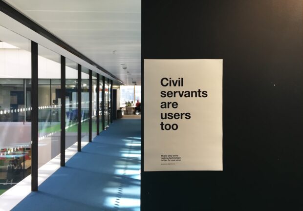
Civil servants are users too
Civil servants around government have to use many different systems and tools every day to deliver services to end users. These systems and tools are often badly designed and difficult to use. We realised early on that civil servants are users too and that the tools we develop for them to do their jobs need to be designed well and with the same focus on user needs we’d give to public-facing services.
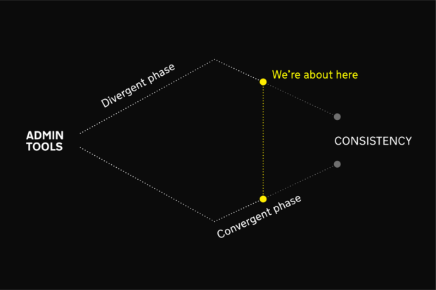
Divergent design phase
As these admin tools have been developed, they naturally followed a path that was influenced by the needs of their own users. For example, the nuances around user permission levels for public sector teams using GOV.UK Pay was different to GOV.UK Notify. In GOV.UK Pay’s case, permission levels were dictated by the fact that there were distinct user groups that needed ‘read only’ functions for things like finance reporting, versus those users that needed to do more caseworking functions such as issuing refunds.
GOV.UK Notify, in turn, identified different permission levels based on the needs of users of that platform. This meant that – in the earlier stages of development – admin tools looked and worked differently from each other in certain circumstances.
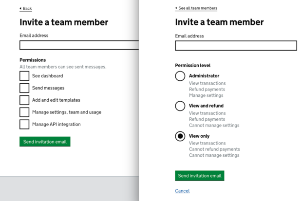
It was important for this ‘divergent design’ phase to happen as we wanted to give teams the space to design for the specific needs of their users. The tools generally had the same GOV.UK visual language due to the core graphic design patterns that came from GOV.UK elements (the precursor to the GOV.UK Design System). It was the extra design elements that were not yet catered for that led to this natural divergence.
Documenting designs and identifying patterns
Over time, as these admin tools became more mature and feature-rich, we began the process of documenting the designs. We reviewed the admin tools we were creating, and documented potential design patterns into categories. Within these categories, we felt common patterns could be identified and refined to be more consistent while still meeting the needs of all the platforms. We also aimed to record any research done against particular patterns, and noted any bespoke needs of specific platform admin tools.
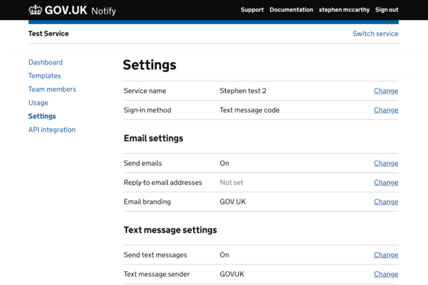
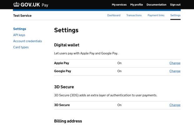
This documentation included categories such as call-out cards, warning messages, dashboards, navigation levels, account creation flows and user permissions.
Convergent design phase
We then began the process of making our admin tools more consistent. The patterns we documented were roughly put into 4 levels of complexity:
- Quick wins with minimum to no impact on users
- Suspected minimum impact, but will need to be monitored for any effect on user behaviour
- Things that will need to be usability tested before changing or updating to make sure there are no adverse effects on user behaviour (also may require larger involvement from other team members such as backend developers)
- Stuff inherent to a specific platform that we shouldn’t change
This process of making these admin tools more consistent is still ongoing. It’s also worth noting that any new tools that are being developed now have a more mature set of admin tools to take inspiration from. This means that teams developing new admin tools spend less time creating new patterns and are more consistent with the rest of the suite of platforms from early on. An example of this is the admin tool recently developed by the GovWifi team.
Also, the release of the GOV.UK Design System gives a more comprehensive core set of patterns and styles to work from and build on. Therefore, moving our platform admin tools over to use the design system will also make the process of making things more consistent easier in the future.
Over time, as we identify potential admin tool patterns, we’ll add them to the Design System backlog. There are also other teams doing good work in this area, such as Home Office who are developing guidance and patterns for their own internal admin tools.

1 comment
Comment by Emmanuel Victor Quarm posted on
This strategic approach is critical in the current digital market industry. Many businesses are realising the need to include the potential customers - Be it , internal or external , in any design framework . This is the future of design thinking.