Teams around government are starting to work on admin interfaces and internal systems.
Here are some thoughts about the design of admin interfaces.

First things first
First things first – make it look like GOV.UK, use the design patterns, and follow the design principles.
A couple of the design principles stand out in particular:
Start with needs
When designing an admin interface, it’s easy to just show database rows on the screen with buttons to add, show, edit and delete records. Don’t do this. It’s lazy.
Admin users will typically be doing specific admin tasks, and good admin interfaces will support these common tasks. It’s your job to figure out what these tasks are.
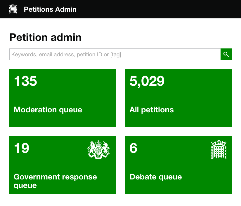
For example, on petition.parliament.uk, the moderators have three main tasks – moderating new petitions, organising responses and organising debates. The admin screens have a to-do list for each of these tasks – the functionality in each list is tailored to the task in hand (there’s also an All petitions list for odd jobs).
Be consistent, not uniform
We’re fully expecting that some of our design patterns won’t apply that well to admin interfaces.
You might renew your passport every 10 years, whereas admin users are often using their admin system all day, every day. Our patterns are mainly optimised for the public, who don’t use government services all that often.
Do research. If you find particular design patterns aren’t working, you can change them.
Here are some things we’ve found work well:
More than one thing per page
For services for the general public, we recommend one thing per page. This helps people find their way through unfamiliar processes.
For admin interfaces, you can assume that staff are familiar with the process and optimise for speed instead. This probably means putting more than one thing per page.
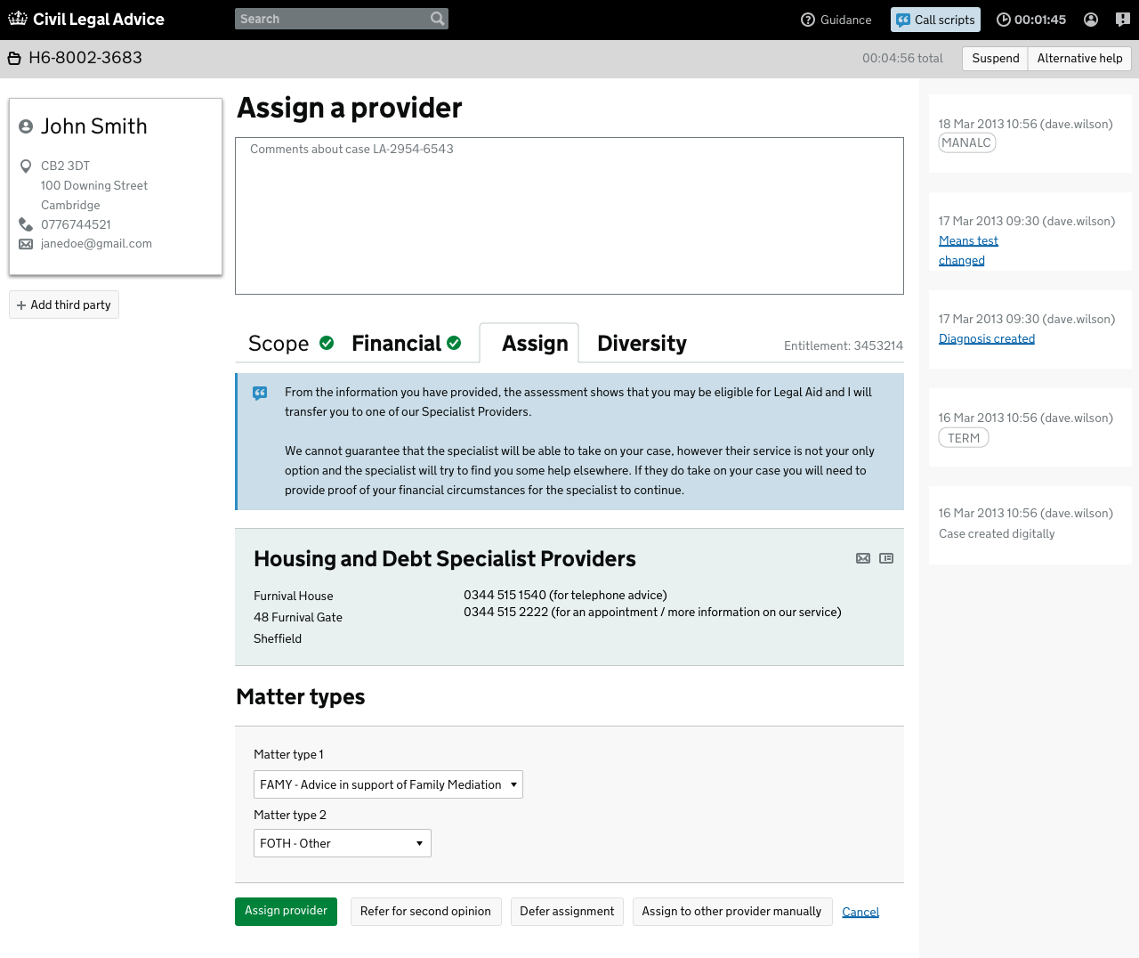
Civil Legal Advice struck a nice balance between guiding new staff through the process, and making it faster for more experienced users.
When you first log in, the screens include call scripts interspersed between the form fields. As you get more experienced, you can turn the call scripts off, leaving a very compact interface. The buttons to see the call scripts and guidance are always present in the top-right corner.
Use the full width of the browser
Admin users often need to switch rapidly between tasks, quickly familiarise themselves with new cases and cross-reference different bits of information. All these things benefit from more screen space.
If you know that staff will be using devices with large screens, it makes sense to choose a wider width or go full width. This doesn’t mean you don’t have to make it work on mobile too (the time when something goes wrong and you fix it from your phone, you’ll be glad you did!)
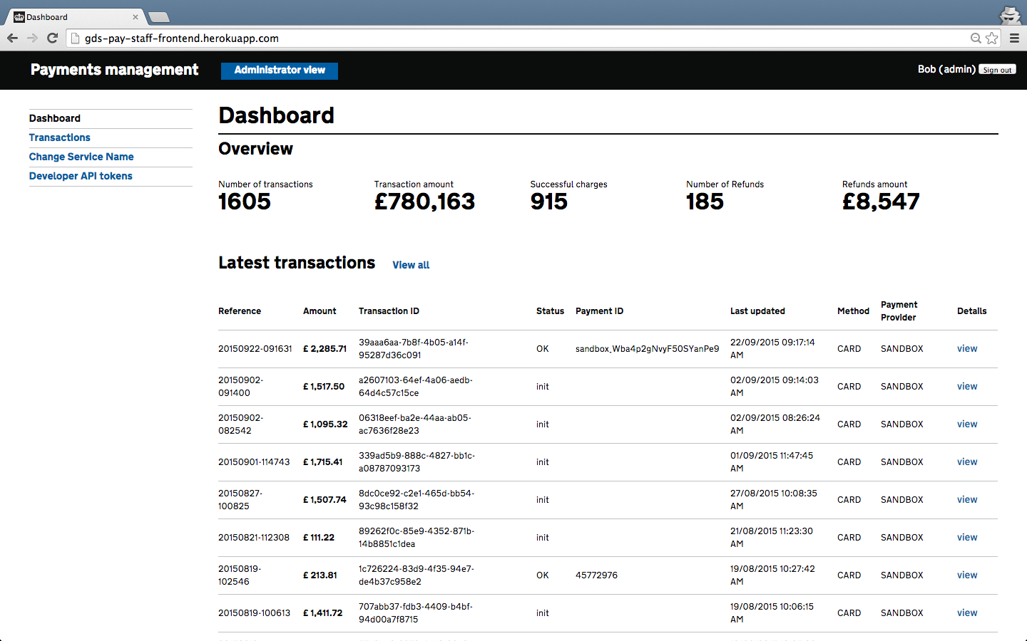
The GOV.UK Pay admin interface uses a wider table to increase the amount of information it can show on a single screen. They’ve used this information density carefully – the page isn’t cluttered or confusing.
Get involved
Thanks to everyone who came to the recent cross-government meetup about admin interfaces. You are the inspiration for this post.
We want to put together some useful resources for people working on admin interfaces across government. To get involved, join our email group or slack channel. If you can, post some screenshots or gifs of what you’re working on.
And if you make patterns that work well, make sure to blog about them, and add them to the hackpad.

1 comment
Comment by Michelle posted on
This site helped me a lot