We’ve just released new updates to the colours and font on GOV.UK. Here’s some detail about the changes:
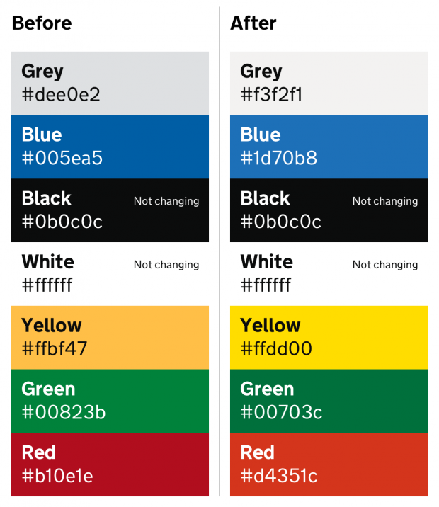
The colours
We’ve made plenty of isolated tweaks to the GOV.UK colour palette since we launched the site in 2012. Each of these changes has improved colour contrast in the particular context it intended to solve.
However, as a result of these changes the overall palette has become darker and duller over time. This is because the eye can only see a finite range of colour, so every time you make a colour darker to increase contrast against a white background, you also reduce contrast against black text. Every incremental fix ended up creating knock-on situations where contrast was reduced.
We’ve taken the new accessibility legislation as an opportunity to reconsider our colour palette across all of the GOV.UK design patterns.
Brightness and saturation
The new colours use brightness and saturation to provide contrast, rather than simply adding black. This means that in most contexts they both appear brighter and perform better for people with access needs. That said, you probably won’t notice a huge difference – the colours will just be a bit nicer and more accessible.
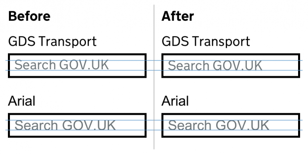
The font
When we first started using GDS Transport on GOV.UK, putting custom fonts on to a website was tricky. We had to provide different types of files for different web browsers, and make sure the font was really well hinted by hand so that older computers could display it clearly.
The downside of providing hinting in the font files is that it increases their size quite a lot, which makes pages slower to load.
Over the years, we’ve revisited this approach a few times to see if we could improve it. We recently noticed from our analytics that we barely have any visitors to GOV.UK using devices that require hinting. Similarly, almost all our users are now on web browsers that work with the same font file formats.
This means that we can simplify things, only serving up an unhinted copy of the font files in WOFF (Web Open Font Format) and WOFF2 formats. Our analytics show that this will support the vast majority of our users, whose devices don’t need the hinting. The fraction of users with older devices will see Arial or Helvetica instead.
Bringing down page size
The reduction in page size from doing this is quite significant; the old WOFF files combined to 188KB. The new WOFF combined comes in at 82KB – a reduction of 56%. WOFF2 shows a similar saving, 136KB for old vs 63KB for new – a reduction of 53%. For users accessing GOV.UK over slow internet connections this should make a real difference.
We first started trialling not serving hinted files on GOV.UK last year and haven’t received any issues, so now we’re making it official.
We’ve also adjusted the vertical positioning of the characters within their em box to match that of Helvetica and Arial. This should make it easier to adapt the design system to your own brand if you want to.
You can dig into the details of the font changes in this pull request: Update font to use v2 of GOV.UK Transport font.
And you can read more about how we've updated the GOV.UK Design System to make it more accessible.

3 comments
Comment by tim posted on
Typo on the before/after color swatches - black is not #005ea5?
Comment by MySweetHubert posted on
"The new colours use brightness and saturation to provide contrast, rather than simply adding black."
I'm curious to know how you measured the contrast here, most tools I know don't account for saturation, do they?
Comment by Tim Rettler posted on
Thank you. I’m not a graphic designer but I found your thought process fascinating.