In my last post I mentioned some of the core tools a graphic designer uses when designing government services. This post will go into more detail about typography – probably the most utilised of those tools.
The typeface we use for GOV.UK services is a variant of New Transport called GDS Transport. Our reasons for choosing this typeface and the history behind it can be found in a previous blog post written by Ben Terrett.
We have documented in some detail the type specifications we use across GOV.UK and related services. They have been formed based on extensive user research – always with legibility, readability and accessibility in mind from the start.
These specifications should be adhered to when designing government services to help them meet the required standard.
Some tips for creating good typography
Be consistent with your type styles
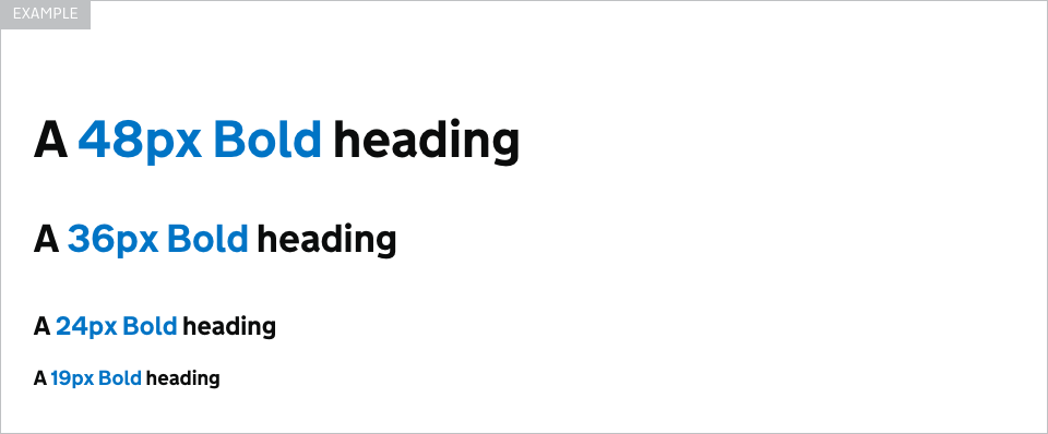
We have set sizes for things like body copy, lead paragraphs and headings. These type specifications help give structure and a clear hierarchy to your content.
Avoid long lines of copy
A good rule of thumb is a max of 75 characters per line as it becomes harder to read beyond that point. This equates to ⅔ the width of the page for body copy at desktop size.
Use bold sparingly
Don’t design using large paragraphs of bold copy. Try limit the use of bold to things like headings and notice patterns for important ‘should read’ items.
No italics
There is no italic version of GDS transport. Don’t force the browser to use faux italic.
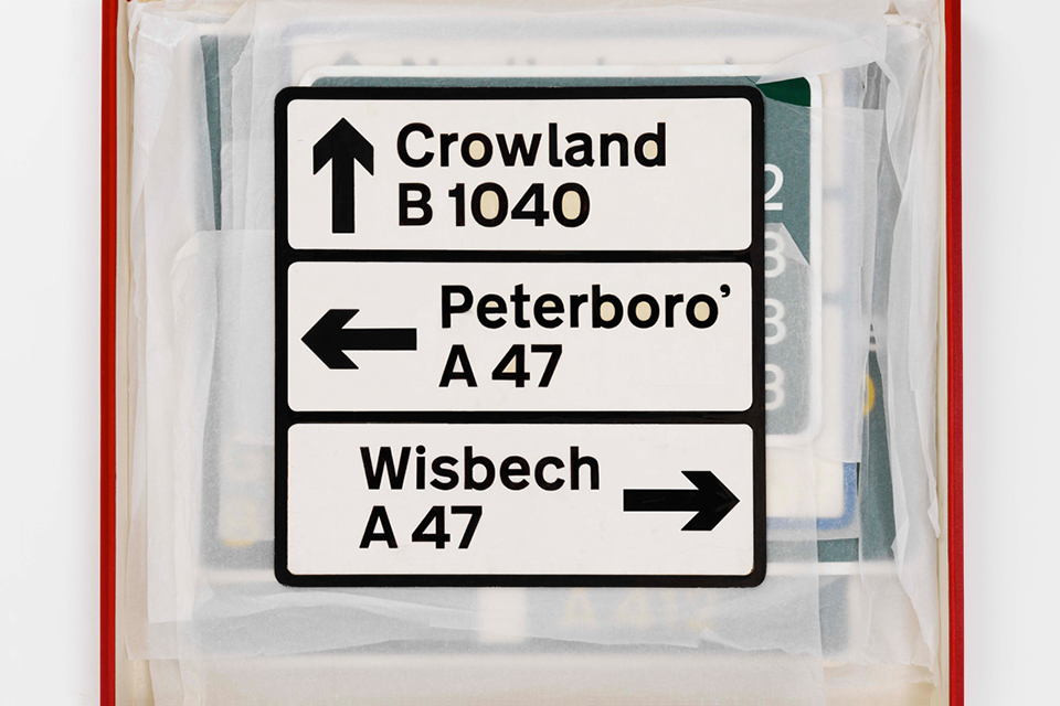
No block capitals
DON’T USE BLOCK CAPITALS FOR LARGE AMOUNTS OF TEXT AS IT’S QUITE HARD TO READ. Block capitals are only acceptable if it’s a constraint of the data being pulled into the service.
Don’t go too small
Use smaller sizes (eg 16px, 14px, 12px) only if there's a real user need to fit a large amount of content on the screen – like comparing complex sets of data. Small type is hard to read on lower resolution screens and monitors. Go larger rather than smaller to ensure comfortable reading for users.
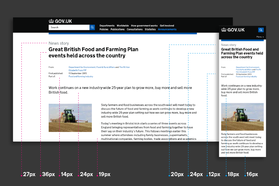
Be responsive
Type specifications should be responsive across mobile devices and desktop. The sizes we use on GOV.UK get smaller on smaller screen sizes as can be seen on the GOV.UK announcement page below.
Black on white is best
Set all long read copy using black type on a white background. If you are using other colour combinations in your layout make sure there is a high enough contrast between the colour of the type and the background.
Give your type some space
Give plenty of “white” space around your type and the different sections within the overall design, rather than using graphic elements like boxes and keylines. It’s better to focus on the content than introduce visual clutter which can make it more difficult for the user to read and understand.
Mind the detail
Use smart punctuation, including smart quotes, as well as en and em dashes, rather than “dumb” typography. These things might seem negligible to others but you’re the designer.

1 comment
Comment by Henry Hadlow posted on
And real en-dashes – like that!