I recently gave a graphic design workshop as part of a wider 3 day course given to cross-government designers. The designers on the course found it helpful so I have decided to write a series of blog posts based on the items we covered in the workshop.
Throughout this series I will explain the core tools graphic designers use in their day to day job such as:
- typography
- grids
- imagery
- colour
- page furniture & space
I will also explain how these core tools can combine to form effective:
- hierarchy
- tempo
- legibility & readability
- accessibility
In general, designing for government services mainly involves communicating information in the most legible and sensible manner based on user needs.
The design should never get in the way of the content. It should be almost invisible. We are happy when people say things are simple or even boring.
As Ben Terrett often says, designers in GDS and across government spend most of their time looking at a black and white website. The temptation can be to add graphic flourishes or devices where they aren’t needed.
Every element on the page should have a clear purpose. If it serves no use, don’t include it. Keep it simple and let the content do its job.
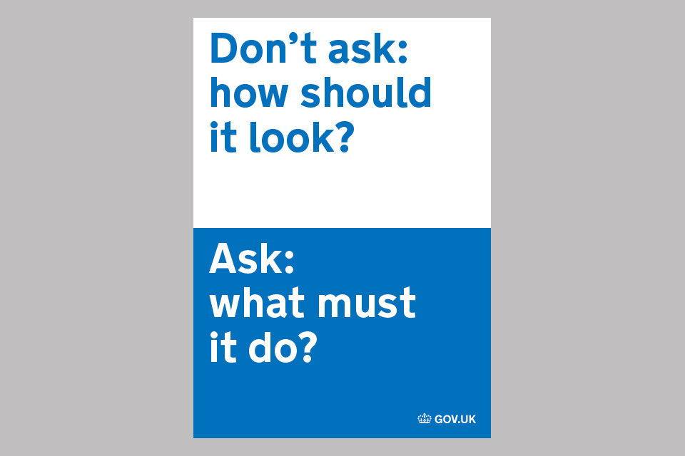
If you haven’t read ‘The Crystal Goblet’ – an essay by Beatrice Warde from 1930 – you should. It’s standard reading on most graphic design courses. The main take home of the piece is don’t start designing by asking ‘How should it look?’, instead ask ‘What must it do?’. That’s what we should do every time we design for government services.
Graphic design is an enabler to content and interaction design. It enables content legibility and readability and it also enables interactions to be seen and understood.

Above: a sketch one of the designers created during the workshop task.
The context and touch points in which users interact with our services needs to be acknowledged at all times. Whether that’s on mobile, desktop, tablet or using paper forms and comms material. The design of each point of interaction needs to be considered separately as well as an individual whole. Nothing should be designed in a silo.
An adaptable yet common design language should be implemented throughout. Consistent not uniform as the design principle states.
We have started to achieve this across government services with the help of the hackpad and patterns library. This reuse of tested patterns enables consistent quality across services.
Graphic design is not something thrown in at the end of the process. It should be considered right from the start and iterated along with the service. Always remembering to ask ‘why?’ and challenging what is being communicated.
We've uploaded the poster shown in the picture above as a PDF. Feel free to download it.

4 comments
Comment by Dan Butterworth posted on
Nice to see my sketch illustrating your blog Stephen, I'm honoured 🙂
Comment by Eduards Cauna posted on
It would be interesting to understand why GDS intentionally ignores one of the principles of UX — hedonism. Design should not be boring, fonts should not be only pragmatic but also aesthetically pleasing, and web pages need "moves" that adds flavor. Why? Because web products too should satisfy desire for fun, to take into account hedonic dimension. To fulfill its functions iPhone don't need all these details that makes most people moan in pleasure. GDS products are really boring and "underdesigned" (you heard it before), can you really explain why are you doing this on purpose? Look again at that wine-glass in "The Crystal Goblet" — is it dumb, boring, made only for purpose to hold a liquid? Would you drink a wine just from any glass including Russian vodka-stakan?
Comment by Joe Lanman posted on
Thanks for your comment Eduards.
When people come to use GOV.UK, it could literally be anyone. And they could have come for any reason, from getting a zoo licence to paying tax to registering a death. They could be in a wide range of emotional states.
The most important thing is that all these people are able to easily and confidently do whatever they came to do. We're not aiming for 'boring' as much as getting out of the way. In research, the crown appeals to people as an official mark of government, and the simple clear style is easy to read and understand.
You might also be interested in this blog post on how we decided on New Transport - a custom font designed for GOV.UK:
https://gds.blog.gov.uk/2012/07/05/a-few-notes-on-typography/
Comment by dadelhi.com posted on
Nice blog!! Each and every point is well explained about graphics designs it great to learn from you. Thanks for sharing. 🙂