You can read the latest guidance on this subject in the Service Manual.
On the Register to vote project, we have been testing different ways of asking for a date of birth.
We began with three drop-downs:
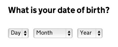
This tested ok, but the drop-down for year was very long. The list went back 115 years, as this is the age of the oldest living person. People found this hard to use - it took them a relatively long time to find their year in the list.
We then tried a text input field for year:
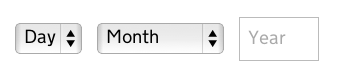
This tested much better, and people were able to complete this question more quickly. We also had unprompted comments from people who were pleasantly surprised to not have to deal with a long drop-down for year.
However, we test with a wide range of people, and we did find some problems with people who were less experienced with computer interfaces.
Some people click a drop-down and then try to type. This does work, but it doesn't act the same as a text input field, and is therefore confusing. For example if you type 1, then pause and type 2, you will select 2 in the list, not 12 as you would get in a text input field. The backspace key does not work.
Some people had trouble interacting with even with the shorter drop-downs. Day and month both require scrolling, and we saw some people having issues with scrolling in general: knowing whether they could, and how to do that. People who struggle here often say that the value they're looking for is not in the list.
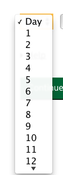
Once they figure the first two drop-downs out, we saw people then get confused when they click into the year field, and get no drop-down.
People having these problems were in the minority, but we felt it was worth trying another approach to see if we could find something that worked for everyone.
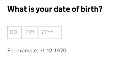
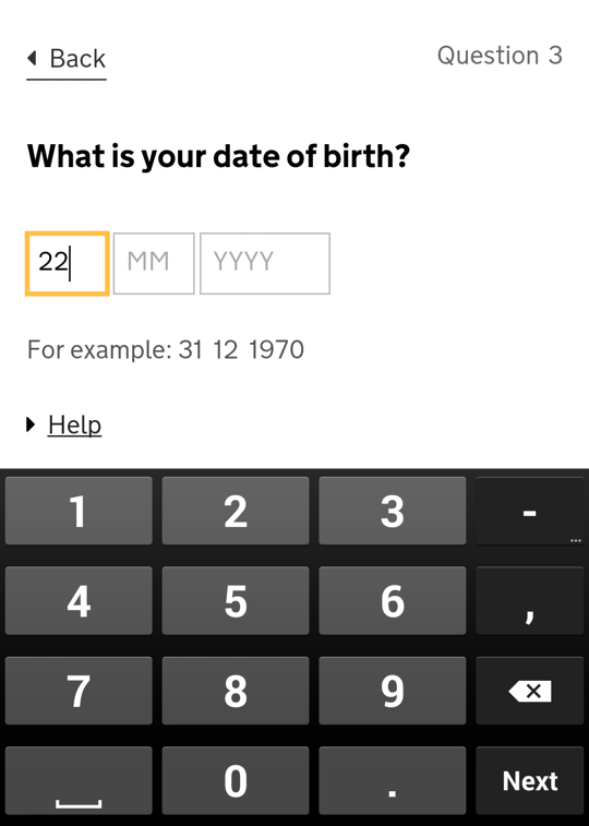
In this design, we use a text field for day, month and year. So far this has tested well, with the main issue being that some people pause and wonder whether to include a leading zero (for example '01' ). We will continue our testing.
Touch-screens
On touch-screen devices such as phones and tablets, we can show a numeric keyboard by using the 'type="number"' attribute. This makes the expected input clearer (a number, not a word) and makes it quick and easy to enter a number.

27 comments
Comment by Edd posted on
Interesting that on the national insurance number input you have gone with one box rather than many but on the date you go with many rather than one. When discussing this in the past we quite liked using something like date.js and having a single input in combination with providing a format style below the input (like "Format DD-MM-YYYY") and then also having a live updating interpretation of what they have entered next to the box after the have entered it to show that their formatting is correct. Of course you would loose the ability to have a numeric keyboard on touch devices but that is possibly less of a pain than trying to tap the next input after every 2 digits.
Comment by Joe Lanman posted on
Hi Edd, thanks for the comment.
It would be interesting to investigate a single field, however the main issue would be that it would make people think about the correct format - whether to use numbers or words, and what separators to use. You'd be relying wholly on the example to inform people.
Losing the numeric keypad on mobile is also significant - many 'normal' mobile keyboards require a long hold, or pressing a switch to display numbers.
Comment by Simon posted on
Well, with a little bit of CSS wizardry we can give the impression of a unified field but also benefit from them actually being separate, and some helpful placeholder text and '/' dividers clear up an ambiguity in regards to format.
I've knocked together a quick example here:
http://simonevery.com/test/merged-inputs.html
I also added a teeny bit of JS that shifts the input focus once each of the day/month inputs have been entered, which I think just makes things a little quicker without the user having to reselect each input (especially on mobile).
My code isn't entirely reusable in most cases without adding classes to suit your needs - but for the purposes of demonstrating the functionality, it works 🙂
Comment by John Waterworth posted on
We found that a single field works fine for National Insurance numbers because it is 'just' a string of letters and numbers. Users wonder whether to include spaces, but there is no punctuation to include, and no ambiguity over the order to input the parts.
With dates there are several possible formats. You can separate the parts with dashes, slashes, full stops and spaces, you can put the parts in a variety of orders, and you can to use a month name or number.
We discussed adding some confirmation of the date that the user entered, but the register to vote process works 'one question at a time'. So users enter their date of birth and click continue. And there isn't such a clear opportunity to show them the date the've entered.
Comment by Ed posted on
Not a problem for most of our users, but I'd be interested to see how US users (or any other country with a MM-DD-YYYY format) deal with this. One of the explicit advantages of the drop-downs is the removal of this ambiguity. This can be partially dealt with by good validation of course, but only for a subset of dates.
I wonder if users would have any issues if the text boxes were done in a YYYY-MM-DD.
Comment by Paolo Montevecchi posted on
In iOS the keyboard displayed for type="number" it's not so friendly. I suggest to use the type="tel".
Comment by Gareth posted on
If you are finding people pause to question whether to use a leading 0, why not use one in the example below the fields? For example 02 12 1970.
Comment by John Beale posted on
Gareth that is an excellent, simple idea
Comment by Joe Lanman posted on
Hi Gareth, thanks for the comment.
That is a nice simple idea. We're going to keep testing the text input version to see how much of an issue the pause is. If it's not that common or significant, I'd rather people not enter leading zeroes - they don't have to. It's ever so slightly quicker, and more natural - dates in the real world, calendars etc, don't tend to have leading zeroes. It's a 'computery' pattern and we try and stay away from those.
Comment by Bennett McElwee posted on
If leading zeros are optional, then why not indicate this in the example?
For example: 31 8 1970
People who go as far as wondering whether leading zeros are necessary may well look at the example and realise they aren't.
Comment by Andy Mabbett posted on
@Paolo But it's not a telephone number, is it? Should we use bad semantic markup, as a kludge workaround for one broken browser? It might then fail in another, of which we're not (yet) aware.
@JOe Thought provoking post. Thank you.
Comment by Michael posted on
As @Ed said some users could have a misconception of what to put where. Maybe text box for day, names in a drop down for month then text box for year might get rid of the confusion?
Comment by Andrew R posted on
As a usability-minded person *and* the developer of a third-party datepicker, I'm curious about the usability of both js-based and native datepickers vs these "native inputs" .
On one hand, a datepicker removes formatting ambiguity (leading 0s or not, month then day or day then month, etc), but on the other it's not strictly a standard interface -- meaning it could cause confusion.
Comment by Frankie Roberto posted on
To improve the keyboard displayed for number fields, you can add a pattern attribute, e.g.:
<input type="number" pattern="\d*" />
This also works with text input types, which is useful in scenarios where you're requesting a string made of digits which doesn't represent a number (i.e. it could have leading zeros). A good example of this the 16 digits on credit cards.
Comment by Joe Lanman posted on
Hi Frankie, thanks for the comment.
The pattern attribute is interesting, but are you sure it helps with keyboard display, beyond what format='number' achieves? From my testing, it doesn't seem to affect the keyboard on Android at all.
Comment by Frankie Roberto posted on
Hi Joe,
You’re right that the pattern attribute on text inputs doesn't yet trigger the numbers-only keyboard on Android, but it does on iOS (I’ve not yet tested Windows Phone).
See https://developer.apple.com/library/safari/codinghowtos/mobile/userExperience/_index.html#//apple_ref/doc/uid/DTS40008248-CH1-DontLinkElementID_14 for keyboard types currently supported by iOS.
For fields where the user is inputting an actual number, type=number is definitely preferable.
However where the data being inputted isn't a number in the mathematical sense, but is a string of digits, using type=number can cause problems, as the browser won't submit any leading zeros – which could be a big issue, say, for someone who's 16 digit credit card number starts with a zero...
Comment by David More posted on
Why not just use a single text field, with smart parsing and redisplay for confirmation? It seems that most of the issues you mention arise from using dropdowns.
Comment by Donnacha posted on
Interesting post. I might suggest putting DD MM YYYY labels above the fields - Inline labels that disappear can lead to confusion if the user gets distracted for even a moment. I've been working on global projects involving age gateways where formats vary by location and I've seen this type of thing first hand.
Comment by Joe Lanman posted on
Hi Donnacha, thanks for the comment.
This is definitely something we'll be looking at - as a rule we don't rely on 'placeholder' text inside fields, for the reasons you mention. The reason we're currently using it here is that DD is more of an example/format than a label. The label should really be 'Day' but then that doesn't convey the format required. We will continue to look at this, it's a good point.
Comment by Colm McMullan posted on
If it is vital this information is accurate (as I presume is the case) have you considered a validation step? For example, use any of the reasonable approaches above for input and display or ask the user to confirm something like "3rd October 1984" - by transforming the date to another output format it should increase the likelihood the user will understand how what they've entered is being processed.
On an unrelated note, I hate the use of anything other than ISO 8601 date formats: http://en.wikipedia.org/wiki/ISO_8601#Calendar_dates Please consider changing!
Comment by Caroline Jarrett posted on
Watching this work (and the comments) with great interest.
I'm not a fan of drop-downs for dates of birth because of the mega-scroll problem, so it's good to know that you've seen similar issues in your testing.
Not sure that I'd have known that the mixed-box approach doesn't work. In hindsight, it seems obvious. Shows the value of testing.
I'm definitely NOT a fan of date-pickers for dates of birth. The ones I've seen so far suffer from similar problems to the mega-scroll problem - getting to the correct year is frustrating.
Definitely NOT a fan of placeholders. I am adamantly against them when used in text boxes, and nearly as adamantly against them for other boxes. Please see my article "Don't put hints inside text boxes on web forms": http://www.uxmatters.com/mt/archives/2010/03/dont-put-hints-inside-text-boxes-in-web-forms.php
I would prefer to see the formatting hint put above the entry boxes, next to the label (question). It's less likely to be missed when it's shown as part of the question. I agree with Donnacha about this.
I'd also definitely recommend that you try the open text box approach (as mentioned by David More), followed by parsing the date and echoing it back to the person in an unambiguous format e.g. 13th December 1983 with the month spelled out. (as mentioned by Colm McMullan)
Like Colm, I'm definitely NOT in favour (although testing can surprise anyone) of asking for ISO format, year-first, dates of birth for an audience that is dominated by British citizens. Year-first dates are completely unfamiliar in this country for everyone other than a small number of technology specialists.
That would also make me slightly nervous about requiring a leading zero where necessary. That's also only natural for technology specialists - I've not seen an ordinary member of the general public write a leading zero in a date. Nor is it common to see dates displayed with leading zeros.
Really looking forward to hearing your results from further rounds of testing.
Comment by Anigel posted on
Before you worry about how to ask for Date of Birth, just remember to first ask the question, do you have a legitimate business need to ask for a date of birth. So many forms ask for this information where they actually have no need for it at all. Should I need to give Date of Birth and Mothers maiden name in order to purchase a fridge? No but some retailers will expect you to give that info before they will accept your order.
Comment by Jessica Enders posted on
Dates are notoriously difficult, just like names. It's always the ones that look simple at first that turn out to be the biggest headaches!
FWIW, mixing drop downs and a text field also has the disadvantage of making some people switch from mouse to keyboard part way through.
I personally think a single text field with an instruction that says "Enter however you like, e.g. 23/12/1975 or 7 December 68" would be very interesting to put through testing. Obviously requires parsing, but isn't that precisely the sort of way computers were going to make our lives easier? The one problem I could envision is the absolute freedom actually causing users more pause than a more constrained approach. This is why testing would be fascinating.
If this is not feasible (yet), how about three text boxes, one each for <Day> <Month> <Year>, where <Day> is numeric (no leading zeros needed, but accepted), <Month> is a auto-complete text field (i.e. type "Oct" and it suggests October), and <Year> is a numeric field that requires four digits? Avoids the mental conversion from text month ("July") to numeric month (7), while also keeping typing to a minimum, degrading gracefully and working for touch.
I would also place hint text immediately above or below the relevant fields, rather than inside. I think you could combine formatting and example into a single hint: "e.g. 6" under the Day field, "December" under the Month field and "2001" under the year field.
Comment by Mark Pickering posted on
Hello,
I would be keen to know the results of usability testing against using the HTML 5 element than triggers the date-picker tool built in to Chrome and a majority of mobile/tablet devices.
Comment by Jakub posted on
Hi there,
is there any updates based on latest usability testing?
Comment by Joe Lanman posted on
Hi - our latest guidance is here: https://www.gov.uk/service-manual/design/dates#asking-for-memorable-dates
The main change from this post, based on user research is that we use labels above each field, instead of placeholder text. Placeholder text can be confusing to users (is there already something entered?) and is lost as soon as a user starts typing.
Comment by Lise Daoust posted on
I don't see measuring errors as part of this testing of open text fields for DOB. Unless I'm missing it, it seems like the sole focus is time on task. I'd love to know what your real world experience is with this now that some time has past since the original testing. Given the type of data that it is, it is important that what is collected is accurate not just quickly inputted. A person could think they have easily provided you with their DOB details but in the end provided incorrect data. Curious to know about error rates on the part of actual users of your forms - if that has increased or changed. And how you account for cultural differences in relation to the calendar months.