We’re building an autocomplete. These are sometimes called typeaheads. They can help users answer questions, and help services get more consistent data.
We’ve started with one that will work really well for users providing country information – we’re calling it a country and territory picker. We will also look at other uses for autocompletes – things like picking a medical condition, or finding a document you have.
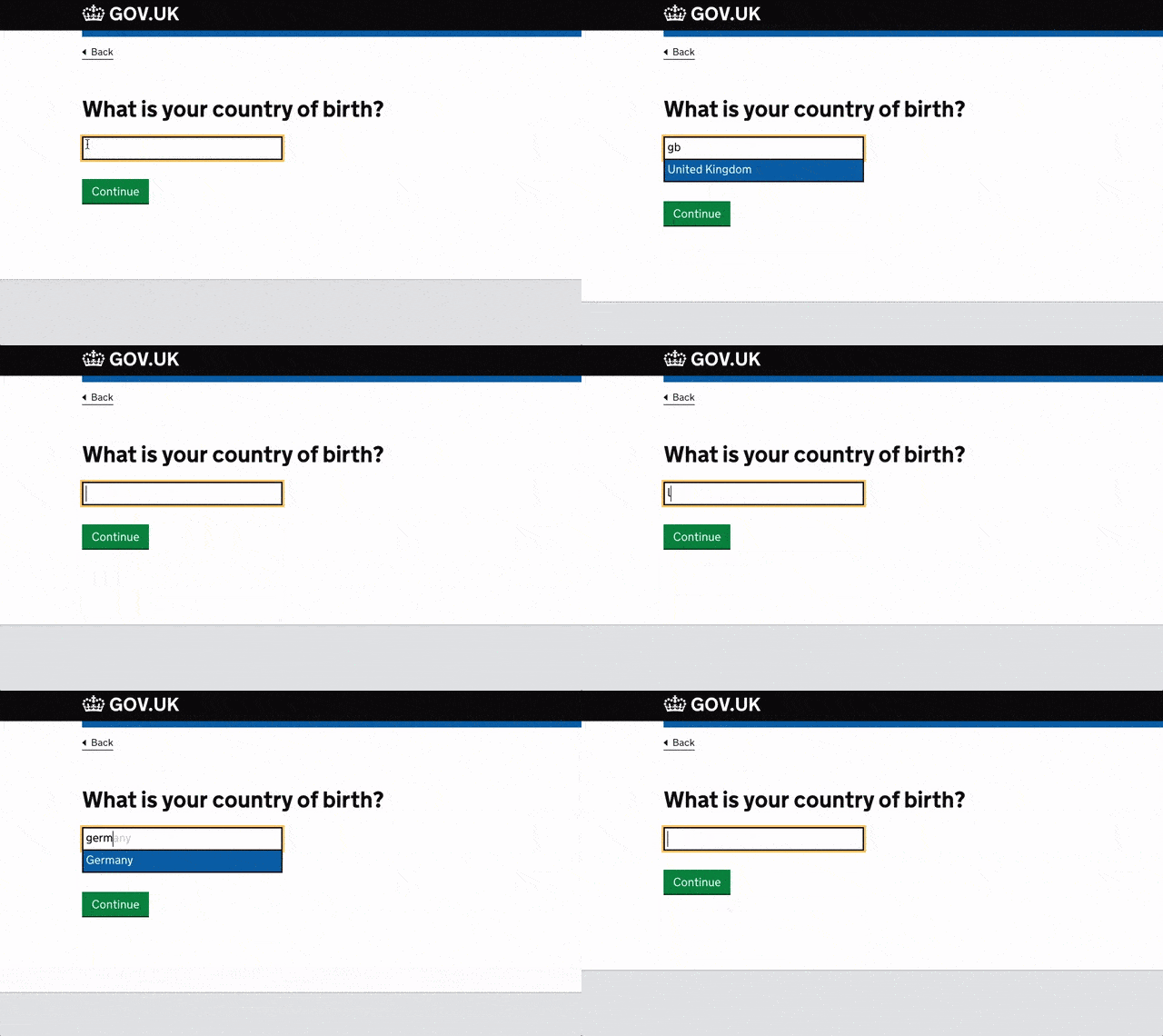
Our new country and territory picker looks like this:

Existing autocompletes
There are already quite a few different autocompletes out there – so why are we building our own?
We looked through quite a few and found that the majority had issues with accessibility. Many didn’t even consider it. Those that concentrated on accessibility often had usability issues or were lacking in features.
We want our picker to have up to date data, so we also need it to work well with registers.
Our new picker does three things well:
- makes it easy to pick a country
- is accessible to all
- uses accurate and up to date data
Making it easy to pick a country
We’ve designed our picker to make it really easy to pick a country (or territory). We let users type in the name they know, and we’ll try to correct typos too. Based on the principle of ‘Do the hard work to make it simple’ - if we have an idea what the user means, we can suggest an answer.
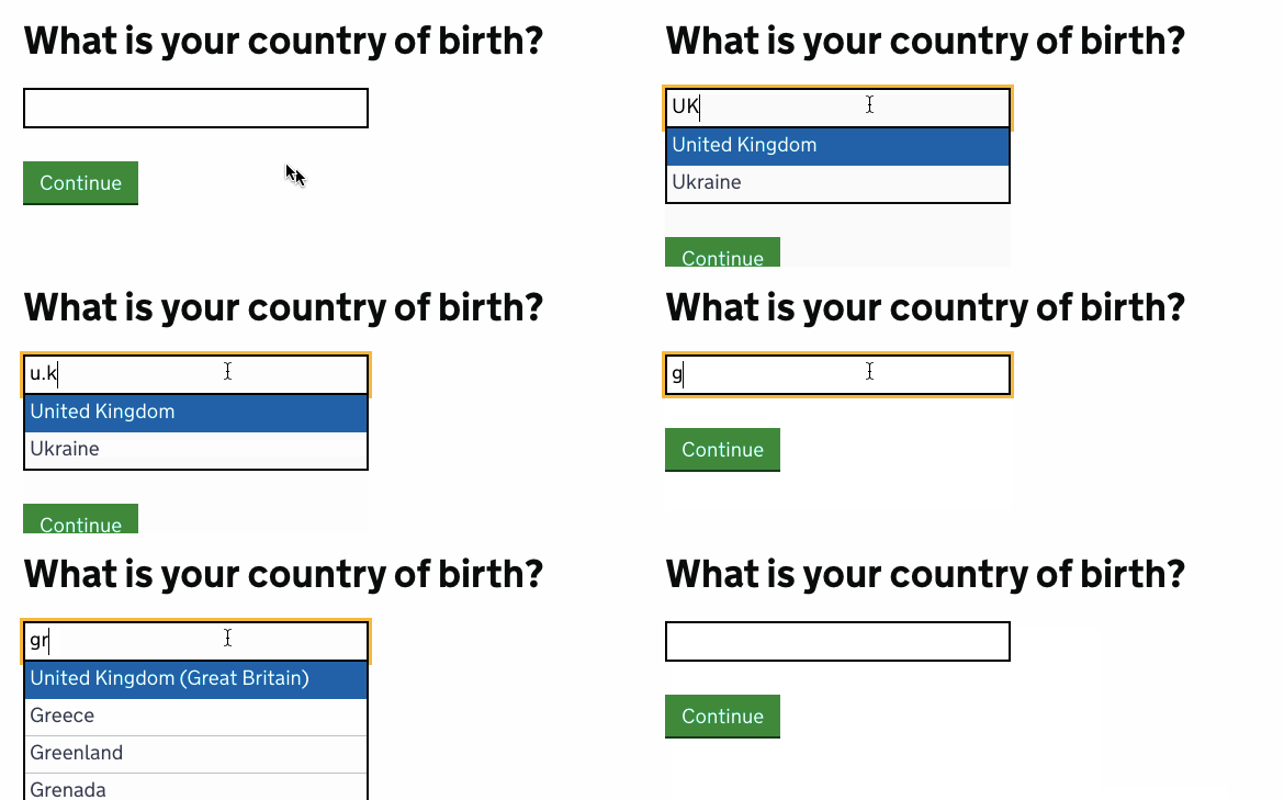
There are lots of different ways of saying you’re from the UK or one of its territories. Often, users will tell us they’re from Great Britain or England – where the service would like to know the country. We’ve made sure a whole range of aliases will work – for example: if the user types in UK, U.K, United, GB or Great, we can answer ‘United Kingdom’.

Services will be able to decide whether they’d like countries like Scotland or Wales to map to their parent country, or whether they should appear as separate countries. Similarly we support local names for countries (endonyms) – so if a user enters ‘Deutschland’ we can answer with ‘Germany’.
We’ve done 4 rounds of usability testing of our new picker and are really happy with how it’s working.
Making it accessible to all
Most existing autocompletes are not very accessible. The Home Office and DWP have done some great work to improve things in this area, and we’ve learned a lot of lessons from their autocomplete.

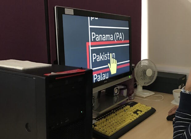
We’ve tested our picker in a range of assistive technologies and have built it from the ground up to work well for them. It’s been reviewed by the Digital Accessibility Centre, and we’re planning further usability testing with users with access needs to make sure it works for them. Once we’ve finished building it, we will book another accessibility test.
Using accurate and up to date data
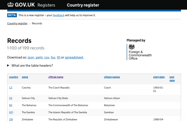
Our picker uses the country register and territory register so has an accurate list of countries. It adds its own data about synonyms, endonyms and common typos. We’re looking at a way a way to keep this data up to date so that services can stay current with updates.

Next steps for us
We’re already well on our way with developing our picker.
It will be released in two forms:
- A country-and-territory-specific autocomplete that links with registers (prototype code here)
- A generic accessible autocomplete (code here)
We’ll be blogging shortly about our accessibility testing of the new picker, and some of the things we learned whilst designing and building it.
Try the picker
You can try a demo of the new picker here. (warning: hacky prototype code!)
We’re looking for services to trial the picker so we can see how it works for them - both for countries and as a generic autocomplete. If this sounds like you, get in touch with registerteam@digital.cabinet-office.gov.uk.
Follow Ed on Twitter and don't forget to sign up for email alerts.

15 comments
Comment by Steven Hoober posted on
Awesome. Noted, and hope to use it.
But: that's an "auto-suggest." User can ignore it as it's just a box of options below the input. Autocomplete is different, usually more intrusive and set up to default complete or complete on pressing some single key to continue.
Comment by Bryan Garaventa posted on
Hi, please make sure you observe the differences between the ARIA 1.0 and 1.1 guidance design patterns. https://www.ssbbartgroup.com/blog/differences-aria-1-0-1-1-changes-rolecombobox/
Comment by Ed Horsford posted on
Hi Bryan,
Thanks - we're aware, and will be looking at that document.
Comment by Jo Smith posted on
You have USSR on the list but no GDR. Yes, some people filling in your forms were born in East Germany.
You missed "Republic of Ireland" somehow.
DRC is missing from the popular abbreviations. Wikipedia has a good list of abbreviations.
Leichenstein is missing. Spelling is an access issue I would have thought.
Interesting that you allow Taiwan as a "Country" (see page title) - surely that's politically somewhat problematic? Additionally, I understand it is officially known as "Republic of China", which is again missing.
One technical thing - once you press the down arrow, you can normally still carry on typing, but you can't in your box until you press the up arrow again. I guess there's some thinking behind this departure from the norm.
Also, have you thought how you might get the page-load time down to something acceptable? I'm seeing it at about 1.5s, of which a whole second is parsing the data - currently done in the critical path.
Comment by Ed Horsford posted on
Hi Jo,
Thanks for your comments. I'll go through each in turn.
> You have USSR on the list but no GDR. Yes, some people filling in your forms were born in East Germany.
I think it's a bug that it's not showing. We'll look at it. We can include historic countries where they're listed in the registers. Service teams will then be able to decide whether they want to show them depending on use case.
> You missed "Republic of Ireland" somehow.
The country register recognises the official name as Ireland. We may be able to add 'Republic of Ireland' as a synonym. See https://country.register.gov.uk/record/IE
> DRC is missing from the popular abbreviations. Wikipedia has a good list of abbreviations.
Thanks, we'll look at this. The list we have is not complete and it will be possible to add missing items over time.
> Leichenstein is missing. Spelling is an access issue I would have thought.
Noted - we'll try to add.
> Interesting that you allow Taiwan as a "Country" (see page title) - surely that's politically somewhat problematic? Additionally, I understand it is officially known as "Republic of China", which is again missing.
Taiwan is listed in the territory register. The picker will pick from both the country and territory registers, but services will be able to configure this. The official territory name in the register is also Taiwan - see https://territory.register.gov.uk/record/TW
> One technical thing - once you press the down arrow, you can normally still carry on typing, but you can't in your box until you press the up arrow again. I guess there's some thinking behind this departure from the norm.
This is (semi) intentional. Once you've arrowed down, you can actually continue to type, though you're correct that the cursor (carat) doesn't show. This is because focus has moved to the item in the menu, which has been done to help users of assistive technology navigate the menu. We're going to review whether this solution remains the best option. Ideally I'd like users to be clear they can continue to type.
> Also, have you thought how you might get the page-load time down to something acceptable? I'm seeing it at about 1.5s, of which a whole second is parsing the data - currently done in the critical path.
Absolutely! The page you looked at included hacky prototype code that demonstrated the functionality and accessibility, but had had no production work. If you try the demo again, you'll see we've now got the picker coming in at 37kb and the data at 24kb. We hope there's still room for improvement.
Comment by David Bloomfield posted on
Hi Ed
Interesting article and the autocomplete/typeahead looks and works great!
Would you be able to explain how are existing autocompletes are not accessible and how yours addresses these issues?
Is it because the list of suggestions appears as a unordered list in the web page content (making the suggestions next in the order of content and also pushing the continue button down so it's still clickable) rather than "above" the content using z-index?
Thanks
David
Comment by Theodor Vararu posted on
Hi David,
> Would you be able to explain how are existing autocompletes are not accessible and how yours addresses these issues?
We've written a set of accessibility acceptance criteria [1] for autocompletes. Our autocomplete prioritises meeting as many of these as possible. We've found in our own testing that other solutions did not meet these criteria and/or were lacking features we wanted.
As for how we address them, in a number of ways (deserving of its own blog post), but to name some interesting ones:
- We populate a hidden aria-live region with information about the total number of suggestions available and how many characters you need to type in for suggestions to appear
- We manipulate the browser's `focus` rather than relying solely on `aria-activedescendant` as we've found this to work much more reliably across different screen readers and browsers
- We prevent the suggestion menu from closing when users dismiss the keyboard on iOS
- We periodically check for updates to the autocomplete input field from irregular sources, such as those from the Dragon NaturallySpeaking Chrome extension (which writes the `.value` directly and bypasses normal event listeners)
- [1] https://github.com/alphagov/accessible-autocomplete/blob/master/accessibility-criteria.md
Comment by Remko posted on
Very interesting, thanks for sharing. I assume before it was a long scrollable dropdown. Are users finding their country faster now? Could the need for using the keyboard bring up a new barrier? Why did you choose for forcing the use of a keyboard instead of having a dropdown that can be filtered (allowing the user to type and to scroll).
Comment by Ed Horsford posted on
Hi Remko,
Our research has shown that dropdowns can be very hard to use for some users. See https://designnotes.blog.gov.uk/2013/12/05/asking-for-a-date-of-birth/
We don't believe that requiring keyboard input introduces a barrier, but are looking at adding a feature where the menu can open when you click in to the field. You can see the discussion and work on that feature here: https://github.com/alphagov/accessible-autocomplete/pull/158
Comment by Frances Maxwell posted on
Hi, we absolutely love this solution! Many thanks for creating it! I'm just a bit unsure on the data side. I installed it using npm the other day, but I found, for example, you've got things like East Germany, Czechoslovakia, and Yugoslavia on there. But not Czech Republic. What's the deal with that?
Comment by Ed Horsford posted on
Hi Frances,
We're using data from the country and territories registers, with some extra synonyms and typos we've collated. East Germany and Czechoslovakia are in the country register as they're historic counties.
The Czech Republic is an interesting case - the country changed it's name to Czechia last year - so it's not a historic country. As it's the same country, it keeps the same record.
Possibly helpful: I've got an item on our backlog (https://github.com/alphagov/openregister-location-picker/issues/5) related to this.
Comment by Frances Maxwell posted on
Ah thanks for replying so quickly, Ed. Wow I had no idea the Czech Republic had changed its name!
Comment by tyfairclough posted on
Is there a shared licence for textzoom people building services for gov can utilise? Would be great to be able to use it while developing our prototypes.
Comment by Ed Horsford posted on
Hi tyfairclough,
Do you mean ZoomText? I'm not aware of any 'shared licence' - you'll likely need to look to your own department to get the relevant assistive technologies. We've recently published details of the assistive technologies we recommend you test with.
Comment by Ben Rusholme posted on
This is great, thanks for doing the hard work to make it simple.