We’ve released new patterns and guidance to help design services. You can find them on the Service Manual. Previously we talked about the naming your service guide and the check before you start pattern.
This blog post is about the task list pattern. A list of tasks that users will have to do in order to get the thing they need.
Understanding the ‘application process’
Nearly all government services have criteria that mean some users are eligible to use the service and some are not eligible. Navigating these criteria and getting all of the things done that need to be done in order to apply to do something – whether that’s applying to become a childminder or getting a small business loan – can be a challenging, stressful experience for users.
During our research, we spoke to a government agency where over 60% of user support is attributed to queries about the application process.
Different types of applications involve different sets of tasks. From those that can be completed quickly in one sitting, to those that require supporting documents to be prepared over a period of weeks or even months.
People’s individual circumstances too can have a huge effect on the usability of this vital part of the service, as users invest different amounts of emotional and mental energy depending on what they are trying to do. From an office worker whose job it is to apply for export licenses, to someone requesting the right to live and work in this country.
Giving the right guidance
Most services will have some kind of guidance available for users to describe what they need to do to use a service. Sometimes this guidance shows a step-by-step guide of all the things a user needs to do, but more often they’re long, confusing documents that can be difficult to relate to a user’s personal circumstances.
Overall, the experience can be time-consuming and stressful. As one aspiring childminder told us during user research: ‘It feels like you’re being judged rather than helped sometimes.’
Through listening, designing, testing and iterating we identified the following group of common needs that we have attempted to address through the task list pattern:
- know what tasks a transaction involves at a glance
- know what order to do tasks in, if any
- plan time to do each task
- know which tasks are done and are left to do
All the tasks – the whole service
During research we learned something important; users need to know all the tasks required to do something. Not just the online tasks, but an overview of everything they need to do.
This meant a task list ideally would need to include:
- online tasks, such as 'book a test’
- offline tasks, such as 'take a test'
- non-government tasks users must do, such as 'get insured'
This got us thinking. At least from a design point of view, a service is a group of tasks that you complete to do something. As a designer or service manager you need to know what all these tasks are. And what order they need to happen in.
Collecting and comparing examples
Many services already use lists of tasks. Such as Digital Marketplace.
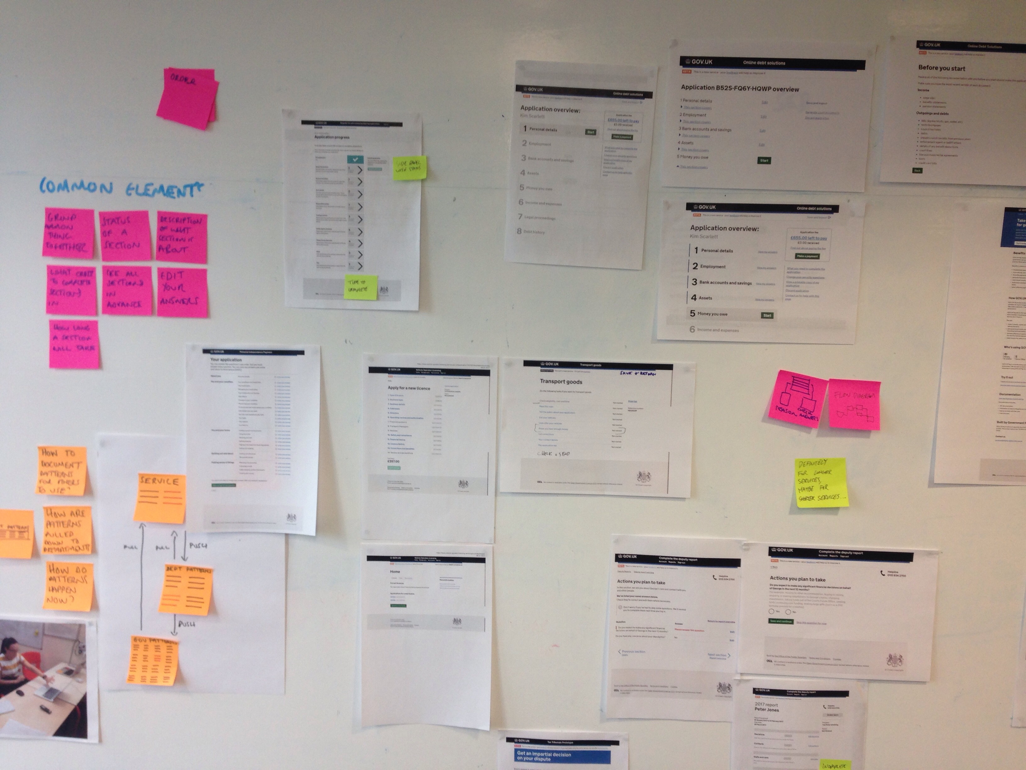
We collected and compared these examples. This involved discussions on mailing lists, speaking to the teams that designed them and sticking screenshots on a wall.

We did this for a couple of reasons. First was to check all the examples were designed to meet the same user needs. They were.
The second was to find the things each example had in common. Our reckon was that this would lead us to the pattern.
We found that there were some features that all the examples had:
- users can see all tasks in advance
- content is grouped into themes, for example questions about money
- the name of task describes itself, for example ‘give medical information’
- there is a suggested order to do tasks in
- task status is labelled, for example ‘completed’
- answers can be edited for each task
Iterating the pattern
We built prototypes then tested them with with 34 users over 5 rounds of research. Users becoming childminders, learning to drive and transporting goods. After each round of testing, we iterated the pattern.
These observations contributed to subsequent design iterations - such as enabling users to save and return to the service at a more convenient time, or reducing users' cognitive load by splitting up task lists into sections.
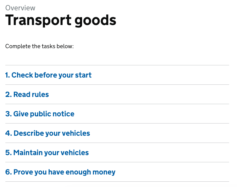
At first tasks were just one ordered list:

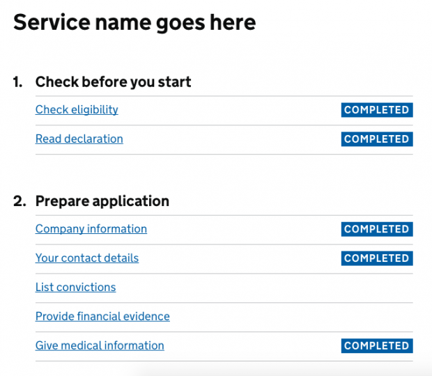
Users were unsure what order to do tasks in or if some tasks could be done at the same time as each other. So we changed this, putting tasks into numbered groups:

This made the page faster for users to scan and it made it clearer what order to they must do tasks in.
We made ‘read declaration’ one of the first tasks you do. At the moment, reading and agreeing to a declaration is one of the last things a user does. However we found users wanted to know these rules upfront, as they might affect the decision to do something in the first place.
What statuses to give tasks was something we tested. The examples we compared had several: A tick, ‘done’, ‘started’, ‘not started’, ‘finished’, ‘not finished’.
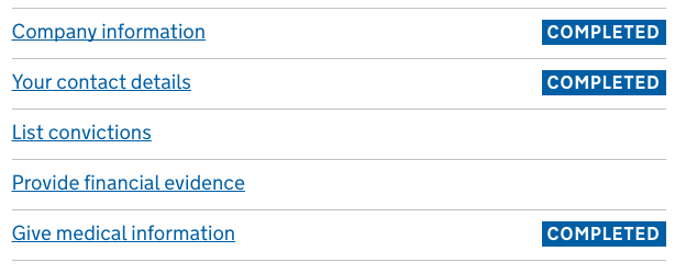
The first iteration with a tick proved ambiguous.

For the next iteration we showed the status as a word and gave it it’s own column to make it easier to scan. We chose ‘COMPLETED’ as this was consistent the language we already use in confirmation pages.

The next iteration was using users’ language for statuses; changing ‘COMPLETED’ to ‘DONE’. The feedback was that this didn’t feel authoritative or definitive enough, so we went back to ‘COMPLETED’.

For the following iteration we labelled tasks ‘not started’. This proved harder for users to scan. Users also told us they only cared about knowing what tasks they had completed and they wouldn’t start an task unless they could finish them.

The latest iteration we’ve made it blue, as some uses saw black as an indication that there was a problem.

Prototyping
The pattern is now in the latest version of GOV.UK prototype kit. Either update your version of the prototype kit or download a new one to try it out. There is Service Manual guidance for when and how to use the pattern.
This is a ‘beta pattern’, which means we’ve tested it in prototypes but that it needs more research.
So we’re keen for teams to try the pattern with their users. For example research on how users return to a task list they’ve already started, which only can be tested in a live service.
We’ve provided a coded pattern. Meaning teams can quickly try it with their users and help refine the pattern further. Please provide feedback on the design patterns wiki.
Follow Harry and Rob on Twitter and don't forget to sign up for email alerts.

5 comments
Comment by Caroline Jarrett posted on
Over the time I was at GDS, I must have sketched this pattern at least dozens of times - if not even more. And before that, I've been urging designers to try this pattern for a long, long time.
I'm delighted to see that Harry and Rob have at last had the opportunity to do the hard work to turn those sketches into a pattern that's now in public beta.
Comment by Stuart Hopper posted on
We have some initial tasks that define the tasks that follow. Maybe this works best as a 'before you start' pattern which would then lead into the application task list? An alternative we are exploring is to disable later tasks, and name them more generic/less specific so the user has an idea of what is coming up..
Comment by Harry Trimble posted on
Hey Stuart,
Some services have different users do different tasks. For example when becoming a childminder if you plan to care for children under 5, you need to do specialist first aid training.
We tested adding tasks to a list based on users answers at the beginning. It tested well. You could use the http://www.gov.uk/service-manual/design/check-before-you-start pattern to do this as we did.
As for disable tasks this requires more research. If tasks have to be done in a certain order, they should ideally be in different numbered sections. We found although users shouldn't complete a task yet, we can help them plan to do it by:
1. task having short, descriptive names starting with verbs. For example 'Provide medical information'
2. introduction page that explain why they need to do the task and what it will involve
Please add any feedback to the design pattern wiki page https://designpatterns.hackpad.com/Task-list-pages-qAPtTmL1GJm
Comment by Rich Clarke posted on
We are planning to use this pattern at the centre of our new 'Houses in Multiple Occupation' licence application form. It's been really interesting to read the story of how you arrived at the pattern, particularly the use of the 'completed' badges (and _not_ using 'done' or 'Not started')
I'm interested to know if there is any guidance for the patterns to use in the forms behind the task list, ie the forms that the applicant needs to complete in each section.
Comment by Adam Silver posted on
What happens when order matters - that is, if the user clicks a task in section 2, before all tasks in section 1 have been completed?