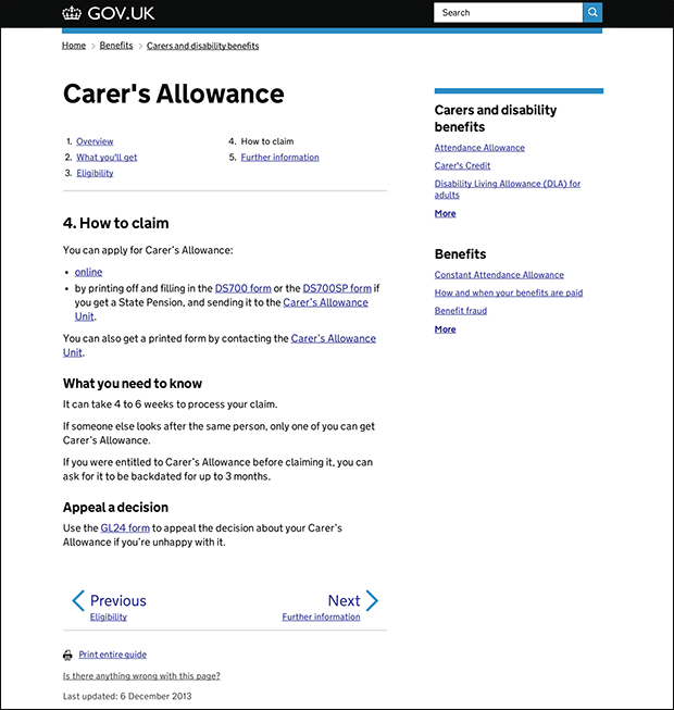
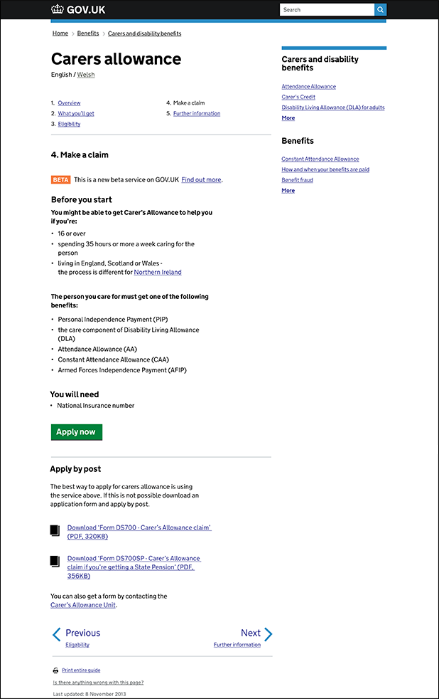
Guy and I have been working with the carer’s allowance team to test the start page as part of a guide to improve the user journey and try to encourage more users to apply online.
In a lot of cases transactions don’t require users to have to have a great level of understanding before they start - a name like ‘renew a tax disc’ explains clearly what the service is for. Other transactions are more nuanced. Services like ‘carer’s allowance’ or ‘lasting power of attorney’ require more information so users fully understand what they are for.
This problem becomes more significant when you look at the data. Lots of users navigate to start pages for services through content on GOV.UK, which means a start page repeats information they may already have read.
How we addressed the problems
We explored several ways of improving the first page of the carer’s allowance service. The most successful included;
-
creating a section within a guide that acted as a start page - reducing the amount of steps a user needs to complete to start a transaction
-
changing ‘how to claim’ to ‘make a claim’ to make starting clearer
Ben Holliday, the researcher on the transaction, tested our prototype with 5 people who wanted to apply for carer's allowance at Preston library. His research showed that users were able to navigate clearly to the online transaction from the guide, reducing the amount of steps the user needed to take.
It seems like a small change, but it’s really significant. It means people can use services much quicker, and they have detailed information in the place they most need it.
Next steps
Before we implement any changes to the carer’s allowance guide we need to investigate how much eligibility detail needs to be given on the new ‘how to claim’ section. We need to look at this alongside the existing 'eligibility' part and decide whether that should exist in its current state.
On the back of our start page work we have also been testing beta labelling. There will be a post coming soon. If you are working on a transaction and have done any research in to beta labelling, we would love to hear from you.


5 comments
Comment by John Beale posted on
Thanks for sharing, very interesting. In tests, did peple notice that the other options for applying are beneath the "apply now" button and a horizontal line? I guess this is a nudge to apply online, but just wonder if the other option is a little too hidden - the button doesn't specify 'apply online' so people might think they will be given all the options after clicking.
Comment by Amy Whitney posted on
Hi John,
On the existing start pages, the button's call to action is start now. Analytics showed us that users are searching for terms such as 'login', 'register' and 'apply' as start now doesn't give the user any expectations. From both user testing and data we know that users don't read the content of the start page, this is because it is located below the start now button but also that the start now makes the user just want to jump in without knowing what to truly expect.
So far, all users have understood that they were applying online because they were in an online environment. If we start noticing problems like we have with the start now buttons we will look at the data and iterate from there. We'll continue to look at usage data to see if users are missing the offline application options.
Comment by minh posted on
good
Comment by Joe Lanman posted on
Interesting stuff, would this replace the separate start page, or be in addition? If its the former is there a risk people wanting to just start (say from google) might not find it as easily? And if it's the latter is there a risk of duplicating content?
Comment by Amy Whitney posted on
Hi Joe,
thank you for your comment. The content team and I have been having very similar thoughts. We will be analysing user journeys of a couple of services to see how users are moving between content on GOV.UK. As well as doing research to see if users are phased or understand where they are when arriving from Google.