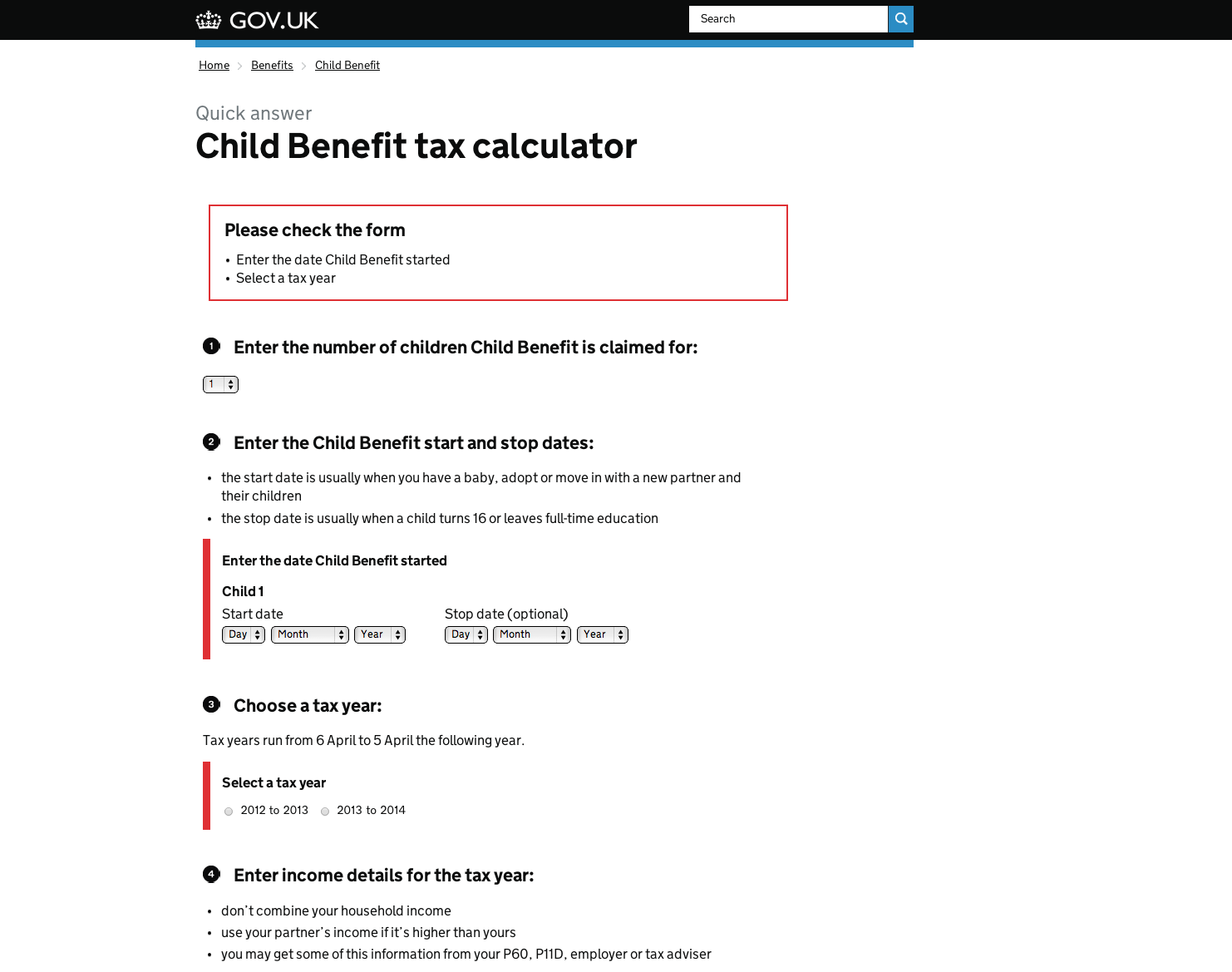
This is a recent pattern we’ve started using on GOV.UK Mainstream for error messages when the user hasn’t entered their details correctly, or at all.
Errors are first grouped at the top of the page in a summary and then markers are placed next to the incorrectly completed fields.


12 comments
Comment by Pete posted on
Should the errors listed at the top be anchor links to specific errors? Could be good. Could be tough with drop downs etc...
Comment by Amy Whitney posted on
Hi Pete,
sorry I should have stated they are anchor links to specific errors. In research users scrolled rather than clicking the links, but it is good accessibility with screen readers. We added tabindex="-1" to the div, and use .focus() to move keyboard focus to the div as it opens. This will cause screen readers to announce the heading text, and will also put both screen reader users and keyboard only users in the right place on the page to access the error information.
The anchor links take the user to the div rather than the field as you say this could be tough with drop downs.
Comment by joelanman posted on
Screenshot of register to vote validation.
looks nice, couple of points:
If you're validating with JavaScript, I think it makes more sense to put the message near the continue button.
On Register to Vote, we've been able to keep each step relatively small, and one advantage of that is it makes validation messages very easy to connect to the fields. In your example, it might be hard for people to connect a less obvious error (such as in my image, above) with the field, as when you scroll to the field, the message is not on the screen.
In the past I've used the icon/bubble approach, so a user can click on the [ ! ] next to a field to read the error message.
Comment by Amy Whitney posted on
We aren't validating with Javascript.
I really like the fact that the error messages are next to the continue button, I think it works really well when you can keep the sections small.
In the example of child benefit tax calculator all of the steps are one page because the questions are connected to each other. Having the validation messages at the top means that users scroll (or use the anchor links) to navigate to the errors and then down to the calculate button.
Comment by chrisheathcote posted on
For HMRC, we're looking at putting the error reasons grouped at the top, and also the reason by the question, as some of the validation we do isn't pure data entry errors, but logical errors (answers in different questions contradict, don't add up, etc.).
Comment by timpaul posted on
Something we've been trying on another exemplar is combining the error message with the field label. So, instead of 'First name' followed by an error - 'Please enter first name', we just colour the label red and add the word 'missing', so 'First name missing' (this is in addition to summarising the errors at the top of the page).
It's more compact and your able to easily generate error text based on the type of error. It's also untested as of yet ;-).
I'd have posted images to illustrate but we're not able to. Can we sort that?
Comment by Luke L posted on
Is there a reason the error messages are not displayed in the same order as the actual fields themselves?
Comment by nhau thai cuu posted on
If you're validating with JavaScript, I think it makes more sense to put the message near the continue button.
Comment by Amy Whitney posted on
Hi nhau thai cuu,
We aren't validating with Javascript. In the example of child benefit tax calculator all of the steps are one page because the questions are connected to each other. Having the validation messages at the top means that users scroll (or uses the anchor links) to navigate to the errors and then down to the calculate button.
On Register to vote they are able to keep the steps really small, so the validation messages are easily connected to the field and the button.
We will continue to explore both patterns and iterate based on our findings.
Comment by catfood posted on
do you have any specifications or opinions regarding the semantics of your error messages?
Repeat the context of the errors location in the message:
"Enter the date child benefit started"
or keep it generic:
"This field must not be left blank"
I imagine option A requires more developer, copy and maintenance resources whilst option B can be rolled out pretty quickly but comes with obvious accessibility issues and would only work if it appeared alongside the field containing the error.
Any research or validation you've done in this regard would be appreciated.
tx
cf
Comment by Ed Horsford posted on
Hi Cf,
We recommend validation messages be specific and as helpful as possible. The first message is clearer for users, and works better if there's more than one error on the page.
It follows our fourth design principle: 'Do the hard work to make it simple'.
Our design patterns for validation have moved on a bit since this blog post - you can see our current guidance for this pattern here:
http://govuk-elements.herokuapp.com/errors/
Ed
Comment by catfood posted on
solid!