Tried & tested
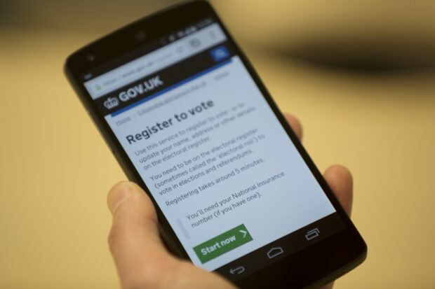
We recently launched 'register to vote' on GOV.UK. It's a service that will be used by a broad range of people, so we really tried to make it as simple and straightforward as possible. Here are a few things we …
In our Design Principles number nine is 'be consistent, not uniform'. The principles were never meant to be strict brand guidelines, as we said at the time, "We can’t imagine every scenario and write rules for it." Two years in, …
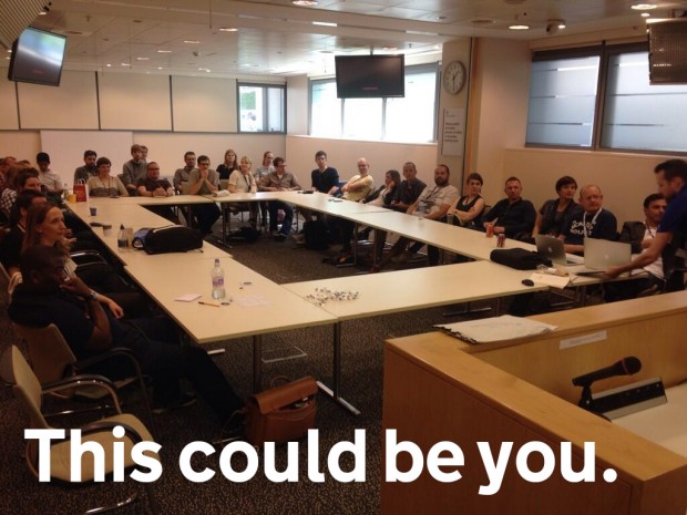
...do regularly as a design community. As we transform more digital services we need more interaction designers. People with experience of designing easy to use services. Some of these jobs...
...the other day. It reminded me of our fourth design principle, do the hard work to make it simple. The second sentence, "If they don't know how to form the...
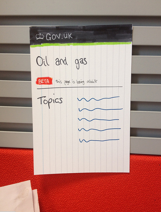
...on paper to help you visualise how things might work and so you have something to show and discuss with colleagues. We do this quite a bit at GDS. Picture...


