We have published a new version of the Task List pattern within the GOV.UK Design System, after 2 years of cross-government collaboration.
What’s changed
There are three new features of the updated pattern:
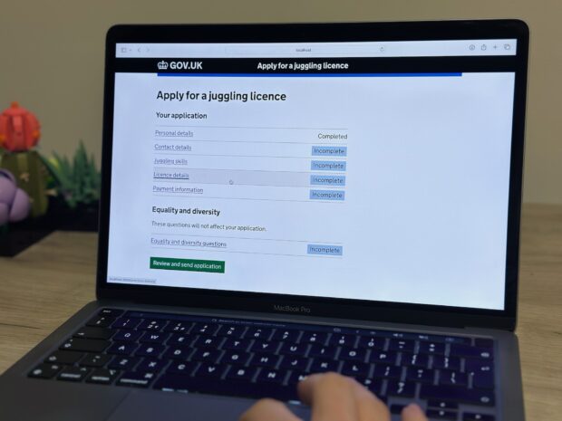
- status tags no longer use uppercase text, and the colours have changed
- the whole ‘row’ of the task is clickable
- you can now add additional hint text to describe a task
Additionally, the code is now available within the GOV.UK Design System rather than just the GOV.UK Prototype Kit, making it easier for teams to use the pattern in production services.
Why we’ve changed it
The task list pattern was first published back in 2017, after being designed by the Government Digital Service (GDS) for more complicated application processes where users need to complete a set of different tasks.
Since then it has been used successfully in dozens of services across government.
However, it hasn’t always been implemented in a consistent way, and was for a long time still considered ‘experimental’.
Two years ago, we started some cross-government collaboration to understand how it was being used, and see what different teams had learnt from their research on it.
The most common recurring finding from this research was that teams observed users attempting to click on the status tag (for example ‘not yet started’) instead of the link text. Whilst users were generally able to recover quickly from this, it indicated to us that the status labels looked too similar to the standard button design.
In addition, we heard repeated concern from teams that the uppercase text on status tags may be harder to read than regular text, particularly for certain user groups or where longer text was used.
To improve both of these issues, we changed the design of the status tag so that it always uses a darker text colour on a lighter coloured background, and no longer uses uppercase text. This makes them more distinct from buttons, which use white text on a darker coloured background.
In case users still perceive the status tag as a button, we also made the whole row of the task clickable.
Finally, we also include a version of the status label which is just plain black text with no background colour at all. We recommend that teams use this for ‘Completed’ tasks, so that more visual attention is drawn to the tasks where users still need to take action.
How we developed the change
This change was developed through a new collaborative cross-government contribution process.
We kicked off with an open call to join an online workshop, and had over 120 participants attend from dozens of government organisations. This helped us to understand the diversity of ways in which the task list pattern was being used, from application forms to case management systems, as well as collecting research findings, and user needs that the pattern was helping with.
From the workshops a smaller group, comprising designers and researchers from across different government departments, was formed to work on iterating the actual design.
Collaborating in this way wasn’t always fast – the work had to be fitted in around everyone’s main roles – but a dedicated Slack channel and semi-regular calls helped to maintain momentum.
Once we had a version we were all happy with, it was sent to the Design System working group for feedback. Their main feedback was that the design changes to the status tags within the task list should also be applied to the tag component more widely, such as within the ‘beta’ banner, or when used within tables. We were happy to do this, however this did cause the new component to become a ‘breaking change’, which meant waiting to release it with version 5 of GOV.UK Frontend.
What’s next
We are still keen to learn from teams how they are using the task list pattern.
The new guidance pages for the pattern contain recommended wording and colours for status tags in task lists, but these are non-prescriptive and you can change them if your research shows different text is more suitable.
If you use the new design in a service and have any feedback, please let us know.

4 comments
Comment by Anupama posted on
I just have a question, if the whole row is clickable why is there an underline under license details? Would you say it is a bit unnecessary now? I believe there needs to be visual cues that something is clickable but when a whole row is clickable why make one part underlined and the other not?
Comment by Kim 'beeps' Grey posted on
Hi Anupama,
We continue to underline the name of the task as this helps us meet the Web Content Accessibility Guidelines (WCAG).
WCAG criterion 1.4.1: Use of Color recommends that you don’t rely on colour when “conveying information, indicating an action […] or distinguishing a visual element”.
We use an underline so that it’s clear the task can be clicked on without relying on colour.
When hovering, the change in background colour is also quite subtle, transitioning from white to light grey. The difference between them is only a 1.1:1 contrast ratio, which doesn’t meet the minimum 3:1 minimum contrast ratio that would pass the criterion.
This is why we increase the thickness of the underline when the row is hovered over, to indicate that clicking the row will activate the link without relying on the background colour.
Thanks for commenting!
~ beeps
On behalf of the Design System team
Comment by Anupama posted on
Thank you for your response
Comment by chas linn posted on
This is so great, for year I campaigned for clickable rows and better status label affordance in HMRC. So excited to see this happen now.