Dyscalculia (Dis - Cal - Coo - Lia) is a specific and persistent difficulty in understanding numbers.
It makes it hard for someone to read, understand and work with numbers. It impacts the ability to handle money, like counting change, telling and managing time, estimating how long things take, understanding percentages, and remembering number facts.
Dyscalculia also affects someone’s working memory. It impacts everyday things like remembering items on a shopping list, following instructions, phone numbers, PINs or game scores.
It means people miss trains, withdraw the wrong amount of money from cash machines, get locked out of their accounts, and sign contracts they don’t understand.
People can be unaware they have dyscalculia but know they struggle with numbers.
Most people with dyscalculia are undiagnosed
There’s little awareness in society about dyscalculia. And this means you’re less likely to be diagnosed if you have it and are less likely to be offered support.
Dealing with numbers can be overwhelming and stressful, often developing into maths or numbers anxiety.
About 1 in 20 people have dyscalculia in the UK. As a comparison, about 1 in 10 to 20 people have dyslexia.
If diagnosed early enough, younger people can be supported with interventions that break maths down into manageable chunks, using different ways of learning.
But for adults who have gone undiagnosed, many have learned over time to cope, avoided situations or just lived with the limitations of not understanding numbers and the impact that has on everyday life.
It’s not just people with dyscalculia that struggle with numbers
Low numeracy affects half of the working-age adults in the UK. That’s nearly 17 million people. 1 in 5 people say they would avoid jobs that involve frequent use of numbers.
Low numeracy makes it harder and more stressful to manage money. For example, a Financial Conduct Authority 2020 survey found that those that had fallen into debt felt it might have been avoided if they had understood their options better. (It was hard for us to read the results from the financial conduct authority survey because they were all in percentages!)
How can people understand the consequences if they don’t understand their options?
Designing for people who struggle with numbers

We need to deliver services which convey numbers plainly and in a way that is easy for everyone to understand.
It's challenging because, unlike plain English, there is little guidance on presenting numbers and data.
Some of the concepts we work with are complicated, like pensions, tax, interest rates, and net income. These all require some ability to perform calculations and understand percentages.
There are simple ways we can design to help people make better sense of numbers. And this is vital. It could mean the difference between people using a service to access the support they need or not being able to use it at all.
Research published, found that making small changes to the way bills and statements are presented, doubled the number of customers who understood them.
We can:
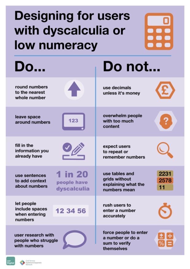
- remove unnecessary numbers - always try to round values up to a whole number, and get rid of decimal places unless it’s money
- leave lots of space, so that numbers don’t jump around so much on the screen for people with dyscalculia
- involve people who struggle with numbers in the design process, from both within and outside the design team
There is no alternative to government services, so we must make numbers accessible to everyone. Design to be inclusive, and everyone benefits.
Forming a cross-government dyscalculia network
We are designers (some of us have dyscalculia) from HMRC and DWP raising awareness of dyscalculia. We have produced an accessibility poster called ‘Designing for people with dyscalculia and low numeracy’.
Get the poster
The poster is available to download in accessible formats from the DWP Accessibility Manual.
The poster is general guidance. If someone cannot do all the things we have listed, we want them to do as much as possible. It will make a difference.
The poster is a first step in our campaign. We are building a cross-government dyscalculia network, sharing our experience and research with the government design community.
Thank you!
A big thank you to:
- Ollie Sweetman and the Civil Service Dyslexia and Dyspraxia Network
- Craig Abbott, Head of Accessibility at Department for Work and Pensions
- the Dyscalculia Network for consulting on the poster
- National Numeracy for reviewing the poster
- Plain Numbers for reviewing the poster
- people who attended our focus group for helping shape the poster
More helpful links
What it’s like living with dyscalculia.

9 comments
Comment by Martin Jordan posted on
This is great! Thank you for sharing this work – and also continuing the poster series.
Is there one single place to find all posters of the series so that I can point interested people towards that place? Thanks very much!
Comment by Hannah Jump posted on
The whole set of accessibility posters can be found on theHome Office Posters GitHub - https://github.com/UKHomeOffice/posters, (under the 'Our posters' heading).
'Designing for people with dyscalculia and low numeracy’ was created a few years after the accessibility team at the Home Office published the original set of posters. They are not all available from the same place yet, but this is something the team are looking into together.
Comment by Siobhan Mercer posted on
Loving this poster and it has taken me down a rabbit hole this morning into the other posters and other blogs. Thank you!
I found this list of accessibility blogs, but this one doesn't appear on it, presumably due to category tagging.
https://hodigital.blog.gov.uk/category/accessibility/
Is there another category I should be looking for to see all the content relevant to inclusive design please? Thanks
Comment by hannahjump posted on
Hello! That's the right tag, I just had forgot to tag this blog to it! If you haven't seen it already, you might find this blog interesting too - https://accessibility.blog.gov.uk/
Comment by Vohn Mercer posted on
Brilliant, thanks so much Hannah
Comment by Alex posted on
So great. Are there plans to produce a similar article for designing for dyslexia? I was surprised there aren’t any articles in the blog about that.
Comment by hannahjump posted on
Hi Alex, it would be great to have a post about designing for users with dyslexia. Our blog is made up of contributions from the design community, so feel free to work on a post about that if you're working in government at the moment! You can submit an idea here - https://designnotes.blog.gov.uk/about-the-design-in-government-blog/. Also, if you haven't seen it, there is a really helpful poster about designing for dyslexia - https://github.com/UKHomeOffice/posters,
Comment by Violet posted on
What does leaving space around numbers look like in practice? It feels contradictory to including contextual sentences around numbers because in giving the numbers space, I picture numbers being shown on their own.
Comment by Laura Parker posted on
Hello, thank you for your question.
We encourage people to leave space around numbers because, for some people with dyscalculia, numbers appear distorted, fuzzy or move around the page.
It's helpful to see the outline of numbers clearly. If a number is close to other content, like words, it’s hard to read.
Explaining what the numbers mean (maybe in a sentence above the table or grid) is helpful if you're dealing with content in a table or grid. But also making sure numbers in the table can be seen too by leaving space or widening table margins.
There should be a clear connection between the number and context.
There is more context behind each tip on GitHub. So we're adding this link to the poster too. https://github.com/abbott567/dyscalculia-poster#readme