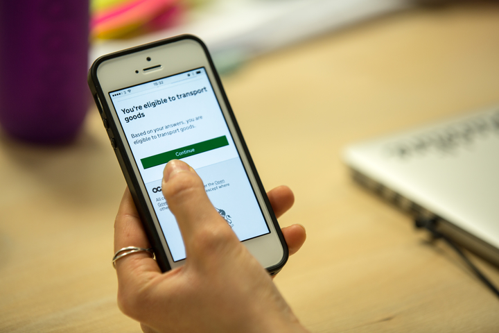
We’ve released new patterns and guidance to help design services. You can find them on the Service Manual.
In a recent blog post we talked about the naming your service guide. In this second of three blog posts we’re looking at a pattern new to the Service Manual: check before you start, which we first blogged about back in July.
Here’s why we made the pattern and what it does:
Getting away from ‘It depends…’
Many services already have users check certain things before they start using them. Such as apply for budgeting loan.
These can be either things the user needs to know about the service or things a service needs to know about the user, like:
- whether or not a user is eligible or has to use the service
- how much the service costs to use or how much money the user will get if they use it
- how long the user will have to wait for an outcome
However, the answer a user gets back from the service is often ‘it depends…’ because the guidance on how to use a service is separate from the service itself.
Not only is this frustrating, but the answer ‘it depends…’ creates uncertainty for users, which costs lots of time. It leads to things like:
- calls to ask: ‘am I eligible?’
- calls to ask: ‘how much will it cost?’
- calls to ask: ‘how long will it take?’
- applications that aren’t ready
- applications that aren’t eligible
- applications that aren’t necessary
Providing answers
The check before you start pattern can help provide users with answers they need. It does this by:
- asking users questions
- automatically calculating the answer
- showing users the answers specific to them

By using this pattern in services and giving clear answers, we can help remove uncertainty and wasted time for users and government.
Designing for uncertainty
Before adding the pattern to the Service Manual, there were some things we needed to test:
- how to ask users questions
- how to let users know whether or not they are eligible to use a service
- how to show results about money
- how to show results about time
- what variety of services the patterns could be used in
We tested the pattern with 46 users over 6 rounds of research. We talked to users doing a variety of things: becoming childminders, getting environmental permits, learning to drive and transporting goods in vans and lorries.
One of the main learnings during early rounds of research was that people felt too constricted by questions that they were forced to answer either yes or no to. People don’t always know how to respond. So we started adding a ‘don’t know’ or ‘not sure’ option as a response.
By acknowledging that people don’t always have all the answers and designing with this in mind, users feel more reassured.
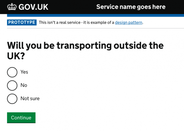
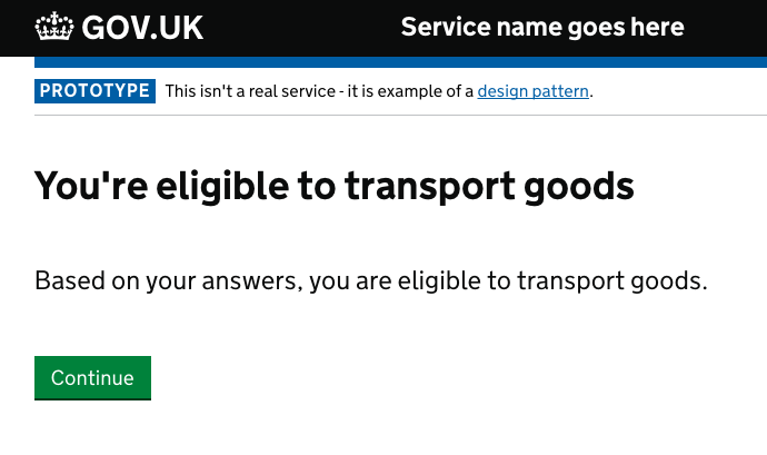
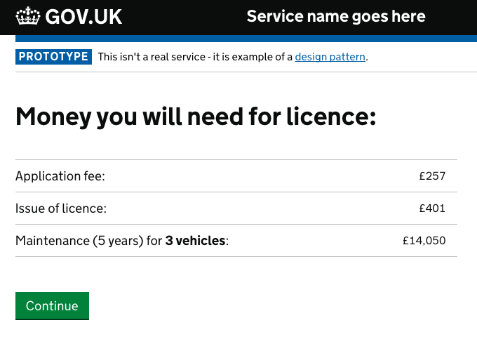
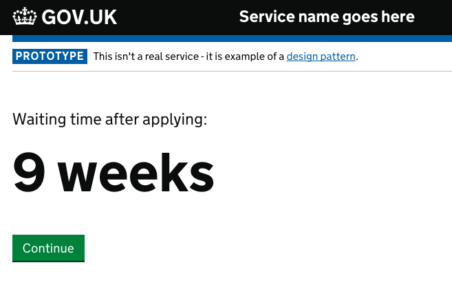
Another iteration was giving one answer per page. Previously, we put all the results on one page: ‘You’re eligible’; ‘Registering will cost £35’; ‘It will take 8 weeks to register’.
There was too much information and too many types of it. This confused users. So we changed it and made the page clearer.
This single page:
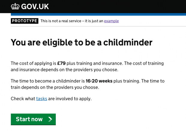
...is now three pages:
Not a technology fix
Good design needs good policy - this pattern will only work if policy teams are working with service teams and designers to create the right questions.
When policy is too complicated to be made into questions, then make it simpler. The pattern is partly to encourage teams to do this.
Testing and feeding back
The pattern is now ready to use in the Service Manual, with a link to a prototyped example.
We’re keen for teams to test the pattern with their users. Please provide feedback on the design patterns wiki.
In our next blogpost, we’ll talk about adding another new pattern to the Service Manual; task list pages.
Follow Harry and Rob on Twitter and don't forget to sign up for email alerts.
