We recently removed the external link icon from GOV.UK. That’s the icon that looks like this:

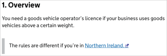
Here it is on a page on GOV.UK:

We’d assumed that there was a clear need for the external link icon, but in 4 years we’ve seen no evidence that backs this up, so we're going to stop using it.
The pull request making the change contains a full discussion of why we’ve decided to do this, but I thought I’d summarise some of the reasons for our decision here.
You don’t always need to tell people about external links
There are some cases where you might want to warn users about external links in advance (for example if they’re in the middle of a task), but there’s no need to tell them every time.
The icon is obscure and ambiguous
The icon is not widely recognised and is often confused with the ‘opens in a new window’ icon:

Some websites actually use it to mean this, so it’s not an effective way of telling people that a link goes to another website.
Words are more effective
If your users do need to know in advance that a link goes to another website, it’s more effective to do this with words.
You can do this in the link text itself, or if you have a collection of links you might want to do this in the immediately preceding text to avoid duplication.
Next steps
We’ve removed the icon from the information pages on GOV.UK. As other teams in government update to the latest version of the GOV.UK Frontend Toolkit the icon will start to disappear from service pages too.

11 comments
Comment by Andy posted on
You mention that you saw no evidence that people found it useful... can you elaborate on that? I would be really interested to know more about how a government team makes these kinds of decisions. Did you do user testing or some kind of data-driven approach? Did you consider a/b testing the removal and see if it affected how often links were clicked? Thanks!
Comment by Tim Paul posted on
Hi Andy,
We considered A/B testing, but it wasn’t clear how a change in the rate of clicks should be interpreted. If the rate went up, would that be a good or bad thing?
With low level changes like this the evidence comes from multiple sources and there’s a certain amount of judgement involved.
We drew on the experience of the design and research communities in government and asked them if they’d ever observed users making use of the icon, which they hadn’t.
This gave us the confidence we needed to make the change, but we’ll continue to check in with GOV.UK teams to make sure it’s not causing problems for their users.
Comment by David Cook posted on
Hi. As far as I know, the original intention of these icons was, in line with accessibility guidance at the time, to let users of screen magnifiers know that a link would open open in a new window (whether on the same site or not), because not knowing this was considered to be confusing to them. Not sure whether that is still true with screen magnifiers software these days, but obviously the same can be accomplished with copy, as long as you have space to do so.
Comment by Tim Paul posted on
Hi David. Yes, you're right. I think somewhere along the way the concepts of 'opens in new window' and 'opens a new website' got conflated, leading to the ambiguity I described.
Comment by Bill posted on
You say words are more effective, but it sounds like you're adopting a 'don't mention external links' by default approach. So I assume your evidence is more about removing the reference as a whole, not just the icon?
Comment by Tim Paul posted on
The main finding was that the icon wasn't understood by all users, so it's not an effective way of telling people that a link is to another website. There's no default approach. Content designers will continue to evaluate whether users need to know in advance that a link is external and the best way of doing this. Its just that from now the icon will not be one of the options.
Comment by Eliot posted on
Hi Tim,
There's some associated vulnerabilities with `target="_blank"` we should be including `rel="noopener noreferrer"` in any links, which I don't we do at the moment.
Thanks
Comment by Tim Paul posted on
Thanks for this Eliot. We recommend against opening links in news windows anyway but you're right - if you do need to do it, you should include that rel attribute too. I've updated our page on links in our wiki accordingly: https://designpatterns.hackpad.com/Links-CgBO9L4bF4a
Comment by Gianfranco posted on
When browsing, my way of opening links now is middle-click or cmd + click if I want a new tab or single click if I want it in the current tab.
If single-click still opens a new tab, close the previous one.
Comment by greath smith posted on
You got a really useful blog I have been here reading for about an hour. I am a newbie and your success is very much an inspiration for me.
Comment by Nicky posted on
So glad I found this blog post. I was researching best practice around external links and I've noticed some sites use little icons to indicate this but when I first saw them I didn't know what they meant and as this post suggests a lot of other people don't either.
Can you give an example of how you display it in words, is it as words as in part of a sentence so it's visible to everyone or in ARIA mark-up. I've also seen it as tooltip on one site.
Thanks again for this blog post.