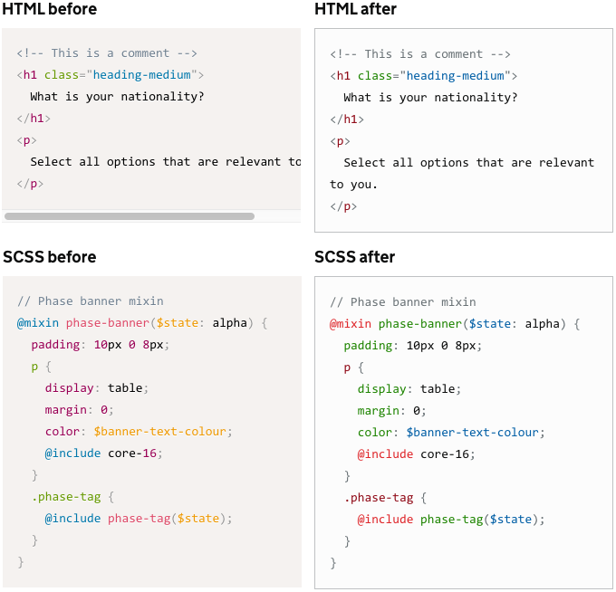
Last week we carried out some work on the GOV.UK code syntax highlighting to make it more accessible. We updated the colours used in code examples on GOV.UK to make them more legible.
The previous colours used a default colour scheme that had not been checked for accessibility. Several of the colours used did not meet our minimum contrast requirement of 4.5:1 between text and the background behind the text.
This meant that people with a visual disability could struggle to see some of the examples.
The changes are minimal for HTML but, as you can see above, greatly improve the contrast for SCSS and other code languages.
A small but significant update
The new colours attempt to balance the conflicting needs of being dark enough to meet contrast requirements whilst also being distinctive enough to see the different elements. They’re not quite as nice as the previous colours in all cases, but they are more legible.
Right now we’re using dark-text-on-light theme, as this style fits best where code examples are included with other content. We may also add a light-text-on-dark theme if needed. This is an easier choice as most bright colours have good contrast with dark backgrounds.
Using the new colours
The new colours are already in use on GOV.UK Elements, and we'll use them in future projects where we need to display code examples.
It’s a small change, but we aim that everything we make be accessible to as wide a range of people as possible.


2 comments
Comment by Artem Zakharov posted on
How do you measure contrast?
Comment by Ed Horsford posted on
@Artem there are free tools that can do this. I use the free Paciello Group colour contrast analyser.
We've written a bit about colour contrast in more detail on the accessibility blog: https://accessibility.blog.gov.uk/2016/06/17/colour-contrast-why-does-it-matter/