Steve Borthwick is an interaction designer working at the Department for Work and Pensions. In this guest post, he writes about how his team iterated the Check your State Pension service and halved the number of enquiries around their biggest query.
The service

The new Check your State Pension digital service has been in public beta since April 2016
We’ve been iterating and testing different design approaches using insights from our user research to make sure the service meets user needs.
We knew that it was important to understand more about how people plan for their retirement and what information they need to know about State Pension to help them do this.
The user research we did in discovery helped us understand the most important user needs for the service. They sound simple, because they are.
Someone planning for retirement needs to know:
- when they will get their State Pension
- how much State Pension they will get.
Designing for user needs
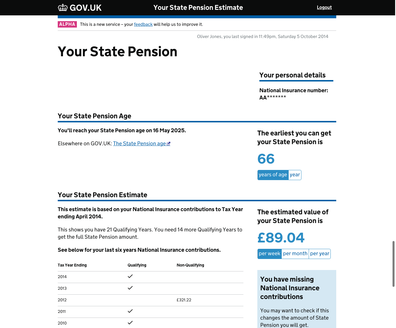
This is an example of an early prototype.

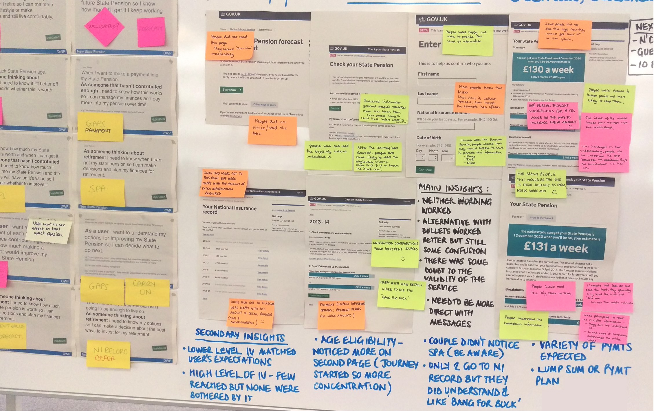
When we tested the designs, people found it difficult to quickly find the information that really mattered.
Because it was an early prototype, we were able to move on quickly, iterate, and test a different design approach. We started again with user needs – thinking about what content was really important to people.
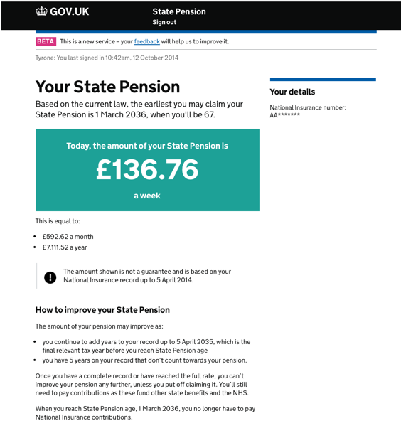
This led us to use what’s often referred to as the ‘bank holiday’ design pattern – a simple, clear layout which works well on mobile as well as desktop. The bank holiday page on GOV.UK is where most people go to find out when the next bank holiday is. This is the most important information on the page and the design reflects this. It focuses on one thing.
We used the same approach for our design to emphasise what we believed was the most important thing people needed to know: how much their pension was worth. We then combined this with other supporting information like telling people the earliest date that they would be able to claim their pension.

This much simpler design approach tested much better with users of the service.
Doing the hard work to design the right thing
This is where the hard work really started.
We’ve continued to iterate and test variations of this design approach to help us understand what’s important to our users – and what isn’t.
We’ve tried many different approaches. For instance, stepping people through their pension value today and then showing them a forecast of the amount they’ll get at State Pension age.
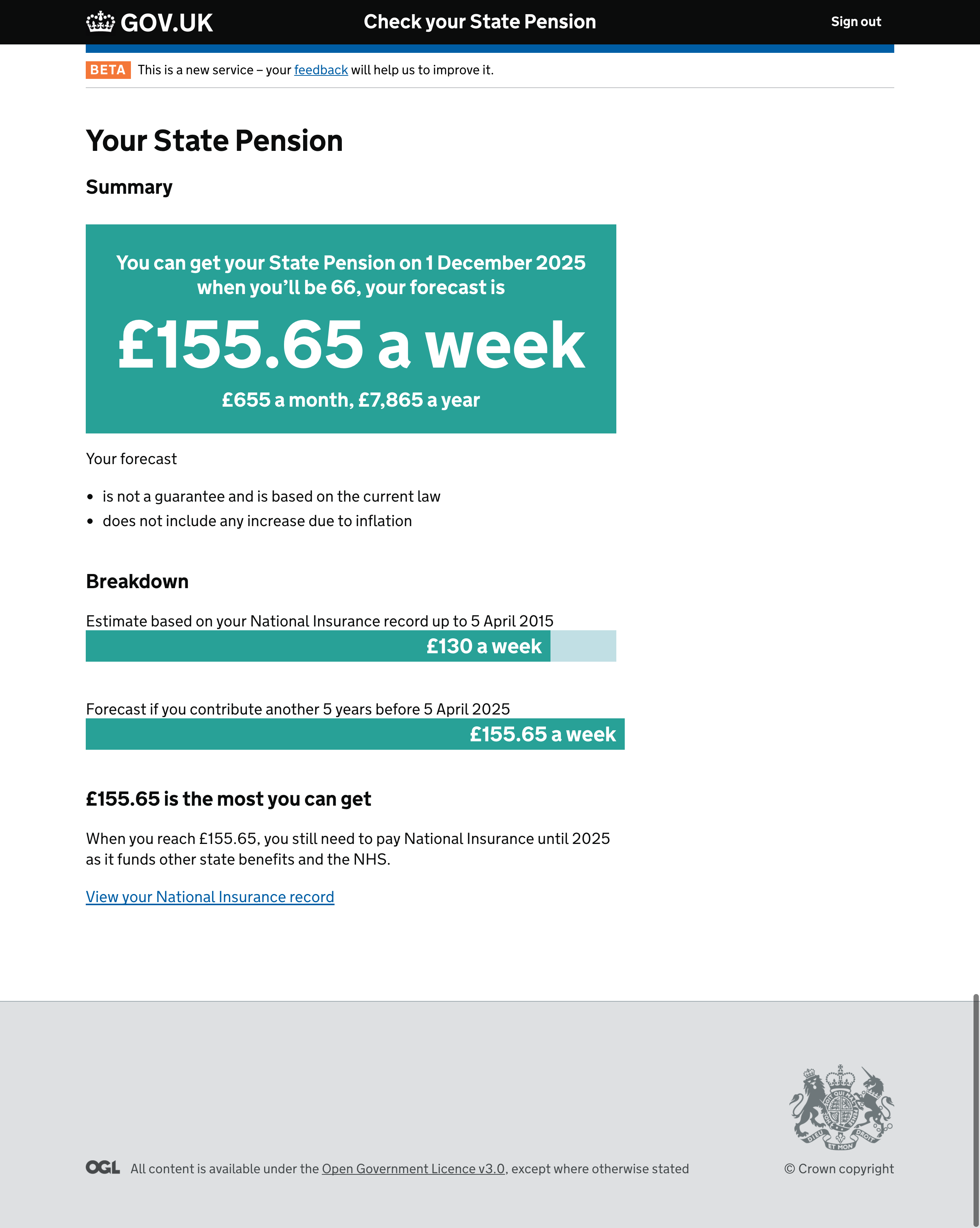
Testing this confirmed that what users really want to know is what they are going to get when they retire. As a result the main focus of the page became the forecast. We only show their current State Pension value as secondary information if people haven’t yet reached their full pension amount.

Simply showing this progress visually really helped to get across where people are on their journey and that the amount is linked to their National Insurance contributions. This is important because we found when people understand this, they understand how they might be able to improve their pension amount.
This is about meeting the needs people have after finding out how much they will get and when they can get State Pension. They need to know what their options are.
Improving the public beta service
In order to deliver a service that works well for people it’s really important that we don’t stop iterating and learning. Getting the service to public beta was just the starting point.
In public beta we’ve already had over a million people use the service. We’re using feedback and web analytics from the live service to prioritise what new features to develop and test how effective they are.
For example, the biggest query we had about the State Pension amount was "What's the most I can get?". We stripped out a lot of generic information and legal caveats and made the messages more personal. After that the number of enquiries related to this dropped by 51%.
We’re mindful that introducing new features and content shouldn't negatively affect the most important user needs – knowing when they will get their State Pension and how much they will get – for the service.
For most users, we believe that meeting these needs will still be enough.
