GOV.UK Verify is the new way to prove who you are online, so you can use services on GOV.UK safely, and securely. It lets people safely sign in and use government services using a certified company. No single organisation has all your information, so your data is more secure. You can find out more in this blog post.
It's the first of its kind anywhere in the world. This means that the verification process is not what people normally expect, and it can be hard to explain such a new system that involves a lot of difficult concepts. In early testing, most people would get very confused and lose confidence in what they were doing.
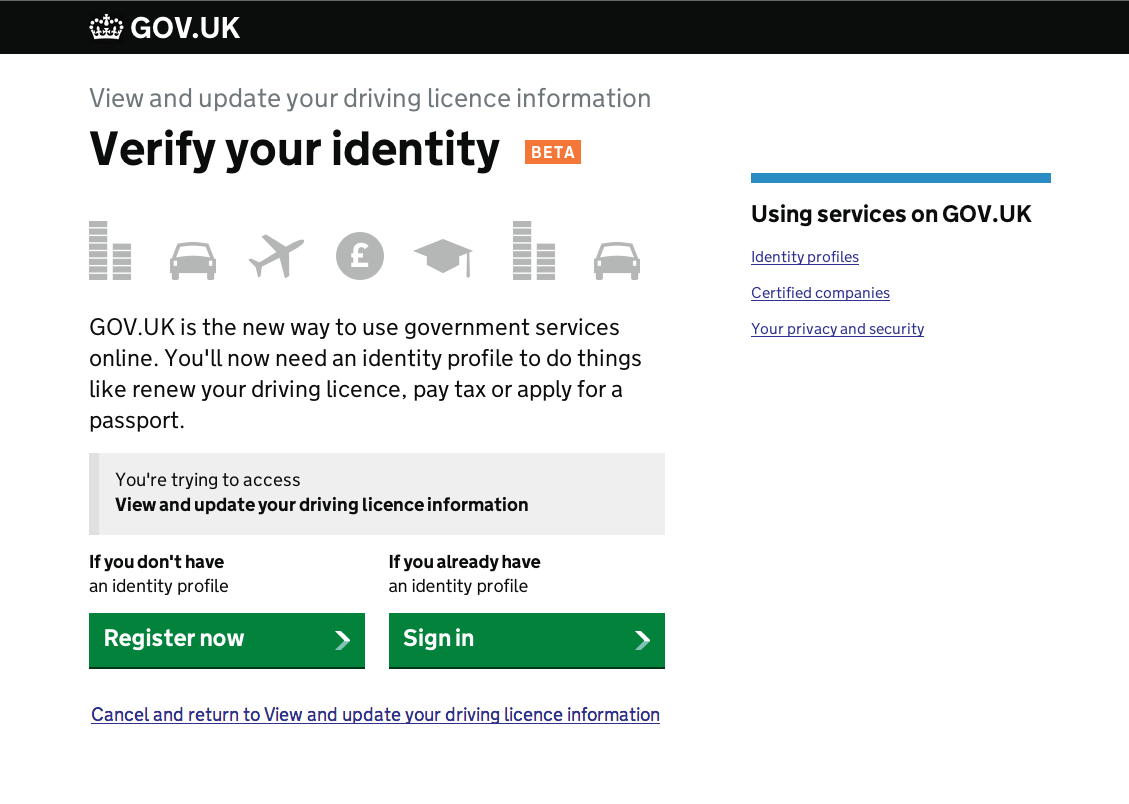
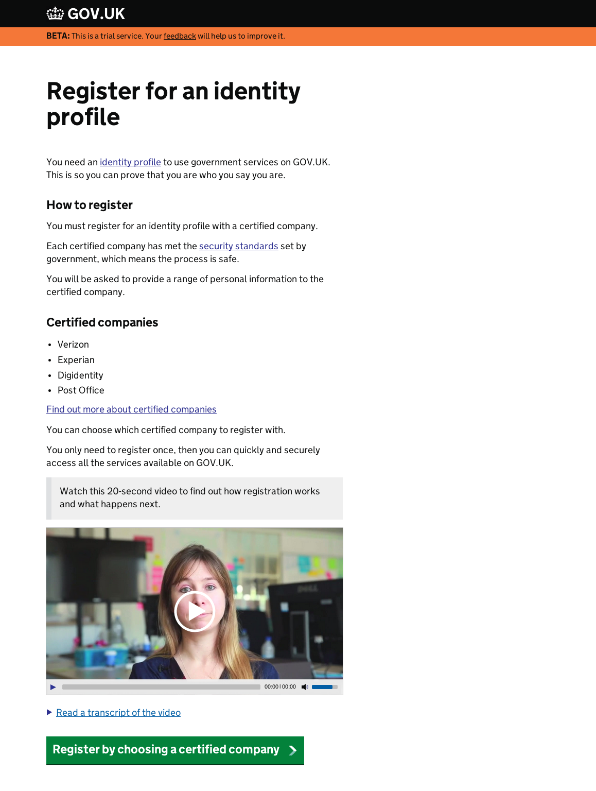
To help people understand GOV.UK Verify better, we tried using a video. In it, some nice people at Government Digital Service explained the key points. Here are some screenshots of that version:
We tried different versions of the video until we found the best combination of information and length.
It was successful - people who watched the video had better understanding, and were far more confident and comfortable with the process.
However, when we launched the trial version of GOV.UK Verify, we could see in our statistics that very few people watched the video. We also knew there would be situations where people would simply not be able to watch it (for example at work, without being able to listen to the sound).
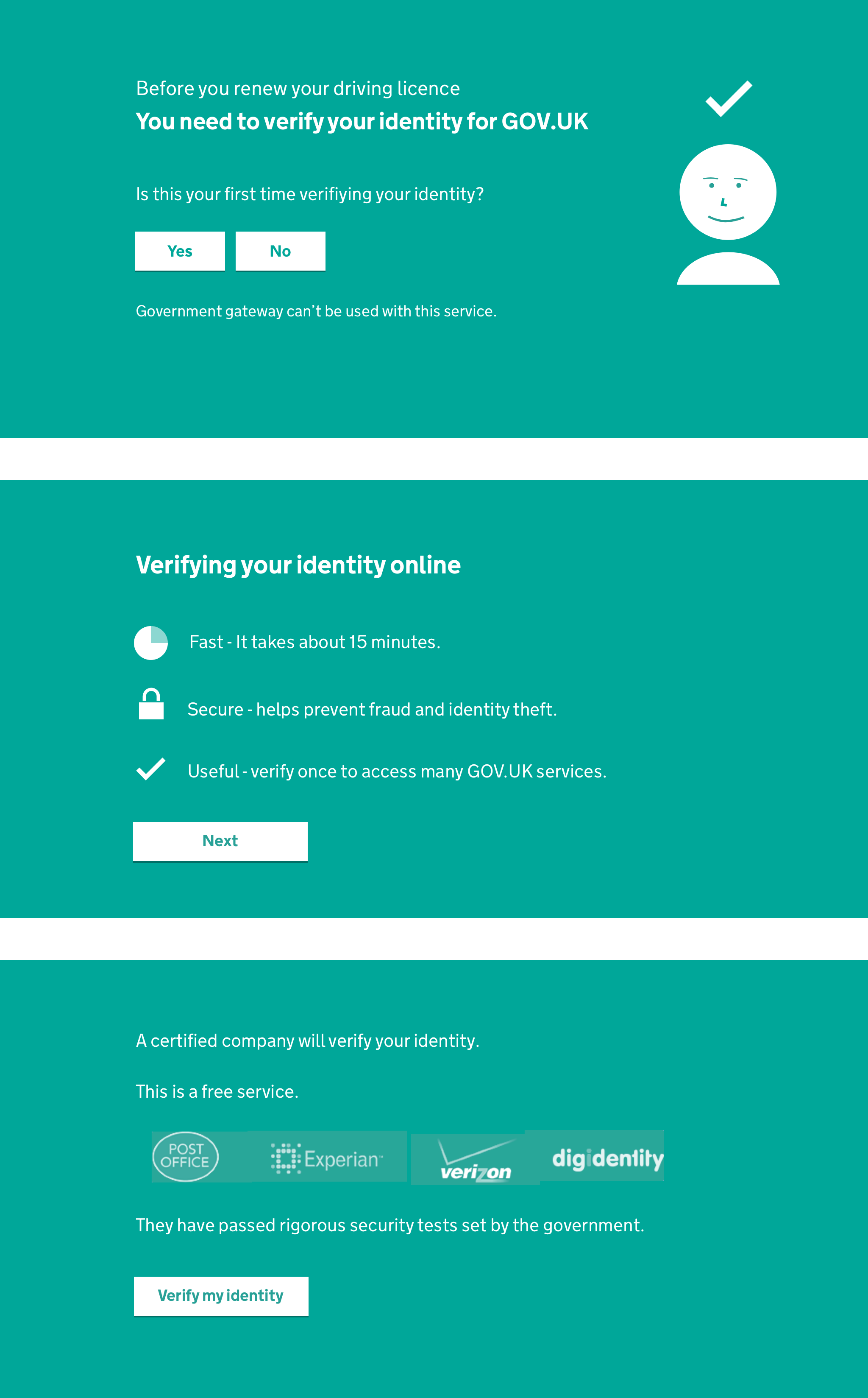
So we investigated a new solution that wouldn't rely on video: a set of slides to give everyone the key points step by step. This is a design pattern used by many mobile apps, and recently web sites too.
Here's an early version of our slides. You can see the latest version in the company car tax service.
In user research we found that general understanding and confidence was not as good as when people watched the video. However, more importantly, more people were taking in information because everyone saw it.
Using data in the design process
Having tested various versions of the slides with users until we found the one we were most confident with, we then ran a test with large numbers of people to make sure this was the right direction.
We set up two versions of the prototype - one with a video and one with slides. Both prototypes showed a full GOV.UK Verify journey, from the start of a service through a (fake) verification process. 600 people took part in the test, with half seeing one version, and half the other. At the end of the prototype, everyone got a short survey to measure understanding and confidence.
Results
Completion rate
The percentage of people who completed the whole journey. (Note that we provided an 'I would rather not do this online' button to let people know they didn't have to complete the test, and explained this in the introduction).
Video: 47%
Slides: 61%
Ease of use
The percentage of users who selected that the process was 'easy', or 'very easy' to complete
Video: 55%
Slides: 68%
Perceived task time
The percentage of users who selected that the process was ‘a bit quicker than expected’ or ‘much quicker than expected’.
Video: 30%
Slides: 46%
Satisfaction
The percentage of users who selected ‘satisfied’ or ‘very satisfied’.
Video: 55%
Slides: 70%
Understanding
We tried to measure understanding by asking a few multiple choice questions about how GOV.UK Verify works. These numbers show people who answered every question correctly, however they are not statistically significant because we didn't have enough people answer all the questions.
Video: 27%
Slides: 33%
What we learnt
It's important that everyone is able to take in information about GOV.UK Verify, and that's not possible with a video. Our lab research and large scale test gave us the confidence to use slides instead.
However, while in general the slides tested better with most people, people who said they only had 'basic' computer skills had a higher completion rate in the video version. This might be because less confident people are more likely to watch a video, rather than skipping over it. We'll be continuing to investigate this and improving GOV.UK Verify for everyone.


