At the Rural Payments Agency, we’ve been thinking about how to design services that work well for both new and regular users.
The users of the Rural Payments service fall into 2 broad groups:
Farmers use the service each year to claim for farm subsidies. The amount they get is based on the land they own and what they use it for - it's a lot of information to provide. The average age of a British farmer is about 61 and a lot of them don't use computers too often.
Land agents manage things like Rural Payments on behalf of farmers. Some manage up to 1000 farms (though the average is much lower), and they need to gather and enter information for all of them.
We want to meet the needs of both groups, without designing two separate services.
Wizards and dashboards
On GOV.UK we’ve often used the wizard design pattern for services. Examples include Pay your car tax, Claim Carer’s Allowance and Register to vote. Wizards work well for first-time or infrequent users because they guide them through an unfamiliar process step-by-step.
On the other hand, regular users can find wizards a frustrating experience. They want to complete tasks in an order that suits them and they value efficiency more, because they’re going to be doing this lots of times.
Having your cake and eating it
To accommodate the needs of both groups we’re planning a hybrid approach:
- structure the service in a dashboard-like way
- when people access part of the service for the first time, route them through the screens step-by-step, like a wizard
Here’s a diagram showing part of the information architecture of the Rural Payments prototype - the coloured lines show the routes that first-time users take (click to enlarge it):
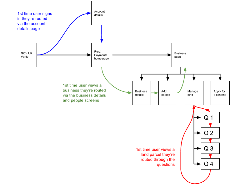
Check your details
The blue and green routes illustrate an additional benefit you get from this approach: you can redirect users via preferences and account pages to get them to do things like check their details, which can be trickier with a dashboard.
Same but different
One thing that became quickly apparent was that you sometimes need to tweak things like page titles and submit button text slightly if you're routing someone through pages for the first time.
What’s next
We’re developing these ideas in a HTML prototype, which we’ll take out and test with real farmers and agents. If it works, we’ll let you know.

2 comments
Comment by John Beale posted on
Probably reading it wrong, but the 'Once a year' group, ie the individual farmers who need the wizard approach would not be first time users in subsequent years, but would still need the same approach wouldn't they?
Comment by Tim Paul posted on
Hi John, thanks for your comment.
Yes, from what we've seen on other services a year is long enough for people to forget how to use a thing, so it pays to imagine them as first-time users. Also, if the service is improving iteratively it might be quite different a year later.
Perhaps 'infrequent users' is a better phrase.