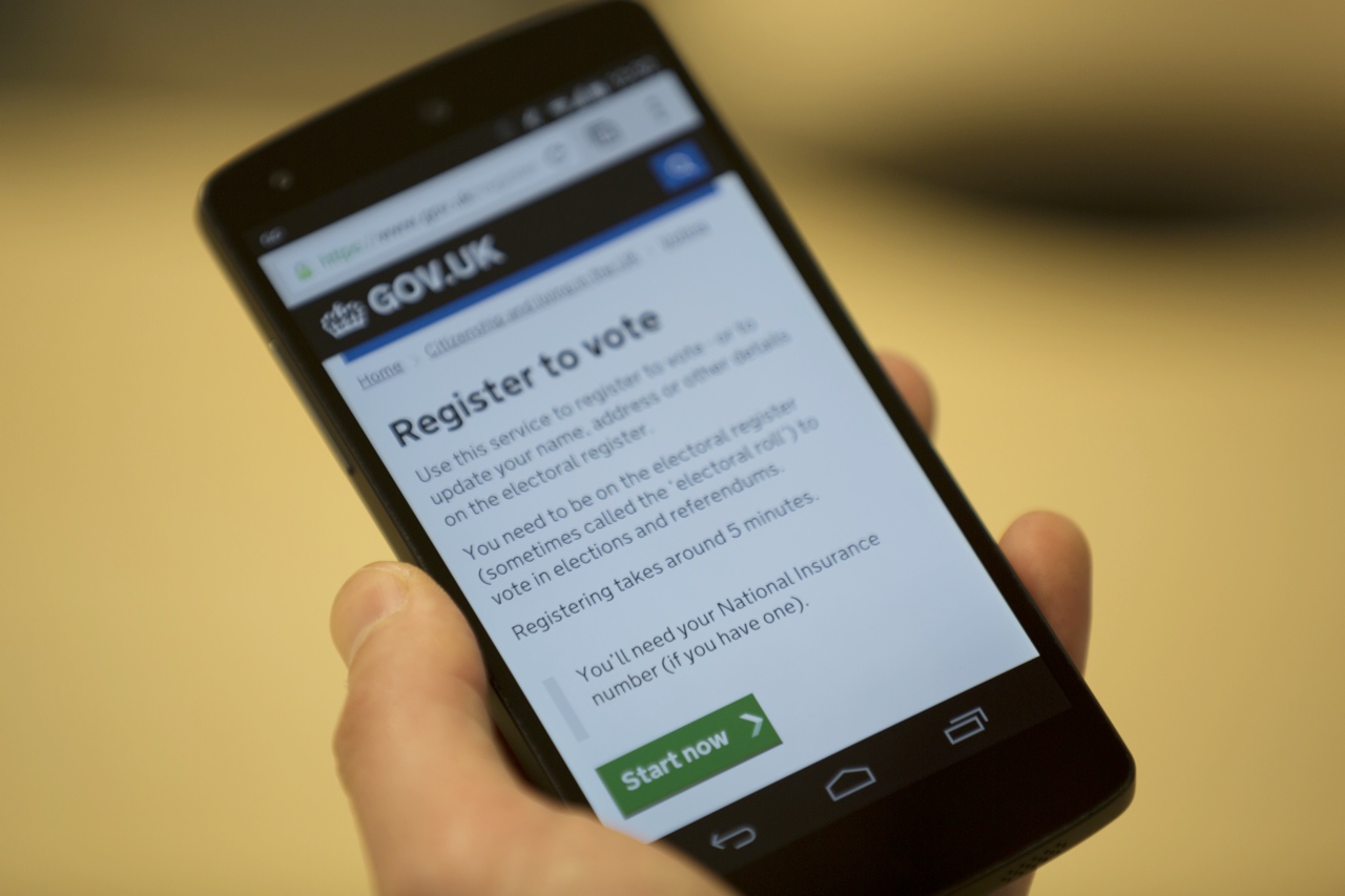
We recently launched 'register to vote' on GOV.UK. It's a service that will be used by a broad range of people, so we really tried to make it as simple and straightforward as possible. Here are a few things we learnt along the way.
1. Designing for mobile can make it better for everyone
We began by designing ‘Register to vote’ for mobile phones. There were two main reasons for this:
- The number of people using mobiles to access GOV.UK is rising rapidly: 24% for January to June 2014, compared to 16% for the same period last year. We expect this trend to continue, our statistics are public and you can keep an eye on how people access GOV.UK.
- Designing for the constraints of mobile is useful - if we get the fundamentals of the service working on small screens and slow network speeds, it can work on more capable devices.
This meant that we started with asking just one or two questions per screen, making it very manageable on mobiles. When we sent this early design around internally for comments, a common response was that it felt odd on large screens. And so we planned to have the process adapt so you could see more questions at a time on larger screens.
However when we started user research with the general public, we saw a very positive response to the simple step by step approach, even on large screens. Though it added more clicks, people said it made the process feel simple and easy - there wasn’t too much to take in and process at any one time. So we stuck with the simpler screens for everyone.
The approach gave us other advantages. For example, say someone makes a mistake answering a question: entering an email address with no ‘@’. The mistake and how to correct it is a lot clearer if the question is on the screen. With longer pages, it’s common for the question to be off the top or bottom of the screen, making it harder to find.
2. It’s easier to discover what to add than what to remove
When we began the design process, there were various pieces of help text and interface elements that we felt people might need. For example, we had text on the screen to help people with their National Insurance number - what it was and where to find it. But before we went into user research, we removed a lot of this help. By doing this we could find out if people really did have the difficulties we predicted. We could see what proportion of people had problems, and what specifically the problems were.
This was a powerful technique - we found that very few people had problems with National Insurance numbers. In fact we saw many people who would say “Oh, I’m strange - I know it off by heart” - they were not as uncommon as they thought.
Seeing that very few people had a problem on this step enabled us to hide the help text behind a link - making the screen simpler for the majority.
3. The right words can make a big difference
When people have problems with an interface, it can be a temptation to add more text. In our experience this is rarely helpful - the more information on the screen, the harder it is to take in and understand.
Instead, it was much more effective to try different words and phrases, and try other approaches to questions and answers.
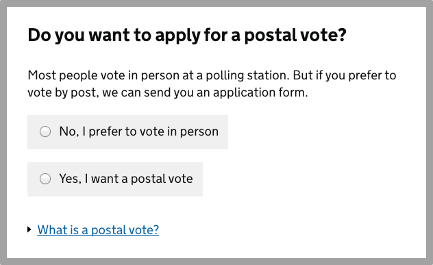
For example, we began with a question that referred to ‘voting by post’. This is where you can send your voting choice by post, instead of going to a voting station. In user research some people seemed to struggle with this concept - thinking that perhaps it referred to the polling card being sent to them through the post.
We did two things that made this clearer and simpler for everyone - we referred to ‘postal vote’ and set up the question with two answers that helped explain the situation:
Experimenting to find the right words helped solve similar problems throughout the process.
At the time of writing, 'register to vote' has a satisfaction rating of 95%, and we continue to look at feedback and try to improve things. If you're interested in reading more about the project, here are some more posts:
- Under the hood of IER - about the technology involved with 'register to vote'
- I fought the law and the users won: delivering online voter registration

10 comments
Comment by Joe Clark posted on
You have an errant closing quote (never ever use ’smart quotes’) in the first graf.
Comment by Sean posted on
"Things we learned". When you say "learnt", it's when used as an adjective (a describing word).
For instance "My knowledge of grammar is learnt". When you're using it as a verb (a doing word), it's "learned" i.e. "Today, I learned something".
Today you learned about "learned", hopefully that's your lesson "learnt".
Your friendly neighbourhood grammar enthusiast <3
Comment by Bob posted on
Sean, are you sure? Sounds like an Americanism.
Comment by Steven posted on
Sean, this is all pretty much not true.
1. Learnt is a verb, and rarely if ever an adjective.
2. Learned is a verb and an adjective.
3. Learnt is actually more common instead of Learned in a UK context.
http://dictionary.reference.com/browse/learnt
http://www.oxforddictionaries.com/us/words/learnt-vs-learned
Comment by Rob Pearson posted on
I love that the desktop view 'felt' wrong internally but tested well. Intuition not a great guide.
The idea that you strip out items for testing is also really interesting. You clearly had a hypothesis that these things might not be necessary, but it takes courage to give the users what you suspect might be less than they need.
I'd be interested to know how you actually did your public testing - numbers and style (coffee shop? more formal?)
Comment by Joe Lanman posted on
The key to both of those points was our regular rhythm of user research, and research starting at a very early prototype. Then you're moving from 'we've worked hard on this and just want to test it's ok' to 'let's test different basic ideas and design solutions to the problems we see'.
The researcher on our team, John Waterworth, did a mixture of lab testing and testing in public places like community centres. We also tested with specific groups who have different registration paths (people in the armed forces, people who've lived overseas, etc).
Comment by John Waterworth posted on
Hi Rob,
As Joe says, we did a mix of lab and popup sessions. Popup sessions were a really good way to reach specific groups (eg students, people with disabilities, homeless people, overseas voters, service voters).
Through the project we tried different versions of the prototype and the beta service with nearly 250 people over 33 research days.
That regular research heartbeat gave us the space to try lots of different ways to frame questions, and lots of different wording for microcopy. And once we settled on something that worked, we still had time refine it further.
Government stakeholders often want to see lots of guidance, definitions, warnings, etc in a service. But if you start out with all that text in your prototype, it's very hard to take any of it away later. And it's tempting to add ever more explanation when users are confused.
We started with few words and then tried to remove anything that wasn't clearly useful. When stakeholders argued that we needed to add or change some text, we could quickly test whether that helped or hindered users.
I found it a fascinating project to work on. We learned (sic) a lot that we can carry forward in transforming other services.
Comment by Pawel posted on
Very good post!
In one of my previous projects we also used data from Google Analytics to decide regarding menu items. Did you notice any other interesting trends in your data, apart from big mobile devices growth?
Comment by Sam Jewell posted on
How can I fork these pages from Github. I'm told by a little bird (Jack Franklin) that they aren't open sourced? Could you possible open source the front-end, or strip out the things that are more sensitive?
Comment by Tom Byers posted on
Hi Sam, we're still working on open-sourcing this code. In the meantime, if you let me know the parts you're interested in I should be able to point you to the code you need.