At the start of this year a few of us started working on two new guides for the Government Service Design Manual. They're aimed at designers, researchers and front-end developers who are building services for GOV.UK.
Design style guide
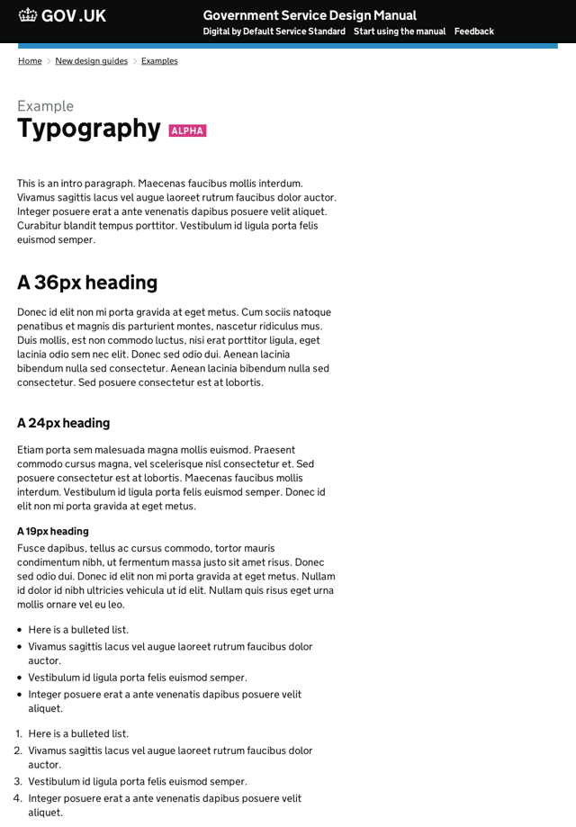
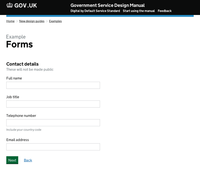
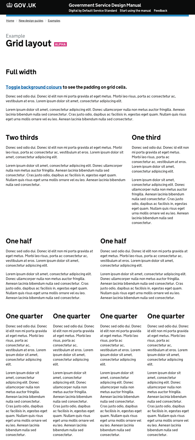
The design style guide explains how to style and arrange basic elements like like headings, paragraphs, images, form fields and buttons. We've included code and examples to help you achieve the same styles in your own work.
Design patterns
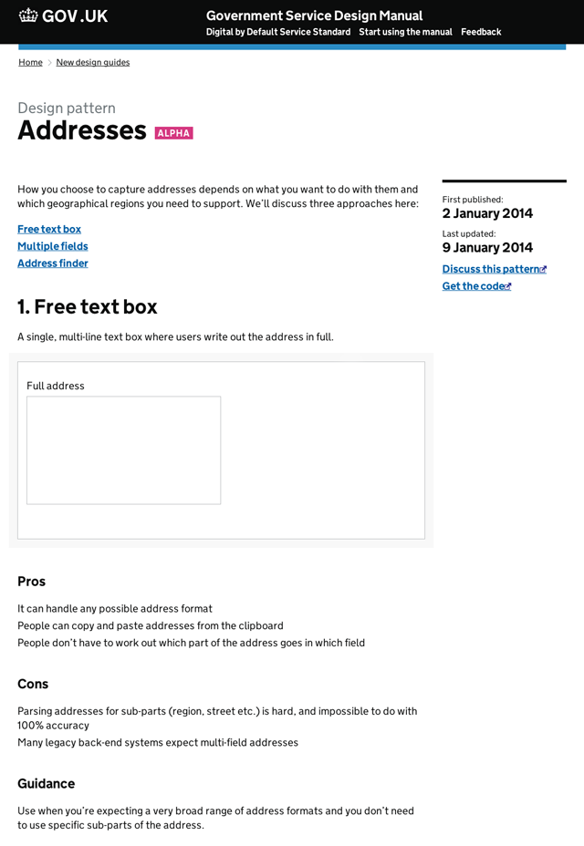
The design patterns show how to combine those basic elements into re-usable components that address specific user needs. We've started with a few common ones (addresses, dates of birth, people's names and progress indicators), but we're gathering information for many more from across government on this wiki.
What's next
You can view a prototype of the above guides here.
We'll continue to iterate the content and design of the prototype as we learn more about what the users of the guides need. We'll be talking to designers, developers and researchers from across government to find out more. If you're one of those users, let us know.


2 comments
Comment by Peter posted on
The design style guide explains how to style and arrange basic elements like like headings.
Double words in their, fellas--Like Like.
Comment by Tim Paul posted on
Thanks Peter. Someone very helpfully did a pull request on the prototype fixing the typo for us (thank you, David P McCormick).