I’m helping to redesign the foreign travel advice content on GOV.UK. When it moved over from the Foreign Commonwealth Office we used a format we already had. Over time we’ve realised this format doesn’t perform as well as it should, so we’re redesigning it to better meet user needs.
As part of this I had a look at the analytics of the index page to see how it was performing, and found something interesting about how people use the related links.
Related links are other pieces of content which the user may find relevant when reading about a topic. The links can either point to other GOV.UK content or external sites, and are based on internal searches and subjects that the content designers feel may be relevant to the user.
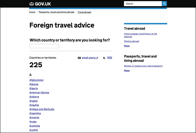
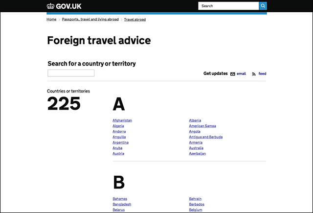
But looking at the analytics, just 0.5% of users click on the related links. There is no evidence to prove that users are lost when they arrive at this page - users are not going to the search box to go elsewhere, nor are they clicking on the related links. They were not meeting a user need, so for the latest iteration we’ve removed them.
By removing the related links on the right hand side, we can use the full width of the page to list countries side by side. This means users will be able to see more countries at a glance, and the ability to scroll and search becomes more obvious
Related links across the site
When I looked at the 5 most popular pages on the site, I found that related links were only getting around 0.7% of the clicks on a page.
How they’re used varies. In some cases there are lots of links - too many to choose from - in others they aren’t always relevant. However, in Lana’s blog post ‘The search is over...almost’, she looked at how picking the right related links can greatly reduce the number of searches on a page. On the Student Finance guide for example, the link to the login page was getting 21% of the clicks because that’s what users are really looking for.
What's next
So far we have learnt that related links are more successful in some formats compared to others. As we iterate these formats we will continue to measure and evolve the related link pattern.
In the meantime, when picking related links, we need to check:
- the amount of related links on the page
- what users are searching for
- if the link would be better placed in the content itself


4 comments
Comment by John Beale posted on
Very interesting. I'm guessing you tested how vistors arrived at the 'Foreign travel advice' page? I just tried a few searches from the home page such as 'travelling abroad' and 'travel advice' and to be honest I didn't have much success unless I included the word 'foreign'.
I might be completely wrong, but I'm not sure 'foreign' is a key search word here - apologies if you've tested and it is! (Interestingly, searching straight from google gave very good results).
If you navigate, rather than search (maybe having failed at that), then finding the page is a piece of cake. Start at the GOV.UK home page. You probably notice 'Passports, travel and living abroad' (easy to spot, easy to understand, no need to look any further). Then you see three clear headings 'Living abroad', 'Passports' and 'Travel abroad'. 'Travel abroad' sounds promising - and then you see 'Foreign travel advice' straight away. Hoorah!
If that is in fact a typical journey, then the related links in this example would be to things you've already seen and rejected - so no clicking. Could that explain it?
Comment by Amy Whitney posted on
Hi John,
this is the first iteration, we are currently doing research on travel advice and world wide content - we will be working on improving the user journey as part of this work.
I will make sure we write a blog post about the improvements we make - would be great to get your feedback again once we have iterated.
Thanks,
Amy
Comment by Stephen Cronin posted on
Personally, I think the related links would work better if they were directly after the main content, rather than in their current position which many people don't see due banner blindness (ie ads normally go there).
Comment by Amy Whitney posted on
Hi Stephen,
thanks for your feedback. We have been thinking about this a lot lately and have been playing around with the "related" links in different formats. The "renew a tax disc" start page has related links at both the top and bottom of the content (https://www.gov.uk/tax-disc).
We are also currently thinking about how to make them more useful - we will share this with you soon.
Thanks,
Amy