Going through the stages of discovery, alpha, beta and live is how government should do things. Beta means that the service is not completely finished but it will still do everything it’s designed to do and must follow the same rules for accessibility, cookies and privacy as existing services. This is the best way to get real feedback from real users, which helps us improve the service. That’s what we call ‘iterative design’.
We’ve already defined what we mean by beta for people who build services on GOV.UK. If that’s the level of detail you’re looking for, you can find it in the Service Manual.
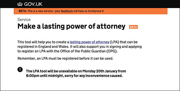
If you have recently used one of our exemplar services, such as the lasting power of attorney, you may have noticed that there is a banner saying beta on the page. The aim of this has been to get feedback from users, so that we can continue improving the service. It also has an educational purpose, as services that are in beta will change. Beyond that, we hoped that explaining that the service is in beta would encourage users to be patient about any teething problems they may have.
But is this working?
We have been testing the beta banner within the service. Most users hadn’t noticed the explanation. If they had noticed it, very few knew what it meant. However, none of the users said they were put off from using it by seeing the word beta.
If users don’t understand it, aren’t interested or put off by a service being in beta, why do we explain it within transactions?
One of the reasons is because users need to understand there may be two versions of a particular service at one time: a legacy and a beta of the new service. Organisations like Google and the BBC often release betas to help improve the experience for their users. Betas may be better than older services, but they may still have minor problems that need working out. When we are satisfied beta services meet the high standard we have set ourselves, they will replace the legacy services.
Another reason we want users to know that a service is in beta is because we build things in a dynamic, iterative way, which is focussed on what users need. Highlighting that it is in beta shows users and departments that making government services doesn’t end when we release a beta. We don’t rest on those laurels. Instead, we keep learning from our users’ experiences, so departments can continue creating simpler, clearer and faster services.
Finding the most effective way to explain beta to users
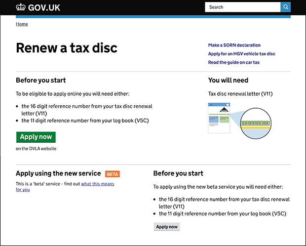
We currently only explain what beta is within the service. We need to test how people respond to seeing the beta label and we’ve started to do this on the renew a tax disc start page, so users can make an informed decision whether to use the beta or the legacy service.
Next, we will be testing what type of feedback we get when we mention beta on the survey at the end of the service. We also have a link to the help page where we offer a user-friendly explanation of beta. As you would expect, our beta explanation is itself in beta; we will continue to make it better.


1 comment
Comment by Eric Shrive posted on
I have just used the 'beta' option to renew a vehicle tax disc.
It was easy to use and straightforward.
However, there is up to a 20-second time lapse between hitting the proceed button for the
particular stage and it refreshing to show that the proceed command has been accepted and processed. There is no icon or caption to show that the system is dealing with the step and also you are presented with an 'empty' version of the details you just submitted. This is confusing and would almost certainly lead to lack of confidence in the system and repeated re-submissions.
I tried using the feedback on the taxdisc page, but that then led to requests to configure Outlook, with no option to submit the feedback directly from that page.