What are we trying?
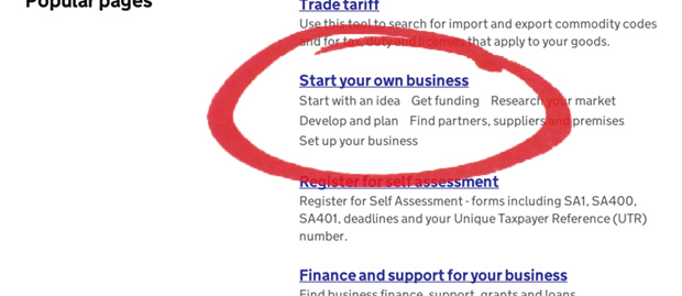
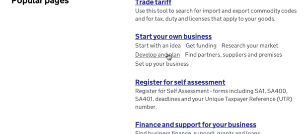
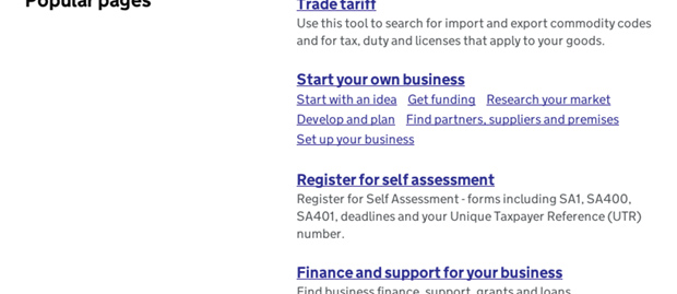
In almost any other circumstance on GOV.UK we would expect an anchor link to be coloured blue, and underlined, set in bold (or both) depending on typesetting context and user need. But on the Business and self-employed browse page we've been experimenting with some links looking like normal paragraph text, with underlines on hover.


Why do we think this is useful?
Too many links, too much decision-making load.
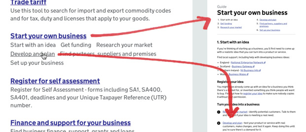
If the user doesn't know what they're looking for, having all the subsections as links forces them to make a choice about which to click on, but that choice is unnecessary because they all lead to the same guide.
If the user does have experience in this area and knows what they are looking for, the subsections are important because the guide is actually a collation of what used to be several documents, which have now been combined into a single sequence. If you're going to list the subsections in the interface, making them unclickable seems like deliberately withholding a useful feature.

What context is this relevant?
Affordance - all the links lead to the same guide, just to different parts of it. If the user doesn't discover that the subsections are links, they'll click on the header anchor and still end up in the correct guide.

How will we know if it works?
We've done some lab-based testing with a small sample of users using a laptop. They all instinctively tried hovering over the subsection titles and discovered that they were links. Which is as we hoped.
We'll look at analytics, see how this affects the numbers.
We also need to look into discoverability with non-cursor interfaces like iPads, where users won't get the hover style.

3 comments
Comment by Guy Moorhouse posted on
If this post had the equivalent of a like or favourite button, I would have clicked it.
Comment by Sam Wakeling posted on
Good idea - really useful for lessening cognitive load. I wonder if it would be a good idea to have a standard more subtle visual indication that such text is a link for touchscreen devices without hover - like keeping the grey body colour but with a pale/dotted underline?
Comment by Paul Gregson posted on
It's certainly far clearer without all the additional blue links. Page navigation is always a problem when covered in obvious links and I think this is a great solution helping quick and easy navigation without too many distractions. Hopefully it will be adopted across .gov sites.