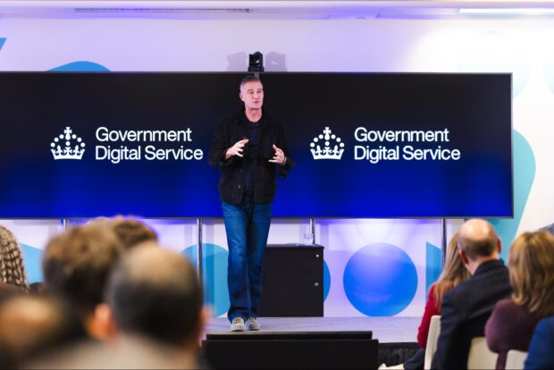
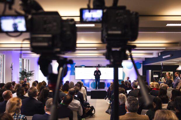
It's been a really busy start to the year in the Government Digital Service (GDS) and in our design team. Just a couple of months ago, we launched the blueprint for modern digital government in an event that included a speech from our Secretary of State, Peter Kyle. The announcement included the news that teams from GDS, the Central Digital and Data Office (CDDO), the Incubator for AI (i.AI) and colleagues from the Geospatial data team and the Responsible Technology Adoption Unit would merge together as the new, strengthened Government Digital Service, within the Department of Science, Innovation and Technology (DSIT).
Ahead of the announcement, we had to work out what the new visual identity was going to look like. This post is about how we approached designing a logo fit for the new digital centre of government. We are sharing how we approached the work, what the final output looks like, and how we’re using it.
The new Government Digital Service
The UK government has a well-established brand identity system that requires departments to use standardised coats of arms, specific colours and logo formats. This simplifies the overall visual identity for government departments, saving taxpayers’ money and reducing the potential for confusion.
It was important that the new Government Digital Service logo visibly echoed this identity system, supporting our new connections with DSIT and placing us within the larger structure. However, we also knew that recognition of the brand is high amongst public sector professionals and people who work in digital (both here in the UK and internationally). We were tasked with maintaining this so that we can continue to attract talent, and to retain the positive associations that have been built up with the Government Digital Service over the years. We had to deliver the work quickly, robustly and at no additional cost.
To meet these objectives, we redesigned our visual identity around three significant changes:
- we added the Tudor crown throughout
- we adopted the colour palette of GDS's department, DSIT
- we created a set of well-formatted, more flexible layouts for the new logo
We believe the outcome works well with the existing government identity system and sits comfortably under and alongside DSIT’s identity. Through retaining the Government Digital Service workmark within the logo, we are able to build on our established reputation, while the visual changes also signal our increased scope, welcome new colleagues in, and create a bold foundation for all of the exciting work we’ve got coming up.
Using the Tudor crown
Working to a brief set by Government Chief Product Officer, Chris Bellamy, we explored various names and visual executions before agreeing with our stakeholders to use the recently redesigned Tudor crown instead of the more traditional coat of arms used by DSIT in most contexts (for example in official publications). We worked with the DSIT Digital Communications team to ensure the new treatments were consistent and complimentary with DSIT’s parent brand. And we worked with the Government Communications Service (GCS) to make sure that any treatment supports their work on the overall government identity.
There are some good reasons for doing this. Firstly, the Tudor crown symbol has very high levels of recognition already, due to its association with GOV.UK, the public-facing website and brand launched in 2012.
Secondly, in a recent change to the overall government identity system, the Tudor or ‘digital’ crown now serves as the single identifier for all government departments in smaller-format digital spaces (including social media avatars and mobile notifications), with differentiation provided through setting it against the relevant departmental colour as a background.
For our new identity we went a step further than this change by integrating the crown symbol into our formal logo, and into the Government Digital Services’s organisation page on GOV.UK too. Doing so creates a connection between our external public-facing and internal civil service identities and pays homage to what the organisation had previously achieved (which remains a source of pride for many) whilst also creating a more approachable, informal and ‘digital’ impression than the more official and heraldic coat of arms.
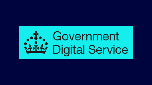
A bolder, more flexible brand
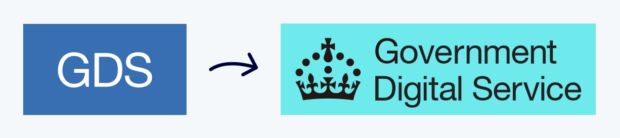
We knew that our use of colour had to reference the wider DSIT colour palette, so after some design exploration we landed on two main colours: the cyan and the midnight blue. At the same time, we took care to typeset the logo properly and create layouts (‘lock-ups’) that work well across a range of contexts. We have a ‘formal’ version, as well as an acronym version, and a fully spelled-out version.
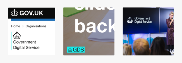
We’re used to working with the Tudor crown and with Helvetica Neue, so creating arrangements that work was a familiar and enjoyable challenge. Some of the main places you can see variants of the new logo include our GOV.UK page, our slide deck template, and our social media profiles like this one on LinkedIn.
We believe that the new Government Digital Service identity is able to stand on its own better than our previous logo was, and also allows us greater flexibility to appear across platforms and contexts, both now and for the future.
Bringing it into the office
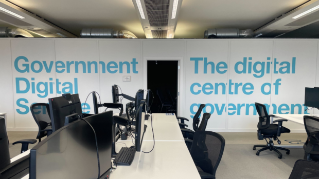
The launch event was a great moment to share assets and guidelines on how to use the identity with colleagues, to welcome them into the new Government Digital Service, give them the opportunity to feel part of what was happening, and to make the overall rollout and switchover more consistent and effective. We also took the opportunity to give our workspace a minor ‘glow-up’, including some refreshed posters showcasing our product line-up framed around the office (available from Github), some tweaks to the on-screen data dashboards that show how people are using our products in real-time, and some impactful vinyl wall decorations in a few judiciously-chosen areas of our office floor.
In some of our assets, you can see that we deconstructed elements of the Tudor crown and use it in the physical space, as well as on some of our social media and on publication covers. We’re still exploring all the ways we might be able to use this, but we like the flexibility it offers and how clearly it references GOV.UK.
How did we do this?
As is frequently the case, we had to work at pace in a small team of designers, together with trusted colleagues. Overall, we had around 8 weeks before the event to do the work, which included the end-of-year holiday period in the middle. This really tightened the cycle of design, critique, accessibility testing, sign-off and installation, and we were only able to move as fast as we did because we were enabled by great support and backing from our leadership. In developing the creative routes, we found it helped to set out all the possible options - including some we wouldn’t normally recommend - at the outset, in order to be able to move quickly in ruling things out with stakeholders and getting to an agreed shortlist as swiftly as possible.
Now we’re on the other side of the official launch, we’re able to start iterating the work based on feedback from colleagues who are actually using the materials day-to-day in documents and presentations. We’re making it easy for people to suggest ideas, and regularly get together as a team to respond to them. We’re keen to build on this start and keep developing this new identity in the months ahead.
