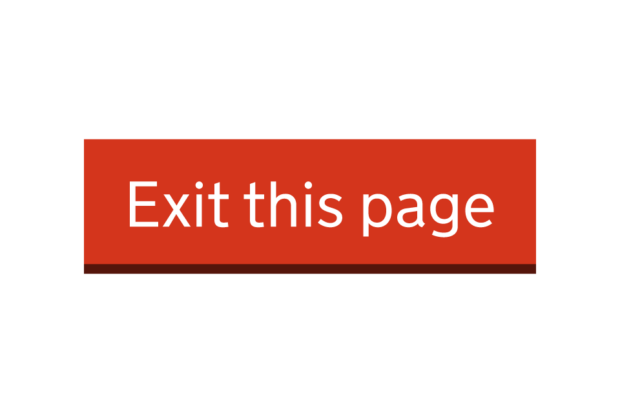
The GOV.UK Design System team have released Exit this page, a component which helps users quickly leave a page or site. It was originally suggested by Rob King at the Ministry of Justice (MoJ) following a collaboration between MoJ, the Department for Work and Pensions and the Scottish Government (GOV.SCOT).
GDS's mission is to design and protect the user experience of government. This work supports that by helping vulnerable users.
Exit this page aims to reduce the risk for users when seeking information and using online services. This component addresses the crucial need for consistency of approach in design and functionality across government.
The team were aware of the potential for sensitive or dangerous situations, so they carefully navigated between making a simple, accessible feature and one that would not further endanger the user.
We started by building a prototype service of Exit this page using the GOV.UK Prototype Kit. We used this prototype to conduct research with people with a lived experience of domestic abuse and people with accessibility needs.
Finding out the users’ needs
Building a component within the Design System always starts with the needs of the user. This is even more essential when the finished component is mainly for vulnerable people and by focussing our research on these groups we get more accurate data than if we only tested in a lab.
As researchers, we have a duty of care to participants. The priorities were to avoid re-traumatising participants, while also caring for our own mental health. Our researcher applied trauma informed practice principles to organise and conduct the research in a way which minimised the risks to participants.
Integral to this approach was a collaboration with Hyndburn and Ribble Valley (HARV) Domestic Abuse Moving On Team, which supports people with a lived experience of domestic abuse. HARV’s involvement was essential in recruiting psychologically resilient people to be participants and providing trusted support to those participants during research sessions.
Jenny H Winfield, Kate Every and Jax Weschler also write constructively on practical approaches and things to consider when researching and designing with trauma in mind.
Part of our research showed we needed to improve how we communicated to users what the component does and does not do, how it affects browsing history and what happens with the information a user puts into a service. We also discovered changes were needed to make Exit this page work better and more consistently for people who use assistive technology.
Designing for the user
Exit this page already had substantive design when it came to us from MoJ. Our main aim was to work out how to visualise 'the button' within a user journey.
A significant debate for the team was how we could draw attention to the button without putting someone at more risk. This was especially challenging on a mobile device, as the button changed format to become a bar across the width of the screen. After testing whether to continue having the button at the top of the page to mirror the desktop experience, we decided it was too prominent on the smaller screen, potentially putting the user at risk. We also considered interoperability issues with other components within a service, such as the accessibility of drop down menus. As a result, we decided to place the button at the bottom of the page, where it was easy to access, did not impede other elements of the service and was more discrete.
For this component, some of our iterations included:
- removing a second tab - the first prototype opened a new tab when the user engaged with the button, to help hide the page they were on. However this confused users who were unaware a second tab had opened and were unable to return to the service they were using
- removing history scrubbing - originally, we replicated how similar components used JavaScript to remove the last page the person had visited. This proved impossible to do consistently and effectively in a multipage service. Significantly, it gave users a false sense of security.
- simplifying and splitting our content up into an interruption page and safety content page - research showed us that users struggled to take in information about the service, how the component works and how to keep themselves safe online in one place.
Making the content clear
With Exit this page, we tried to achieve a balance between how the component functions and how it offers the user a way to obscure their online activity. We needed to clearly explain what the component does and how to use it, while keeping the information discreet. That meant efficiently explaining things where we could and reinforcing this through the design and text of the button.
Writing content to reinforce the user’s understanding of the component also comes with some constraints. For example, button text and screen reader announcements needed to concisely explain what happened when they pressed ‘Exit this page’.
User research showed us the user is likely to be in a stressful, time-sensitive situation and they often held assumptions about what would happen to their data and browsing history. To try and help with this, we decided this component and pattern needed to include a way to inform the user about online safety and privacy, so we’ve included guidance for service teams to add safety content as part of Exit this page.
What the component does
While the Exit this page component appears to behave in a similar way to a normal hyperlink, we needed to make sure the component is accessible. Many of the component’s technical features will not be visible to users, but they are vital to ensure ease of use and user safety.
Keyboard activation
Users of assistive technology can press the shift key on their keyboard 3 times to activate the Exit this page component and navigate away from the page. We initially used the escape key for this feature which only needed to be pressed once. However, we made several detrimental discoveries while investigating this approach:
- the escape key is a common key used in other software, such as screen reader software, so configuring the component to activate by pressing the esc key only once could result in accidental activation
- the HTML specification states the escape key cannot trigger “transient activation”, (a state in a browser which walls off a number of features unless the user has interacted with the page in a meaningful way), meaning the component could not use the escape key on its own to navigate to a different page
- several browsers bind the escape key to the functionality of stopping page loading, meaning it would be easy for users to accidentally block navigation to a new page
We re-designed the button and decided on pressing shift 3 times to activate functionality. This action is common across different keyboards, easy to carry out for users with motor difficulties and does not control any existing functionality when pressed on its own. To make this even more robust, we prevented activation when the shift key was pressed in combination with other keys or if another key was pressed between the 3 shift presses.
We additionally added visual “traffic light” indicators to the component to show how many times the user had pressed the shift key and how many presses remained before the component activated. We also added built-in screen reader announcements to the keypress functionality, so screen reader users know how many presses were left, when the keypress functionality had timed out and when the button was successfully activated.
Page overlay
An additional safety feature of the Exit this page component is making the web page go blank when the component is activated. This is to hide any content during the time between the user activating the component and the new page loading. This is to better protect users on slower internet connections.
This feature does two things. It hides the contents of the page body and creates a page width and height white block to cover the page. We do both these things because:
- only hiding the body copy risks interacting negatively with any existing styling or classes which could override our attempt to hide the page
- only adding the white block allows screen reader users on poor connections to continue to interact with the page content under the block, creating confusion for the user and potentially disrupting the Exit this page journey
Making sure everyone can use it
When making features in a website accessible, such as an Exit this page component, there are methods to simplify the work such as having:
- text explain what the feature will do
- the feature do what the text says it’ll do
- ways for all device setups, including assistive technologies, to get the feature to do what it says it’ll do
For Exit this page though, we dealt with some unique challenges. There is tension between stating clearly what the Exit this page component does, and tailoring it to the sensitive or dangerous situations in which it will be used.
Looking at the first method above, we have text that explains what the feature will do. Directly on the button is the text “Exit this page”. Looking at the second method, that text decently explains what Exit this page does: it exits the page by navigating to a new page. However, looking at the third method, we also needed this feature to work for all kinds of device setups with various assistive technologies. It’s here that our straightforward ‘Exit this page’ text started to raise concerns, especially for people using voice command software tools to navigate.
If someone is using Dragon on a Windows computer, or Voice Control on a Mac, how could they discreetly activate the Exit this page component without audibly commanding their device to “Click exit this page”?
We explored adding a ‘disguised’ alternative name for the button, or adding another hidden button with a less conspicuous command name, such as “click BBC Weather”. But these options had two flaws. Having a ‘disguised’ name for the button would likely interfere with other assistive technologies that rely on descriptive and accurate labels. Additionally, we would need to write content specifically for people who use voice command tools, attempting to explain to them that the secret command exists.
We’ve determined that alternative navigation options like the ‘item numbers’ tool for Voice Control are an adequate way for people using voice command tools to discreetly activate the Exit this page component.
To make decisions about these challenges, we relied on user research, advice from experts, reports from users and manual tests of our prototypes. In particular, we had the component audited by the Digital Accessibility Centre, an organisation that tests services with real users with accessibility needs.
Next steps
We have plans for future improvements, using more research and cross-departmental collaboration.
Making this component available is not the end of its journey. The team is keen to learn from others who use the component in the coming months so we can improve it.
If you’re in a service team and interested in being part of future research and improvements to this component, you can contact us on govuk-design-system-support@digital.cabinet-office.gov.uk.

5 comments
Comment by Terry Brooke posted on
Hi, this is an interesting idea and I can see the reason for something like this to exist, here are some further thoughts for you to consider:
How can you be sure that everyone that needs to know, will know of this shortcut from the text on the screen? Will you repeat the text on each page of a multi-page journey to help with users that might struggle to remember the instructions?
The visual indicator on the button is only useful when the button is visible on the screen, long pages or users of screen magnification software may miss the visual information.
Touch screens - On iOS you have to double press the shift key on the virtual keyboard to enable caps locks. I sometimes press it multiple times, once I remember I need to double tap after pressing it once, so I then press it once again to switch off and then twice to enable caps lock (total of 3 times in a row)
How can you ensure people with conditions like tremors will not suffer from accidental activation? Accidental double click prevention was added to the GDS standard button (as an option) to prevent users double submitting forms for that reason.
Pressing the shift key already belongs to Windows to enable sticky keys (pressing 5 times) what happens to the user in that scenario?
I'm slightly confused why you have used a link and then changed the role to a button and then added keyboard activation support (space key) via javascript when you could have just used a button?
I assume it is for the service manual requirement of progressive enhancement (JavaScript disabled / unavailable) but the component would fail anyway as the user couldn't activate it via the space key without JavaScript, which is now required as you have declared it as a button.
Having said all that, I am interested in how this component will develop, keep up the good work!
Comment by Romaric Pascal posted on
Thanks for your remarks and questions Terry, that’s a lot to look at!
We’ve gathered our research findings and reasoning in GitHub discussions. There’s some information on our thinking for the button positioning as well as a summary of our user research which may answer some of your questions. We’re also tracking the behaviour of the component with the iOS keyboard on GitHub as well.
We’d welcome any contribution in these spaces, whether starting new discussions or commenting on existing ones.
Thanks,
Romaric,
On behalf of the Design System team
Comment by Tobias McVey posted on
Hi! It's great that you have put this much thought into a simple and accessible solution for your users.
What do you think about recommending users browse anonymously? Almost all browsers support browsing in a private mode that leaves no traces in the browsing history after the tabs are closed.
Another option is to encourage users to visit the page only while they are in a safe place. For some that might be a public library, or at a trusted friend's home.
Does your research address these options?
Comment by Owen Jones posted on
Hi Tobias. Thanks for the comment. It's a fair point to make and lines up with our research findings. Often there are other, peripheral means to stay safe in a potentially unsafe situation. That's why we've recommended teams include a separate safety content page on our website which includes advice on staying safe online such as using private browsing, and deleting your browser history.
Owen, on behalf of the Design System team.
Comment by Gavin posted on
I have seen conflicting information on the use of an exit button. In part this goes against WCAG by implementing specific localised solutions for what is essentially a browser use issue. I have yet to see an exit button that does not have the potential to put a user at risk - and they may not 'perceive' 'understand' this in the intended moment.
I was wondering how much research was done on an alternative, as focus is 'trying' to improve, get the button to work. For example, what research has been done on overlay page (pop-up to hide the real url) until user exits or accepts - here we can then educate the user, (more than you can do with a button). to open in safe browser mode, and use a keyboard shortcut/swipe to close window, risk of monitoring by abuser. This could be faster, plus reduces range of risks and can go beyond the current site.
I have seen many sites put an incognito user at risk with a button, as it loads another page in incognito rather than closes! Many home set ups will have router logs, parent controls, spyware all of which could be monitored. Many don't clear that domains history, those that do, don't clear (auto search terms record), or even the history of the google search. Many sites have documents that get downloaded (no exit button on document, plus file in downloads), Many sites signpost to other sites, some may have no exit button the user got used to, others will put it on the other side of the screen etc.
I can see why people request the button - just not sure if a 'button' is actually going to work as intended, or user to understand exactly what just happened when they clicked it (false sense of security). Other tech options? or even for government to lobby google, Microsoft for better clearer controls, or public awareness campaigns.