At the Ministry of Justice (MoJ), we’re reworking our classic Form Builder into an online application called MoJ Forms that is currently in private beta phase.
We hope this will help users create government forms quickly and easily.
To accomplish this mission, we realised we needed to not only use the existing GOV.UK Design System, but to go beyond it.
The GOV.UK Design System is fantastic. But as most of its components and patterns are made for public-facing services, they focus on simplicity and effectiveness – so that anyone can use them – over efficiency – how fast they are to use.
MoJ Forms target users are different: they are professionals, likely to be more digital savvy and they will use our product more frequently as part of their jobs.
Every minute spent using it is a minute they won’t have to do the rest of their tasks. So our tool has to be fast.
What we’ve added
Just because our users have different needs than the general public, it does not mean we need to start from scratch, far from it. Most of the GOV.UK Design System components are still appropriate.
But some of the interactions in our tool were slower and more confusing than they had to be, so we used new components not in the Design System to improve them.
MoJ Forms is a web application, not a website. While the underlying technology is the same, the level of interactivity required is not, and the experience needs to be closer to a typical computer application than a series of pages to browse through. So it is no surprise that some of the components we have added are classics of software design: inline editing, contextual menus and modal dialogues.
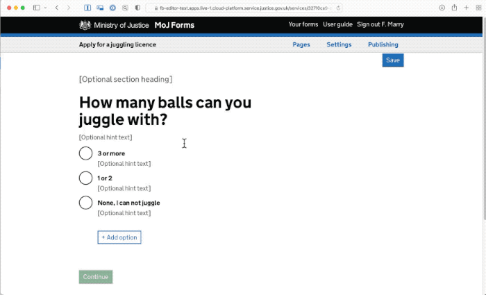
Inline editing
When we decided to modernise our legacy Form Builder application, we realised it followed some of the GOV.UK design principles too strictly. For example, it took ‘one thing per page’ too literally, and made you navigate to another page (and back) every time you wanted to edit anything in your form. While it was using the simplest of design patterns (a link to a new page), the interaction was slow and disorientating.
For MoJ Forms, we wanted the interactions to be much faster, and to avoid the confusion created by losing your place navigating back and forth.
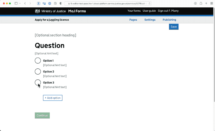
We’ve used a simple native HTML attribute (‘contenteditable’) to allow the copy in each part of the form to be edited, simply by clicking it.
As the styling is always present you can see what the form will look like as you go.
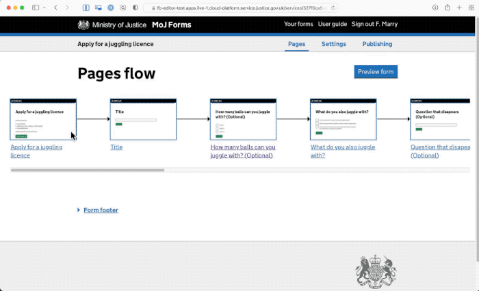
Hierarchical menus
Navigating through pages and subpages was also the way to select a template for adding a new page in Form Builder. These use a standard pattern, simple radio lists, but are very cumbersome. 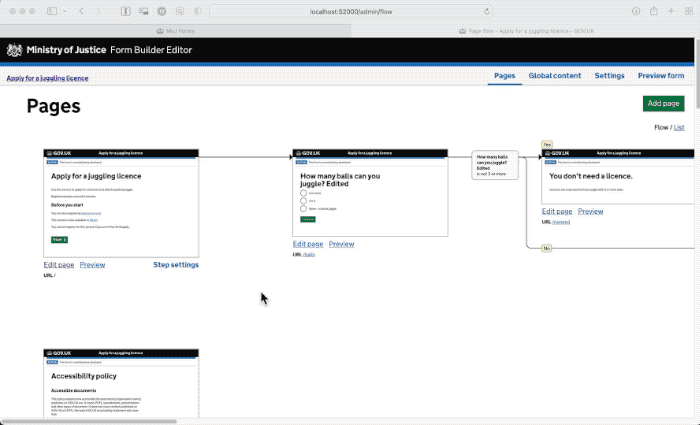
Software design has long established a pattern to pick an item from lists: hierarchical menus.
These menus allow the user to quickly pick an option in lists and sublists, without needing to reorient themselves. So when adding a new page, it’s easy to click on the ‘add page’ button and pick ‘single question page’ in the menu, then ‘radio buttons’ in the submenu. This is much faster and easier than having to navigate to a full new page to see each level of options.
Modal dialogues
In some cases what we need isn’t just picking an option from a list, but answering one or several questions using a very short form. Modal dialogues allow us to do that quickly. They’re great at capturing a short amount of information without losing your place.
Research and tweaks
When we ran research on our new designs we learnt that it wasn’t immediately understood that the form content could be edited in place. So we added a focus on the first field when you open each page to make this editing capacity visible. Following that update, we haven’t seen any more confusion.
For the contextual menu and the modal dialogue, we got the feedback we were hoping for… which was absolutely none at all. No participant noticed anything unusual, and they used the new parts without a second thought.
While this could be seen as anticlimactic, that’s the goal of our design: to be usable, and unremarkable. Eventually, our participants had no issues using edit in place, menu and modal dialogues. These patterns have been in place for decades, just not on government sites.
Other users this could help
The core tenet of user-centred design is that your design should be appropriate for your users and their tasks. As our users are different to the general public, who the GOV.UK Design System was built for, it’s no surprise we had to adapt it.
Many of our MoJ colleagues also work on designing software for colleagues. These often involve case management systems and can be anything from managing the transfer of people between prisons to reviewing power of attorney applications. Just like MoJ Forms, these systems need to be used by professionals, repeatedly and for long periods of time, so they also need to go beyond the GOV.UK Design System.
At MoJ we’ve got an internal professional action group working on coordinating our efforts toward standard components and an MoJ pattern library. We also know many other government departments have similar needs, so we’re reaching out to them too, for example through the Designing Caseworking Systems Meetup.
We need to join up our efforts across government to maximise results and ensure we avoid wasting time reimplementing the same things over and over.
Just like we did for citizen-facing services.
Learn more about our new MoJ Forms on its product page, or let us know in the comments of any similar patterns you have created for your own work.

3 comments
Comment by Michael McNevin posted on
How does the proposed 'Hierarchical menus' (image5.gif) look responsively on say a tablet or phone device?
Love the article and answers some questions about of 'Is there a time where its ok to deviate from a Design System?'
Comment by Fabien Marry posted on
Hi Michael,
As our product is exclusively used by MoJ staff for their work and we know their work devices are laptops, optimising the editor for other devices is not something we've prioritised for now.That's yet another way our user needs differ from the GOV.UK Design System as a whole.
Since this post was written, we've simplified the menu so it has at most 2 panels. It works just fine as is on tablet (as the submenu also open on tap) and works ok on mobile (just need a small scroll).
Comment by Michael McNevin posted on
Thank you for your further clarification and explanation, its much appreciated and makes sense.
One other question I have is...
If you make exceptions to the rules and guidance set out in a Design System for rare circumstances i.e. when usual guidance doesnt fit for the best solution... how do you manage other deptarments using this as a goto excuse for not following DS guidance?