The Design System team at GDS have updated how typography and spacing is defined in GOV.UK Frontend, the new frontend codebase which will replace Frontend Toolkit and GOV.UK Elements.
GOV.UK Frontend is currently in private beta with a small number of teams. This means that when it becomes available in public beta, teams across government will be able to have a single, consistent way of applying typography and spacing.
Why we did this
While we were developing GOV.UK Frontend, we looked at typography and spacing on a number of services across government and on GOV.UK itself. We found there was a large amount of variation in how spacing had been applied to typography and layout. This is in terms of the values themselves, the CSS property used and the direction that the spacing had been applied to.
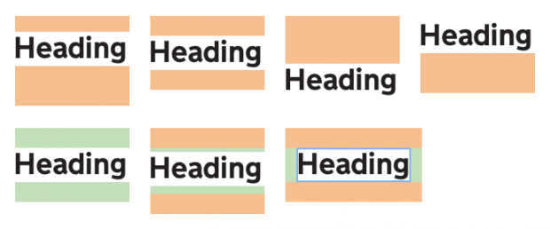
The existing typography code from Frontend Toolkit, although functional, contains multiple concerns that can make it hard for new developers to understand or edit.
To add another layer of complexity, many government services also use GOV.UK Elements, which sets additional spacing on top of those defined in Frontend Toolkit.
As GOV.UK Frontend will replace both Frontend Toolkit and GOV.UK Elements, we took the opportunity to start afresh with the typography and spacing styles. Here’s what we did:
Setting the basic principles
We drew on our research for the GOV.UK Design System, which is also in private beta. We also looked at regularly occurring issues designers and developers across government have, which come up in the Design Community Google Group and Slack channels. From this, we came up with some basic principles for this work:
Margin should flow in one direction
By aiming for a uni-directional margin where possible, it will be easier to control the layout and avoid any unintended additional space.
Typography defines the spacing for everything else
Once all of the margins have been defined through the typographic hierarchy, these units will be used throughout the design of components and pages.
A user can override defaults easily without adding new styles
We know there will still be times when people may need to override the defaults set in GOV.UK Frontend. It will be possible to override font-size, font-weight, margin and padding within the HTML.
New styles don’t leak or override existing classes or HTML elements in an existing service
As most government services are iterated over time, it’s important that new styles don’t affect the appearance of any existing styles from GOV.UK Elements or Frontend Toolkit.
Teams should be able to include GOV.UK Frontend in their services and not see any difference until a new component or class is used.
Getting the right values
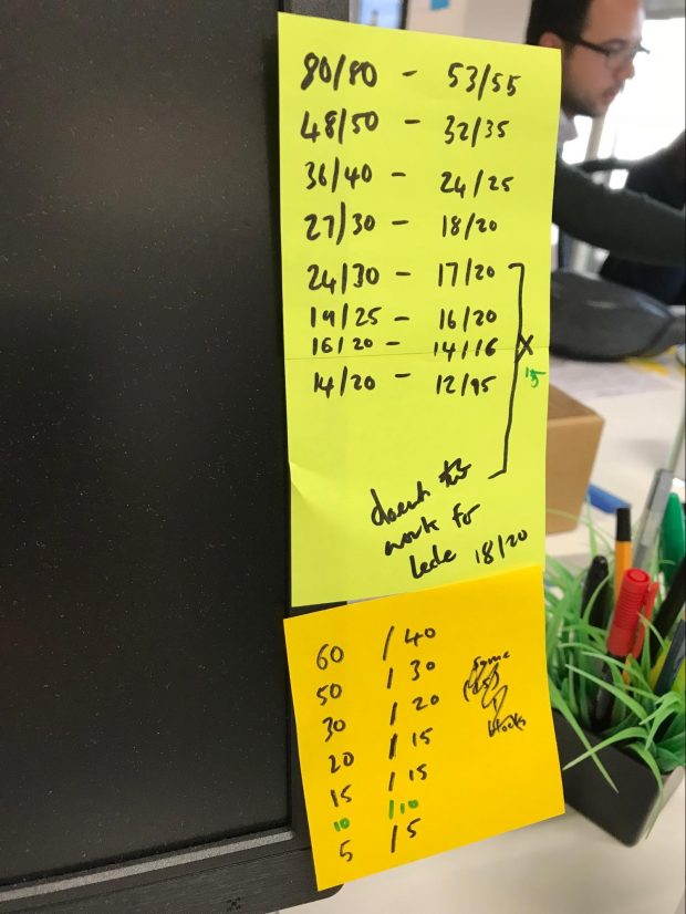
Font-size and line-height is very consistent across services, so we decided to not make any changes to these. Our initial focus was on defining default spacing values for our existing font sizes, for both small and large screens.
Once we had prototyped these values with long-form and short-form content, we refined them into a single responsive scale to be used throughout everything built in GOV.UK Frontend.
For example, a h2 heading, having a 30px margin-bottom on large screens and a 20px margin-bottom on small screens creates a relationship that is reused on all components with a 30px margin-bottom.
Creating the code structure
GOV.UK Frontend CSS architecture is inspired by Harry Roberts's work on the ITCSS (Inverted Triangle CSS) methodology.

Each layer that compiles CSS uses different prefixes for class names:
- the 'Core' layer uses govuk-
- the 'Objects' layer uses govuk-o-
- the 'Components' layer uses govuk-c-
- and the 'Overrides' layer uses govuk-!-
Following this, the new typography code was split into separate concerns: settings, helpers, core and overrides. The same separation exists for defining spacing units independently.
Settings
In the settings level of our CSS we use Sass maps to define font-size and line-height for both different size screens and print.
For example, here is the map of 48px type: ‘null’ in this case is the default size on mobile, ‘tablet’ represents tablet and larger, and ‘print’ sets custom sizes when printing out the page.
580838891678103895975a_000000
The settings layer is also used to define the variables for the spacing scale.
580838891678103895975a_000001
Using Sass maps again, we defined the responsive relationship between sizes on the scale. For example:
580838891678103895975a_000002
This means if you use $govuk-spacing-responsive-8, it will equal 50px on large screens and 30px on small screens without needing to define any media queries.
There are a few other variables defined in settings, such as font stacks and font weights.
Helpers
Within the helpers layer, there are a number of typography mixins. These take the units from the Sass maps and define more specific relationships.
If you want to look at the mixins in detail, you can view the code on GitHub.
The final output in the helpers layer is a mixin that combines the font-weight and responsive font-size.
580838891678103895975a_000003
Core
The core layer takes the mixins and defines the classes that users will use in their HTML.
580838891678103895975a_000004
Letting people override
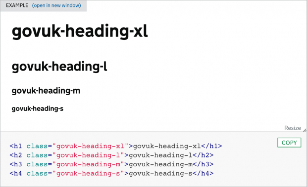
There will be times where people may need to override the defaults. We have provided override classes that can be added to any HTML element.
Overriding fonts
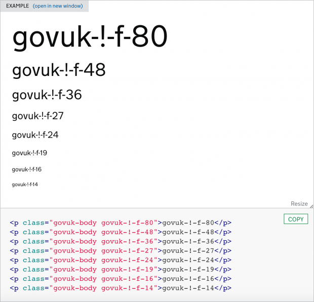
If you want to override a default font-size, you can add a class, for example govuk-!-f-48, which will make the font-size 48px.
If you want to override font-weight, the class would be govuk-!-w-bold or govuk-!-w-regular.
Overriding spacing
To change the default spacing of an element, you can apply a class like govuk-!-m-r9. The ‘m’ stands for margin, the ‘r’ stands for responsive and the ‘9’ is spacing scale 9. Elements with this class would have a margin of 60px on larger screens, and 40px on smaller screens.
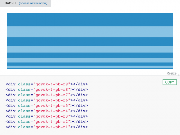
Using the spacing scale within components
Although it’s possible, we wouldn’t recommend using the override classes to define spacing in your entire layout. If you’re building your own components you can include the responsive scale mixin in the same way the GOV.UK Frontend components do:
580838891678103895975a_000005
Contextual adjustments
Although our original intent was to have margin applied in one direction, we made contextual adjustments when required. In certain scenarios, padding-top is added to headings when they follow types of paragraphs.
This padding is only applied in this scenario, not on the heading class when used in isolation.
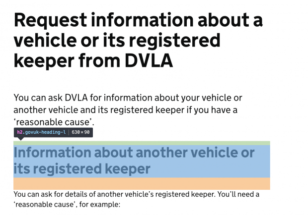
Making sure it all works together
We recreated pages from a number of citizen-facing services and longer form content from GOV.UK throughout development. This helped us refine the values further and consider applications we may not have thought of.
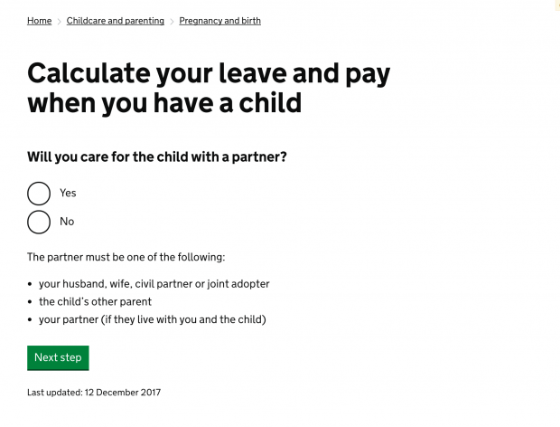
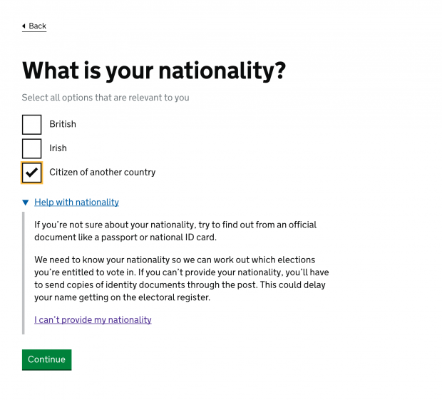
Coming soon!
Both the GOV.UK Design System and GOV.UK Frontend are in private beta. If you want to know more about how you can use them in your service please get in touch with the GOV.UK Design System team at GDS.
In the meantime, you should continue to use the design patterns, components and styles found in Frontend Toolkit and GOV.UK Elements.

6 comments
Comment by Martin Lugton posted on
What was the hardest part of this to come to agreement on?
Comment by Dave House posted on
Some of the overall concepts, such as margin being applied in one direction were already well regarded. We had heard it mentioned a number of times from users while conducting research for the GOV.UK Design System and was generally seen as a good approach amongst the design community.
One subject that has caused the most debate, is of course, naming. Following ITCSS (https://www.creativebloq.com/web-design/manage-large-scale-web-projects-new-css-architecture-itcss-41514731) and BEM (http://getbem.com/) methodologies gives us a number of benefits, but it does mean we end up with some longer, and sometimes unusual class names that could be confusing to users unfamiliar with these practices. This is something we are monitoring with our private beta partners and user research participants.
Comment by John posted on
You may need to know that setting font size in "px" is not good idea (as of 2018), because user with lowered vision can change its font Settings in browser to Large font size, and your site would not reflect that setting. Better use "rem" for font size to have your site accessible for all users.
Comment by Dave House posted on
Hi, thanks for your comment.
Before starting this project the frontend community took part in a review which outlined the pros and cons of px, em and rem.
We’re very aware of the issues when using px units, with users not being able to override the font size on a browser or OS level as opposed to using browser zoom, which works with px.
The most common situation for a user of GOV.UK Frontend will be importing our new components into an existing code base. One of our goals is that GOV.UK Frontend can be imported into a project and not have any effect on any of the existing styles of the users app. Likewise in reverse, an apps global styles should not have any impact on the components that are imported.
Using relative units within GOV.UK Frontend would mean our styles and components could be affected by an apps global settings, such as the root font size. We have seen governments services using a variety of units and measurements on their root, 62.5%, 160%, 19px and 16px which would certainly affect the appearance of our components in different ways if we used rems.
As we’re in private beta, and the typography system we’re replacing uses pixels we have opted to remain using them for now. However this does not rule out the potential for a rem based conversion, or perhaps even a switch to use relative units when creating a new app in the future.
Comment by Matt posted on
Interesting to see the ITCSS implemented. The 'view the code on GitHub' link 404's by the way.
Comment by Genevieve Hassan posted on
Thanks for letting us know, we'll update the link.