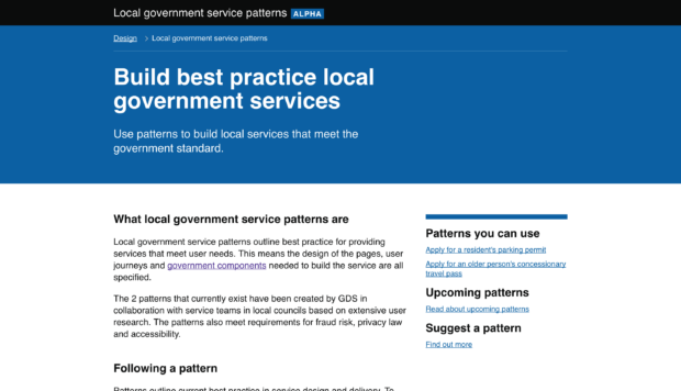
The Verify team has been supporting local councils with end-to-end transformation of a service. It’s the first time GDS has had the opportunity to co-design with local government.
We wanted to see how councils could use GOV.UK Verify to let users prove their identity when accessing council services. Here’s how we’ve been developing local service patterns to do just that.
What are local government service patterns?
GDS has been working on design patterns for central government services for a while. These patterns recommend best practice for designing parts of a service, like naming a service or how the start page should look.
With local government there are hundreds of authorities delivering the same kinds of services. So, there’s an incredible opportunity to produce better services everywhere by co-designing best practice and guidance for all councils to use.
GDS created local service patterns by working with a small group of pilot local authorities to discover best practice. They’re an iterative resource that future local authorities can use and add to. Co-designed and focusing on user needs, they’ve been reviewed by GDS privacy, fraud and accessibility experts. This will make it easier for councils to deliver excellent services that meet the government standard.
The patterns can be understood as iterative policy – documenting the evolution in best practice for tackling both common and diverse local issues.
How we created the patterns
We’re currently running 2 pilots to transform 2 local services using GOV.UK Verify. We’re developing end-to-end patterns for each of these services:
First we ran a collaborative discovery with more than 15 councils to find out what the current services looked like and how well they worked for users. This involved training our local authority colleagues in user research techniques, collectively interviewing more than 150 users, and mapping out the different user journeys to find pain points.
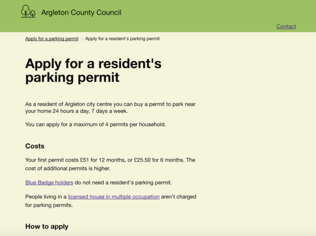
In alpha, we used that understanding to create ‘example services’ for the fictional council of Argleton, made quickly using the GOV.UK Prototype Kit.

Councils then fed back on whether these prototype example services could be implemented locally, based on their policy and technical set-up. We then iterated the prototypes.
Next, we tested them with real users to see how we could improve usability. We used the Argleton prototype and localised variations, branded to look like pilot council sites – enabling councils to research local policy with residents. We did 6 rounds of usability testing centrally. Each of the councils also conducted their own testing. As a result, we did more research than most central government service teams do in alpha.
Throughout the process, we documented design decisions, creating a new format specifically for local services. We also discussed these user research-based changes with council service teams using GitHub.
How we’ve improved the end-to-end journeys
While no two councils are the same, we've found their services have more similarities than they do differences. By collating user research, co-designing the same service and building it at the same time, we’ve achieved far more together than we could have individually.
This collaboration enabled us to identify essential steps of a service and highlight policy changes to make the service better. We couldn’t have done this without a dialogue between councils.
There’s a lot we’re proud of. Here are some examples of best practice we’ve introduced:
- We’re using the Start page, Confirmation page and Check before you start patterns from the GOV.UK Service Manual.
- The older people’s bus pass service includes embedded webcam functionality, which users found easier than photo upload.
- Parking permits service users can print a temporary parking permit and use it straightaway.
- Based on user research we removed journey steps, by helping some councils change their policy around vehicle details and documentation.
- The patterns use GOV.UK Notify to send confirmation messages and reminders, plus of course GOV.UK Verify to prove identity and their eligibility.
Moving forward to live
We’ve iterated the pattern and prototype to the stage where the majority of user needs found in research have been met. Councils that were able to continue into beta are now following this guidance to produce best practice services.
The next step will be for participant councils to go live with their redesigned services. We’ll continue to iterate the pattern together from findings identified in live environments.
We’d love to hear your feedback on the patterns and the prototypes so that this work stays as living best practice. Get in touch with us or, if you’re on Github, you can open issues here.

2 comments
Comment by Peter posted on
For each of the services you tried this with what was the length of time taken to do this? i.e. from start to finish of this write up?
In addition how many local government departments were involved?
Comment by Sanjay Poyzer posted on
Hi Peter,
20 councils fed into our discovery phase, which included identifying users needs and designing the first iteration of the pattern and prototype. 5 councils participated actively in the alpha and beta phases. The Discovery lasted between November - January 2017. The Alpha was February - July 2017. The councils are now in the beta phase, building their services and trialling with the first users. I wouldn't use this as an indication of future pattern projects though, as every service is different and the timescale is hugely dependent on lots of contextual circumstance.
Thanks,
Sanjay