As part of our mission to make GOV.UK work harder for users, we have been looking closely at how we can make navigation on the site work better.
This has been integral to the piece of work we previously called Finding Things, and which is now called Group and Transform Content. We’ve been looking at how the navigation on GOV.UK can be improved and how it can align with a new taxonomy on the site, to make it easier for users to quickly find what they need.
After extensive user research, we’ve now implemented some design changes to GOV.UK, trialling them on the new ‘education’ topic. Some of these design elements are completely new to GOV.UK.
We’ve implemented three significant changes:
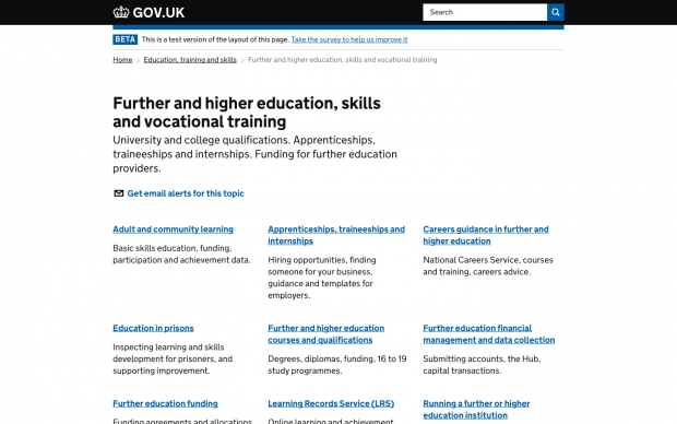
- a consistent breadcrumb across all pages
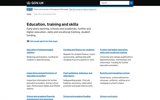
- organising topics in a grid, where appropriate
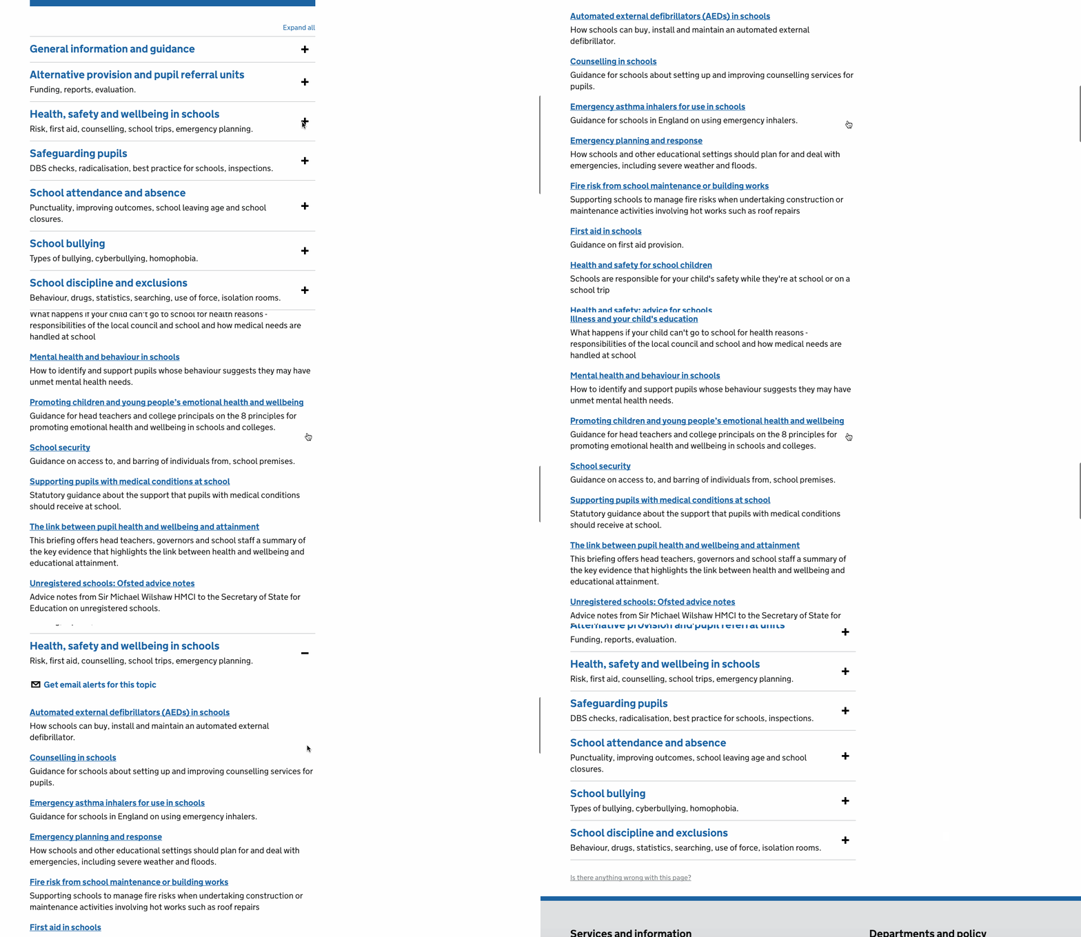
- an accordion design that makes it easier for users to quickly check what content sits under each topic
Breadcrumbs to show the user where they are
We’ve introduced a breadcrumb list at the top of each page. This helps users understand the levels of content on the site. The breadcrumb lists also show the page the user is currently on, to help them understand where they are within the site.

In our research we found that people were using the breadcrumbs to navigate around the prototype. We found that they used them to go back one step, or even to go back to the homepage if they felt they were too deep into the website.
Users are now able to navigate from a piece of content to the other parts of the site using either the breadcrumb link or the topics in the sidebar.
On mobile view we only show the parent topic, so as not to affect usability.
A grid system for large amounts of content

One of the main design challenges we had on the new topic pages - starting with the education topic page - was the sheer volume of content.
The grid is a way of subdividing large amounts of content. We’ve used it on landing pages so that the user can more easily navigate the content when they see it for the first time.
In user research we found that the grid system meant people were able to quickly scan at a high level and navigate to the correct content.
We’ve also been working closely with publishers across departments to make sure that the titles and descriptions used on content are clear and easily understandable for users.
Testing and iterating the accordion pattern

We looked at several ways to make it easier for users to scan through large amounts of content. We carried out testing on 2 elements - the anchor link and the accordion.
The anchor link shows a list of the subtopics at the top of the page, letting users see the content in the topic without having to scroll.
The accordion lets users see all the subtopics in a list and click to open the list in place.
We tested and iterated an accordion design that had originally been developed by the Service Manual team and found that it was the best option for letting users scan through content.
When the user wants to explore something in more detail, they can click on one of the titles and a list of the guidance in that section becomes visible.
In the Service Manual the accordion remembers which sections have been opened when users revisit the page. In our research we discovered this was confusing for our users as their patterns of navigating were different, and they lost the context of seeing all the headings when sections were left open.
We changed this behaviour and users were more successful at orienting themselves. The URL also changes when an accordion section is opened so users can still link to an open accordion section.
We’re continuing to track use of the accordion as we go into beta and will iterate as necessary.
Launching and assessing the new navigation
The new navigation is now live on GOV.UK, in A/B testing on the new education topic.
We’ve set up a performance framework so that we can track how well the navigation is working for users. We’ll be monitoring the results closely and iterating based on our findings.
If this new taxonomy and navigation performs well, we’ll look to roll them out across GOV.UK and bring in more topics and themes.
Follow Alex on Twitter and don't forget to sign up for email alerts.

3 comments
Comment by Benjy posted on
Hi, great post! Can you give any more information about "the breadcrumb lists also show the page the user is currently on, to help them understand where they are within the site".
Was there clear evidence that this helped users? I worry that they take up a lot of room and the repetition is potentially confusing? Not doubting you, just looking into something similar myself and wondering what the pros and cons are.
Comment by Alex Torrance posted on
Hi Benjy
This came about after reading <a href="https://tink.uk/using-the-aria-current-attribute/">Leonie Watson's blog post on the aria-current attribute</a>, and <a href="https://twitter.com/LeonieWatson/status/820339711986241536">asking her on Twitter</a> if she thought adding the current page would be useful. During our research we had observed some users clicking two levels up before we added the current page, and we didn't notice that it introduced any issues.
The length of the breadcrumbs is a problem, and some users don't notice the breadcrumbs have wrapped over two lines. But this was happening before we added the current page.
It's definitely something we will need to look into and improve.
Comment by David posted on
Hi,
We are in a similar position at the University of St Andrews in deciding how best to show a large amount of content on a page.
Anchor links vs Accordions
Did your A/B testing have a final outcome?
Or have you adopted a different approach now altogether?