Using data to understand the content is a useful guide when making design decisions. Knowing that, for example, page summaries don’t usually exceed a certain length, you can make a decision based on this and feel confident that the design will work well for the large majority. It’s also good for highlighting outlier or problematic content (eg a very long page description, hundreds of change notes, hundreds of attachments) – this could indicate that a design isn’t meeting a user need, guidance isn’t clear enough, or that there’s a bigger service design problem.
Late last year we started redesigning publication pages. They’ve been around since 2012, and there are now more than 70,000 publications on GOV.UK. In the time since publications was launched, how has it been used?
It’s seemingly tricky to make changes to something that’s been around for a while and has a lot of published content. To make a start, we wanted to understand the content dimensions: how long page details get, how many attachments are added, and how often they get updated. To answer these questions, developer Edd Sowden ran database queries to get the data. We discovered the following:
How long do page details get?
Anecdotal evidence suggests that users don’t notice the page detail. The page detail is a pretty important part of the page since it describes what the publication is, for example:

It currently lives at the bottom of the page after the attachment list. Should the page detail be moved to the top above the attachment list so that it’s noticed? A potential problem with moving the detail to the top is that page details are so long they require a lot of scrolling to view the attachments. So this is where using data comes in handy. How long do page details actually get?
With database queries we found that 90% of page details have fewer than 1000 characters, and 75% of publications have a page detail with fewer than 548 characters. This means the page detail could be moved to the top and this would be optimal for the majority of current publications.
Yet there are long-tail examples (page details which are longer than 1000 characters, but with a very low number of examples) which would be negatively affected by moving the page detail to the top, because of the length of the page. It’s worth taking into account that a long page detail isn’t a good thing. Some actually stretch to an entire document’s worth of characters – so it’s possible that some of these examples should be something else (eg a HTML publication).
How many attachments are added?
Attachments are displayed on the publication pages. Original feedback we had was that pages had too many attachments, making them difficult to browse.
We were curious about how many attachments were added on average. If, on average, there were many attachments per publication, it made sense to redesign the attachment to be easier to navigate, perhaps like a statistical dataset with a contents page (or at least have a shorter height).
However, we found that 94% of publications actually have fewer than five attachments, and 74% just have one attachment. That’s a low number. The long tail stretches all the way to 152 attachments, though it’s something of an outlier – and again, is it possible that content with a large number of attachments should use a different format?
How many times are publications changed?
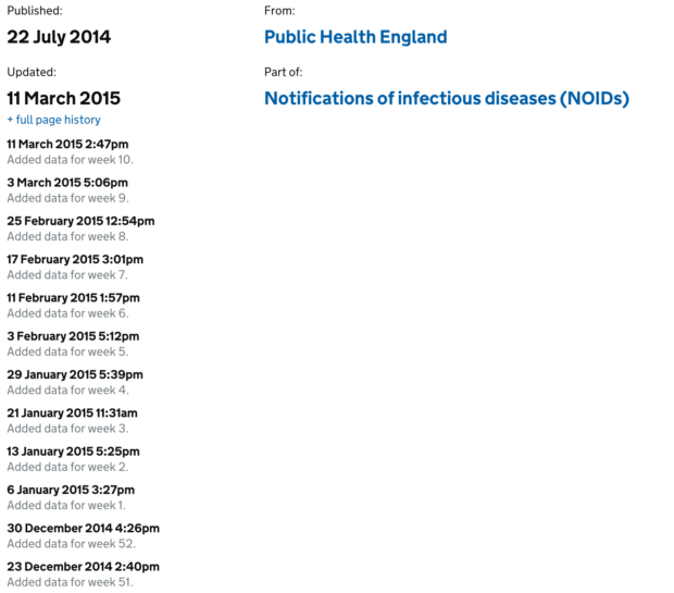
When documents are modified, a change note is published at the bottom of the page to describe the update (with all changes ‘hidden’ under a link):

We wanted to look at whether the current change notes design was serving the frequency and length of updates.
A majority (98%) of publications had only three changes or fewer (so the example in the screenshot is unusual). This is low. Most publications aren’t updated after they’re published. Based on the low number of changes, it would have been a fairly safe bet to just display all the changes on the page without hiding any content. However, we’d be sacrificing the experience for some publications like the unclaimed estates list (who publish daily updates). To make the change notes work for a range of content, we’re considering a design that displays three changes, and hiding further changes behind a link.
Our next step is to test the designs with users in the lab!

2 comments
Comment by Owen Boswarva (@owenboswarva) posted on
For me the most troubling aspect is that departments seem to be able to make significant changes to their material on GOV.UK without flagging them via the page details mechanism. The most flagrant example was Treasury's surreptitious update to a press release on rail fare rises in September (as highlighted by the chair of the Statistics Authority). I've also noticed a few instances in which attachments (usually PDFs) have been replaced with new versions without a change to the "last updated" field on the main page. Am I correct in thinking that updating the page details is an optional/manual process rather than mandatory/automated? It would be better if users had some assurance that departments could not easily bypass the page details mechanism.
Comment by Roo Reynolds posted on
Thanks for the feedback Owen.