This is a guest post from Chris Atherton, a designer working on the Visit visa service for the Home Office.
Since June 2014, we've had a fully-translated customer journey in live beta: customers in China applying for Visit visas have the option at the start of their application process to turn on Simplified Chinese as well as seeing English. Overwhelmingly, feedback has been that the translation is really useful, and that people are grateful to have it, because it makes it simpler and quicker to complete the form.
Initially, we had thought we might do partial translation. We imagined this might be simpler, because there would be less to translate. But at some point while wireframing (because we wanted to figure out where all this extra content would go on the page — we always intended to provide English and a translation), we thought, Hang on, what if we just translated everything. It would just cut out lots of meetings and difficult decisions about which stuff to translate and which to do without.
We did a spike to see how fast we could get 10 of the most useful pages translated. Because we'd kept page content minimal, it was pretty quick. So we decided to do the rest, and that went reasonably quickly as well.
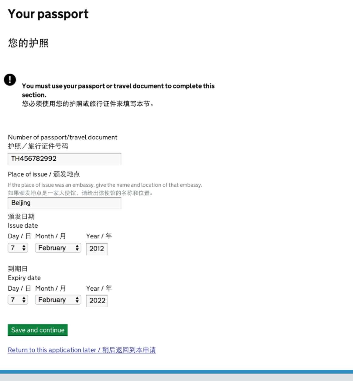
The image shows how we've dealt with parallel translation on the page. As a general rule, we put the translation side-by-side for very short things (button and field labels), and immediately below for longer content (lines or paragraphs). You can see that the English and Chinese are sometimes in quite close proximity; we wonder about 'breakthrough' from the line above or below for people who can read both languages, though haven’t had any feedback about this yet.
Of course, having content in the customer's preferred language means they naturally want to type Chinese characters into the form. This is a challenge for us, as there is a legal/policy requirement for customers to respond to questions in English. It can take them a long time to enter information in Roman script if they aren’t used to doing that — their address, for instance. For now, we show errors when people have typed in Chinese characters, which remind them they need to use English characters. Obviously this wouldn’t stop them entering information in Pinyin, though.
One of the trickiest aspects of getting translation included in the service was workflow. We are a large service with a years-long roadmap of products for rollout to a large customer base, around half of whom are overseas. Simon was instrumental in helping us figure out that we needed a 'copy editor' tool — so we built one. The copy editor acts as the central repository for all copy in the customer application. Our translator can log in remotely, enter his translations for each piece of text, and we can then push those into the application when we want to. (Our content team can also make changes in the copy editor, though we have to be mindful that every change they make may mean we need to get that piece translated again.) Having this tool represents a huge improvement on our initial iterations, where there was a lot of to-ing and fro-ing involving spreadsheets.
We spent a lot of time thinking about the benefits of being co-located with our translator and having them embedded in the team. For various reasons, this turned out not to be possible. But, in any case, it turned out not to be that important. What is important in having a translator who understands iteration and continual improvement. This was hard to work through with many translators and agencies, because they tended to focus on being paid by the word – completely the wrong metric for our kind of work. This meant we had to negotiate a new way of working for our 'agile translators’, and that bringing them onboard and into the team was probably a lot more effort than we'd predicted.
Also, everybody — but everybody — has an opinion about translations, once they're written. 'Debugging' translations and doing user research with foreign language text is really very hard. Users often make subjective comments about the language being a bit weird and unnatural. And it's never clear whether problems lie with the translation itself, or with government-style language, or tone, or the fact that we are trying to explain complex policy.
Our next internationalisation challenge is even more fun: Arabic, for an e-visa waiver for applicants from the Middle East — a little like the ESTA waiver you complete if you’re visiting the US from the UK. Again, we’re providing dual language content: English alongside the Arabic. And obviously with Arabic we have the extra challenge of providing right-to-left language, and of working out how that fits in alongside English, which of course runs left-to-right. But we have some ideas, and we’re already doing some usability testing with Arabic speakers to see what they think.

