In our Design Principles number nine is 'be consistent, not uniform'. The principles were never meant to be strict brand guidelines, as we said at the time, "We can’t imagine every scenario and write rules for it."
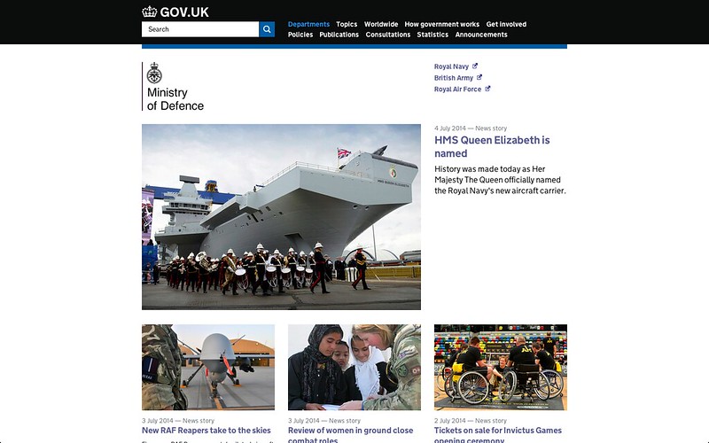
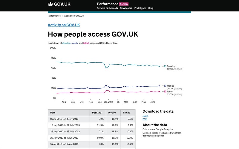
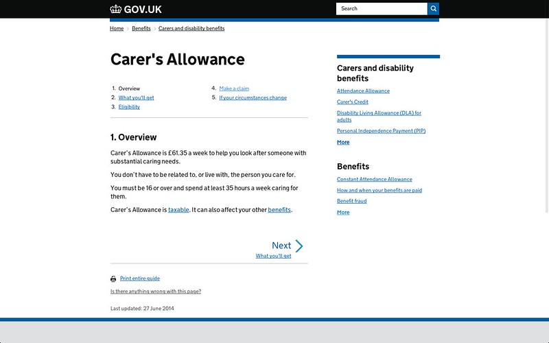
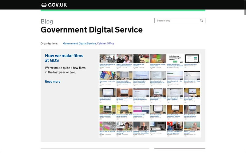
Two years in, I thought it would be good to collect a few screenshots as examples of being consistent, not uniform and post them here.
All these designs use the same font, the same colours, the same basic grid and the same handful of type sizes. You could design most of these pages just by looking at the design elements page in the Service Manual.
These pages all look visually different because they all have different user needs, but they are all consistent.


1 comment
Comment by Alistair King posted on
User feedback - I had to use the "register to vote" page that you show in the images above and I really appreciated the clear, simple structure to get me through the process. Thanks!