Yesterday we published some new design guides in the Government Service Design Manual.
GOV.UK elements
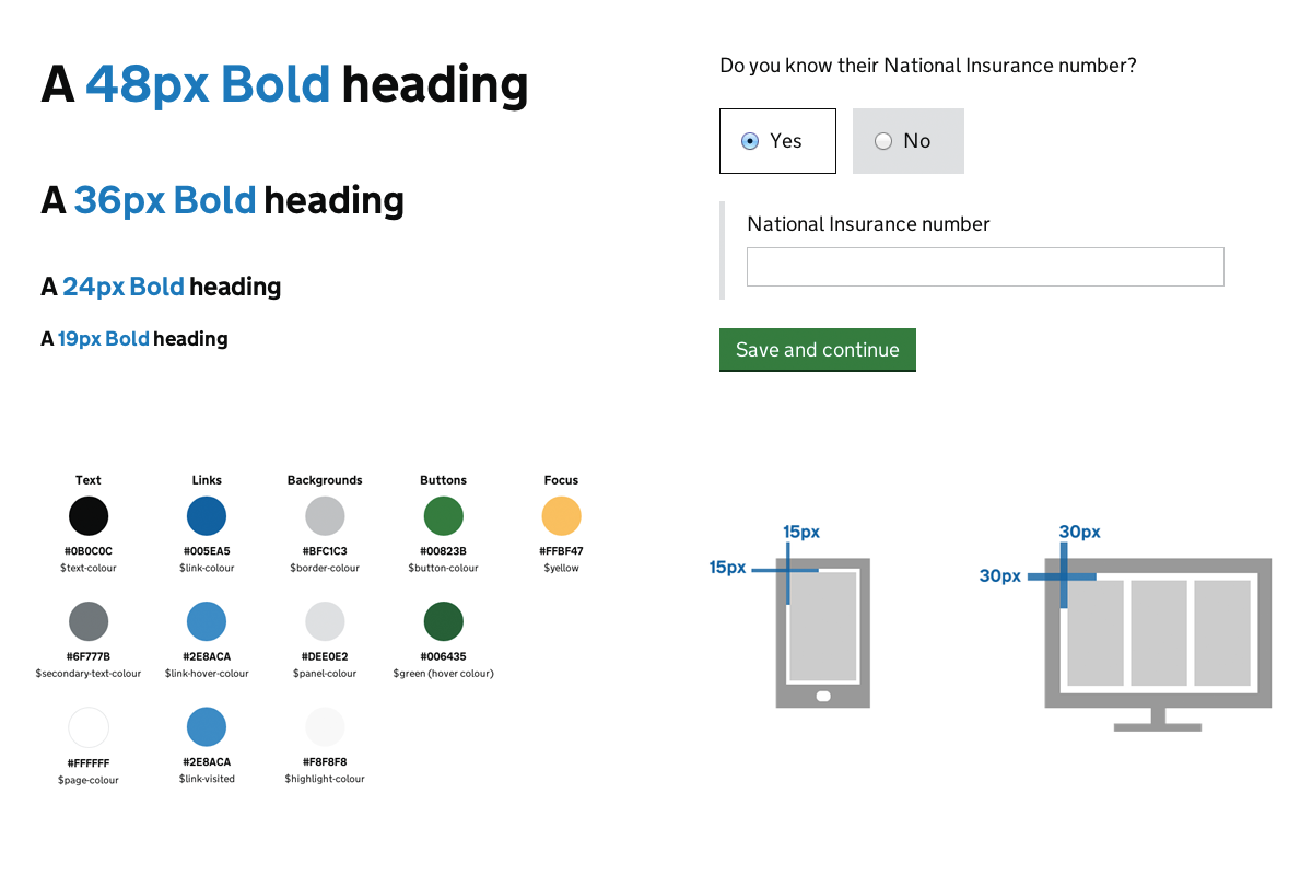
There's a new guide to styling and coding the basic page elements, with sections on layout, colour, typography, forms, buttons, data, images and icons.
 This content replaces some of our older guides, so if you're wondering where they went, it's all there.
GOV.UK design patterns
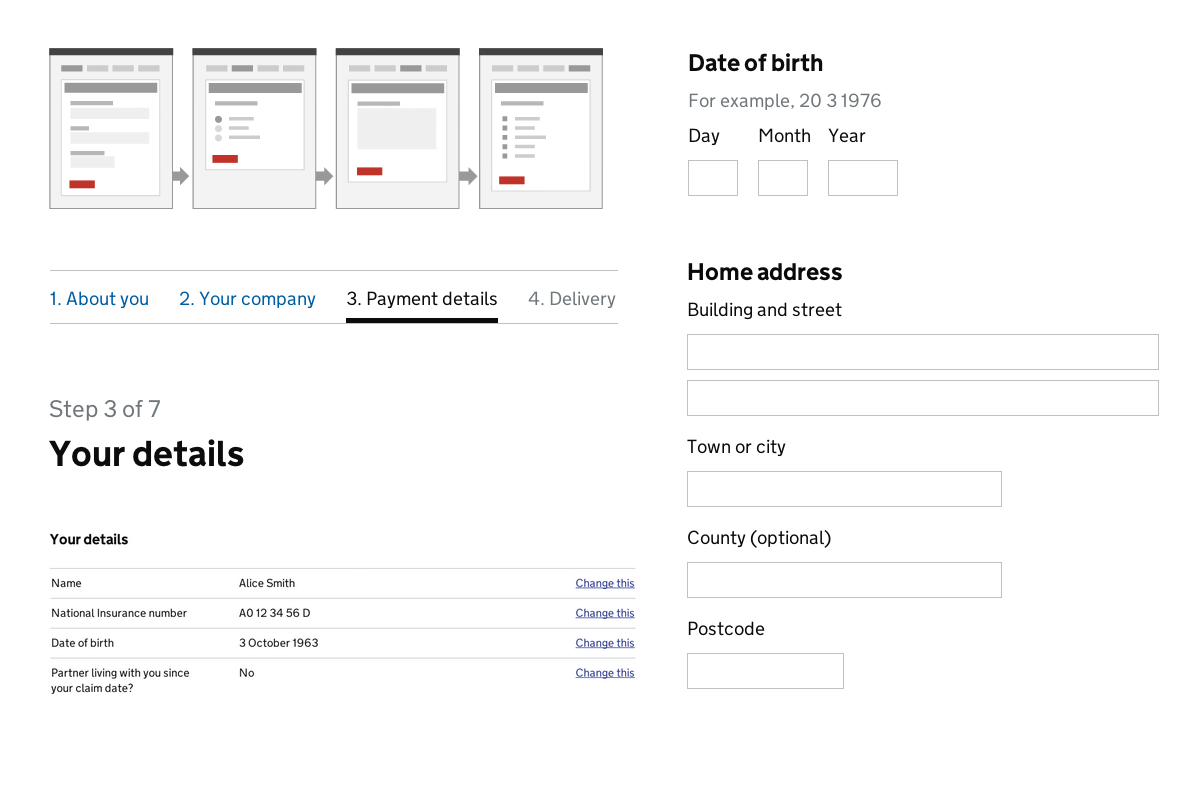
There's also a new section on common design patterns. Things like progress indicators, dates-of-birth, address fields and form structure.
View the GOV.UK design patterns
The design patterns were developed in collaboration with designers and researchers across government, using a wiki (Hackpad) to share and discuss our ideas in the open.
If you want to get involved, join us on the wiki.
Tim - Designer at GDS. Follow me at @timpaul


2 comments
Comment by Rich W. posted on
Care to explain why this page uses tables in it's layout? Also the use of H1 tags is odd, and it uses semantically incorrect styles?
Surely GDS publications should conform fully to industry standards?
Comment by Tom Byers posted on
Hi Rich, thanks for the comment.
I'm assuming your points relate to the HTML of this page rather than either of those mentioned in the above post so please say if that's not the case.
The table in this page is used to show the organisations the post relates to rather than for any layout purposes. This particular page only relates to a single organisation (a 'one-to-one' mapping) so could also be represented using a definition list but posts can relate to multiple organisations (a 'one-to-many' mapping) so a table was chosen to allow this and to provide some consistency in the semantics used across all posts.
In relation to your question about H1s, the use of them in this page is based on the guidance around creating document outlines in the HTML5 specification (see http://www.w3.org/TR/html5/sections.html#outlines). That being so, as it says in the spec', the implementation of this varies across clients so we will review them to ensure it works correctly for users of the blog.
Separate from that, the usage of H1 tags in the blog heading will also be reviewed as it currently contains some duplication which could be represented better.
Finally, would you be able to provide some more detail on your point about 'semantically incorrect styles'? I hope I've addressed it above but please say if that's not the case.
Look forward to hearing from you.