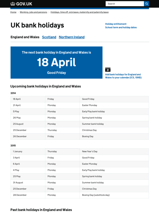
Desktop thoughts
- Use GOV.UK brand colour to highlight information. Preserve green for success outcomes of services.
- Remove related links that dominate page as before. Only two links, now quieter but still prominent. They are of secondary importance, so experimenting with no underlines...
- Remove tabs, don't test well in existing incarnation.
- Make territory links very clear.
- Lead with most popular territory.
- Move calendar link to right to show more content. (not underlined, secondary importance).
- Change table head, no background, border or boxiness.
- Table row zebra less high contrast.
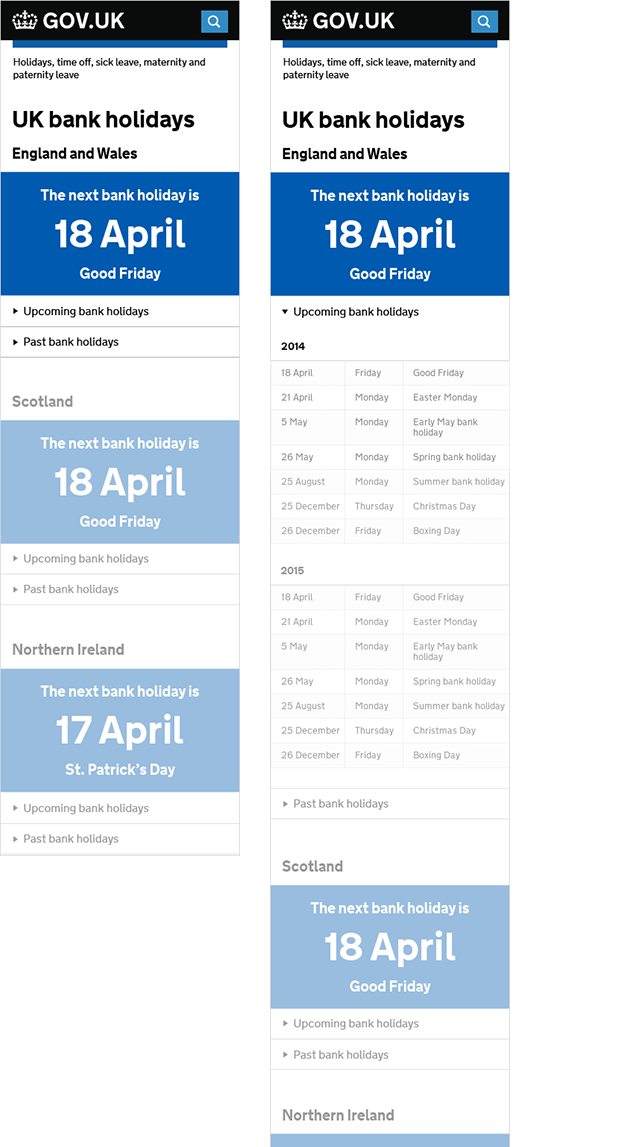
Mobile thoughts
- Show most popular territory first, scroll for others.
- Collapse past and future bank holiday date tables, they are a less important need.
- No calendar link. Currently broken on mobile and arguably less needed in this context.
- Breadcrumb trail stripped back just to category this item lives in. Bring more content in to view.


2 comments
Comment by Gambo posted on
I quite often spend some of my free time reading blogs looking for interesting content. I have read this write-up twice and I still don't fully understand what it is you are trying to say. Never the less, and quite weirdly, I enjojed reading it.
Comment by Guy Moorhouse posted on
Hi Gambo,
Thanks for your comment.
Sorry if this post is not very clear — probably not very helpful in that it's very concise being a bulleted list and is written in language that presupposes a bit of knowledge of the problem.
The post is essentially outlining proposed layout and structural design changes to the bank holidays page (https://www.gov.uk/bank-holidays) on GOV.UK. We're rethinking how this page is presented to better help users find the information they are looking for.
Hope this helps.
Thanks, Guy.