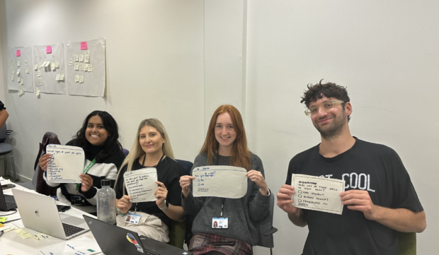
The user research and interaction design teams at HM Courts & Tribunals Service (HMCTS) spent a day together face to face, helping each other to grow their skills and tools. Interaction designers wanted to upskill in user needs and interpreting discovery research. User researchers wanted to expand capability in user journey mapping, designing questions and prototyping for testing. Both teams wanted to gain experience coaching colleagues outside their discipline. User research and interaction design are user-centred design (UCD) roles — you can find the skills required for these roles in the Government Digital and Data Profession Capability Framework.
A group of us facilitated the session, and we designed a challenge based on a fictional government initiative — to encourage pet owners to volunteer their animals to volunteer in the community. The teams used the provided discovery research, did their own desk research, and worked together to end the day with a prototype for the service.
This model can be replicated, both with these disciplines, as well as others.
The structure of the day
We split the day into sections:
- Capturing user needs
- Naming the service
- Mapping the service
- Designing the questions
- Prototyping in Figma with an introduction to the Prototype Kit
Throughout the day, we related activities back to the Service Manual and Service Standard.
The fictional problem we gave teams
The teams were given a brief alongside discovery research about an existing initiative for the public to register their pets as volunteers. The take up was low due to pet owners and organisations not knowing about the scheme.
The department wanted the teams to design a service to allow pet owners to register their animals through a registration form, however teams needed to think about the broader picture beyond the form. For example, how would organisations access the register? How might potential volunteers find the form?
You could use this problem, or design your own brief to focus on specific skills or methods your teams want to develop.
1. Capturing user needs
We began with a refresher on user needs versus user wants, looking at the Government Design Principle ‘Start with user needs’ and thinking about needs as being problem-centred and based on evidence and relevant research, rather than assumptions.
Task 1: The teams then broke off to write user needs on post-it notes. They conducted research online during the activity and then prioritised their user needs.
2. Naming the service
In the next activity, we looked at the guidance for naming a service.
Task 2: The teams worked together to workshop ideas for naming their services, applying the key principles of the guidance. This was an opportunity for the teams to think about the purpose of the service and how users will find it.
3. Mapping the service
We then moved on to designing the registration form.
Before the teams started mapping their services, we reviewed some parts of the Service Manual. We prioritised areas which would help the teams develop a good service, including:
- The characteristics of a good government service - thinking about the service from beginning to end, and every step a user will take in the journey
- Making sure what the service is for and what it involves is clear - the teams had to consider if they needed eligibility questions in the service
- A user has to do as few things as possible and Do not collect information you do not need - when mapping their form, the teams needed to be critical of what they were capturing, making sure it’s only what they need to help the user reach their goal
We looked at mapping styles, from low fidelity post-it notes describing steps in the journey, to high fidelity wireframes.
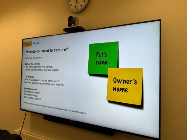
Task 3: The teams then broke down what they needed to capture from users and what the journey would be in phases, such as:
Before the service:
- How will users find the service?
- Do they need to check if they’re eligible?
In the service:
- What do we need to capture from users?
- How long is that journey
- Will they be able to complete the form in one go?
After the service:
- What happens next?
- What can users expect?
- How do we keep users informed?

4. Designing the questions
After creating a high-level map of the user journey, the teams began looking at questions in more detail.
At this point, we took a look at some of the Service Standard - particularly the points that would help the team design their questions:
- Make the service simple to use
- Make sure everyone can use the service
- Use and contribute to open standards, common components and patterns
We also introduced the GOV.UK Design System and the ‘Do’s and Dont’s on designing for accessibility’.
Task 4: Using the design system as a reference for components and patterns, the teams split up their journeys and everyone took the opportunity to create some low fidelity mockups to sketch out how to ask the questions. Then they discussed different pattern options in groups.
5. Prototyping
We then introduced different prototyping methods, including MOJ Forms, the GOV.UK Prototype Kit and using design tools like Figma, looking at the pros and cons of each method.
We worked through a step by step training exercise on how to create a screen in Figma using the design system. This involved giving a high level overview of how Figma works, how to install the GDS Transport font and how to activate the design system as an asset library.
Task 5: Once everyone had successfully created an example page, the teams split off again to continue developing their designs from sketches to screens in Figma.
The teams were also asked to think about how they might test these designs, with a focus on thinking about it from the angle of the other discipline.
For example:
- Did the user researchers have any thoughts on key areas we needed to test for usability?
- Were any of the interactions they had designed potentially inaccessible and worth investigating?
- What questions would the interaction designers ask if they were conducting a research session?
- What testing methods might the designers use to validate the prototypes?
Reflections on the workshop
Overall, both researchers and designers found the day really valuable as a development activity. Designing a service in a day provided opportunities for both disciplines to think more generally about users and the standards we design to, as well as gaining more practical skills like using the design system and Figma.
We hope to follow up this activity in the future — testing the forms the teams have designed and iterating based on that feedback.
We are keen to learn about how other teams use this type of session to upskill their teams, and if there are any other activities they include with other disciplines. If you would like to see the templates we used, email Ros.Boyes@justice.gov.uk.
