From school we are trained to prove we are doing the most, for example reaching word counts for essays. We carry this mindset that quantity is equal to quality into adulthood, whether we’re drafting a report or presenting at a Show and Tell. This can be felt most in our places of work, and the public sector is no exception.
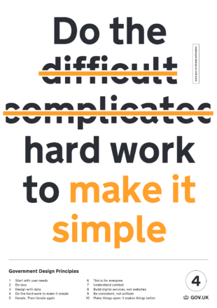
How might we apply the design principles, ‘do less’ and ‘do the hard work to make it simple’ to how we work and communicate?
There are many examples of how the principles are applied to products or services.
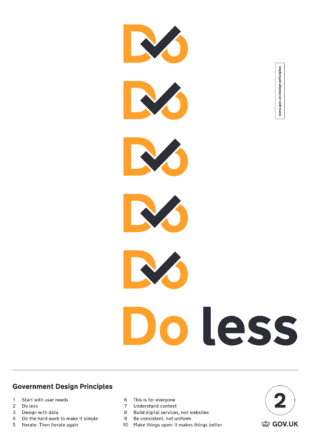
Do less
The Design principle 'Do less’ says:
Government should only do what only government can do. If we’ve found a way of doing something that works, we should make it reusable and shareable instead of reinventing the wheel every time.
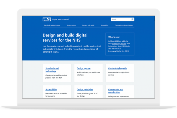
The NHS service manual is an example of “doing less”. They adapted and built upon the GOV.UK service manual rather than starting from scratch (nod to another principle here; make things open, it makes them better).
Do the hard work to make it simple
The Design principle 'Do the hard work to make it simple' says:
Making something simple to use is hard - especially when the underlying systems are complex - but that’s what we should be doing. Don’t take “It’s always been that way” for an answer. It’s usually more and harder work to make things simple, but it’s the right thing to do.
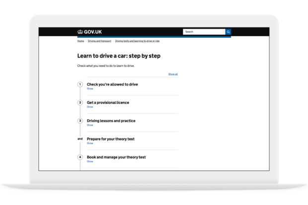
The GOV.UK step-by-step pattern is an example of doing the hard work to make a service simple. We know users face challenges carrying out tasks. There’s a lot of information to find, there might be appointments to book, all at the right time in the right order. The hard work here is to bring all parts of government together to provide one end-to-end service.
Applying the principles to the way we work with each other
We are inundated with calls, documents and presentations. The principles, can be applied not just to the services we deliver or the way we work but also to the way we present information, reducing the cognitive load for our colleagues and stakeholders.
Presenting
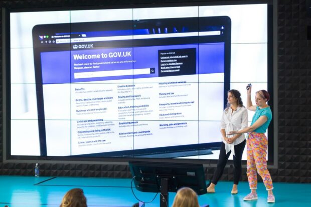
We could challenge ourselves to use the principles to make more engaging presentations by reducing the content rather than the font size, making clear points, setting a limit of 20 slides or using images rather than words.
Pecha Kucha style presentations are an example of a constraint based format designed for engaging presentations, pechakucha, it's a Japanese onomatopoeic word for chit chat, 20 slides, 20 seconds each, no text or video, don't be boring.
Setting constraints like these force us to improve the quality of our communication. Remember, you are telling a story and people should be listening to you.
Writing
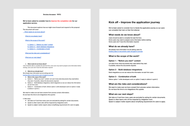
Perhaps we’re just as likely to be communicating through documents. In the image above I’ve received a document (left), it is very important. You can tell the first paragraph is important because it’s bold, but the even more important information is in red. If you look at the redesigned document (right) you’ll see the same information but it’s much easier to understand.
I simplified the document in 3 steps:
- Applied consistent paragraph styles
- Left aligned content, and removed indentation
- Grouped content into distinct blocks, removing anything unnecessary
Your challenge
We are well known for how we apply the design principles, ‘do less’ and ‘do the hard work to make it simple’ to our services but there are opportunities to be bold and use the principles in everything we do: at standup, in emails, reports and presentations.
Whatever you're working on there is an opportunity to simplify it.

2 comments
Comment by Melissa Dever posted on
I really love this. The more we can apply these principles, the better it is for citizens and public servants alike.
Comment by David posted on
Useful insights!