During a pandemic, making sure people can access services and information is vital. This is especially true for groups who might be harder to reach or disproportionately affected by coronavirus (COVID-19).
Our job in the Inclusive Design team at UK Health Security Agency (UKHSA) is to make sure that everyone gets the information and the support they need.
What we did
We prototyped content for the PCR ‘book a test’ journey and had users with cognitive disabilities and lower levels of literacy test the content.
We wanted to understand how well users in these groups would be able to complete an end-to-end journey on NHS.UK.
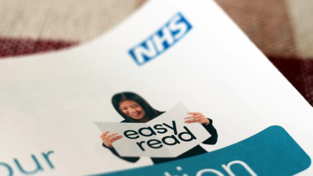
What is easy read?
Don’t let the name fool you. Easy read content is really tricky.
The first thing we noticed during our preliminary research was that lots of people had heard of easy read but weren’t always very sure of what it was.
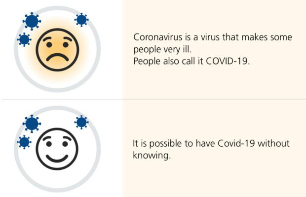
So, to clear things up, easy read is used mainly by people with learning difficulties. It uses pictures and text to convey meaning.
Easy read means:
- wide margins
- images on the left
- larger text (14 to 16pt)
- bigger spaces between lines (1.5 spacing in a word processor for example)
- 1 idea per image
Because of this format, easy reads are almost always PDFs.
Prototyping and testing
Over 2 rounds we tested with 18 participants and their support people.
The first round focused on their experience during the pandemic so far, their familiarity with the testing process and their preferred way of getting information.
We used these early findings to inform a mock-up of some of the core content needed in the PCR testing journey. This included:
- symptoms
- booking a test
- home tests
- test sites
- self-isolation
There was an HTML version that was text-only, and an easy read version that was arranged in PDF documents.
For logistical reasons, we decided not to include the transactional pages, where users actually book tests on GOV.UK.
Even without those pages, it was a massive amount of pretty nuanced information to convey. We tried to draw out the core pieces of information from the existing content on the NHS site.
As a content designer, testing something that you’ve designed with real users is simultaneously the most thrilling and terrifying thing you can do.
Some things went well, others not so much. Either way, we learned a lot.
What we found
Users’ needs are complex, give them options
Some users:
- preferred having material that they could print out and discuss with their support person
- found easy read content really helpful, but others thought the images were patronising and preferred the HTML text-only content
- liked being able to look at things on a screen, but others who wanted to check things with a person, so would use the 119 service
Most users expressed a level of anxiety around visiting test sites, and indicated that video content showing what to expect at a test site would have helped.
We need to make sure that users have a range of accessible options to choose from.
Don’t hide the content
How users access these resources is also key. Users generally missed links on the homepage to the easy read content. They expected to have accessible options that sat alongside the mainstream content.
Having said that, it could also be useful for support people who want to print out the material, to have it grouped together.
There’s no reason that it couldn’t be arranged in both ways.
Also, knowing that many people in this group will have someone to support them, it makes sense to make the content easy to share.
Lessons for how we do easy read
What’s in a name?
We found that lots of users weren’t totally sure what to expect from easy read content. Also, what’s called easy read content is massively inconsistent.
If it doesn’t have all the hallmarks of easy read (images left-aligned, wide margins and larger text), don’t call it easy read.
It’s also really important to maintain a consistent style throughout all our easy read materials.
This is tricky because most of it is commissioned by individual teams.
It would be good to have a single point of contact for teams to give guidance and ensure standards are being met.
Don’t just do it, design it
It’s worth having a content designer look at the content before you send it off to be made into an easy read document.
The language and tone might need to change. The amount of information at each point might need to change.
Bear in mind that some people in this group find it hard to retain information or get anxious if presented with lots of information.
These things need to be designed. That’s why it’s important to have a content designer with you when you start to think about creating easy read content.
Lots of users said they liked having things they had to do set out in a step-by-step fashion, so it was easy to tell where they were in the process and what to do next.
Easy read it and understand it (and how long it takes)
Make sure your team understand what easy read is, who it’s for, and what you hope to achieve with it. This will help if you need to distil some of the information you’re conveying down to its essentials.
It’s also worth noting that easy read takes a long time to produce, so start with this content rather than leaving it as an after-thought once you’ve got your main content signed off.
Although it takes a long time to produce, having a content designer with you at the beginning will make this easier.
Ideally, you’d also test it with the users it’s intended for.
PD effed
One of our biggest issues was there was no way of keeping the easy read formatting in HTML. This meant that we had lots of PDF documents.
While it was good to keep the formatting, it meant that users’ journeys were broken up between multiple documents. Screen readers sometimes struggle with PDFs. There were lots of technical struggles as users had to download things. Sometimes they just didn’t work.
What we think we’d like, in an ideal world, would be an HTML page that:
- supported easy read formatting
- was accessible to screen readers
- could form part of a journey
- was easy to print out
And there’s still loads we’d like to find out
We got some really good insights from both building the prototypes and showing them to users, but there’s still lots we’d like to find out more about, like:
- how can we use video content to help this group?
- would an HTML easy read template work?
- how can we make transactional content more accessible for users in these groups?
- how can we make content that’s easy to share?
- would users have been able to complete these journeys without the help of support people?
- how do users in these groups needs intersect with other needs (like having English as a second language)?
Resources we found helpful
Here’s a list of resources that helped us during the research:
- GOV.UK’s guide to easy read
- CHANGE guide on how to produce easy read
- DWP blog post on piloting easy read in HTML and the service that went live: Get help from Access to Work: easy read
If there’s anything we’ve missed feel free to stick it in the comments or get in touch with any questions.

13 comments
Comment by Caroline Jarrett posted on
I’m delighted to see more focus on the needs of people with learning difficulties and on other people who prefer materials that are easy to read.
But I am definitely uncomfortable about the title “Easy read is hard to write”. That gives the incorrect impression that writing for and with people with learning disabilities is hard.
It may be unfamiliar, it may be something we need to learn.
But all good writing is hard. It’s easy to write badly. It takes more effort to write to meet people’s needs.
Please think about changing the title of this blog post.
Comment by John Newton posted on
Hi Caroline, thanks for your comment.
It's a good shout, we definitely don't want to put people off doing this kind of work.
We're really keen to do some of the hard work to make it simpler for teams to get this right.
Comment by Ben Railton posted on
Thanks for linking to our blog and first easy read guide. If it helps, we've produced a lot more in easy read since that first product:
https://www.gov.uk/government/publications/about-pip-what-it-is-and-how-to-claim-it-easy-read-guide
https://www.gov.uk/government/publications/easy-read-support-for-mortgage-interest-smi
https://www.gov.uk/government/publications/easy-read-universal-credit
https://www.gov.uk/government/publications/tell-us-once-easy-read-guide
https://www.gov.uk/government/publications/easy-read-pension-credit
https://www.gov.uk/government/publications/easy-read-get-help-at-work-if-youre-disabled-or-have-a-health-condition-access-to-work
Comment by John Newton posted on
Hi Ben, this is brilliant, thanks!
I'm looking forward to delving through it all 🙂
Comment by Steven Gardner posted on
I'd very much like to see more testing done on the use of images, and which best aid reader understanding the most, perhaps using a single product to do this to get an accurate picture of what works well.
I've seen a few different styles...
Shutterstock or other image library images (generally closely aligned to the "home country" to be most relevant), usually a single image, high quality and chosen well to represent the text.
Graphic/drawn images, often fairly basic but allowing more freedom, if resource allows (although they can be obtained from image libraries too).
Photographs constructed from multiple images, creating a story or dialogue within the picture to more accurately, or specifically support the text.
The above can include images of people with or without disabilities.
I think there's quite a few variables to work with, and the message and style will be different depending on the audience, but as with any communications I feel we should be always looking to test and learn, and be open to adapt our products as we go... and keep testing with different audiences.
A/B testing would be interesting to see the same product tested using at least a couple of the styles mentioned above to see which if any was most useful in aiding understanding.
Comment by John Newton posted on
Hi Steven, that's a really good point.
We got some good anecdotal feedback in our research, but it's something that we're still trying to find out more about. It was clear that it makes a massive difference to how users interact with the content.
If you know of any good research that's been done on this, I'd love to see it!
Comment by Louise posted on
Hi John
It's great that this is being looked at. There's lots of anecdotal evidence out there now that builds on the original guidelines.
It's worth looking into what symbolic understanding is and the hierarchy of visual understanding. Sounds complicated but it's not 🙂 It's a great way to look at how people use images and how to add images so that a wider audience can use the easy read. It can also help when you have conflicting feedback about the types of images used.
My experience and findings are slightly different in that people who find elements of easy read patronising are those who don't actually need an easy read version. It may be that (as you pointed out above) the person needed an easier to read text version. It's important these two things are not blurred into one as it leads to poorly produced easy read work.
I've yet to find a file format other than pdf that is stable. Webpages that are laid out as accessible can become very hard to read when opened on devices.
Comment by Teinaki posted on
Yes, one thing I'm curious about is whether a team prototyping easy-read would need an embedded illustrator (or at least a graphic designer with skills in illustration). If we spend so much time on iterating the content, shouldn't this also be the case with the images?
Comment by Andrew Beswick posted on
Hi
We worked closely with John Newton on early ER prototypes, which was really productive. Now in the UKHSA IFU design and informational design Studio, where are deep diving into User Research and utilising that over all materials we produce, taking this research to Research and Develop Easy Reads and COVID-19 IFUs (information for user booklets.)
We're creating user friendly easy to follow booklets, infographics, posters, and all the IFU COVID booklets for LFT and PCR. All that information is been distilling and developed with Human Centred design and best User practice for the end User at the centre of our work. Feel free to contact me for any help in this area.
Andrew, Lead Design. UKHSA IFU design/ Informational design studio
Comment by John Newton posted on
Hi Teinaki, we were lucky enough to have a graphic designer working closely with our team on this.
It made a massive difference to be able to see the images as a work in progress and tweak them alongside the text.
I totally agree that the visual aspects need to be iterated as much as the written content, and as Steven said, it would be great to see more testing around how users interact with different types of images.
Comment by Cedrik Kavanagh posted on
At a previous job we included a printable easy read web pages as part of our website redesign. So it definitely can be done with developer support! The developers for the project were The Bureau.
Examples here: https://www.unitedresponse.org.uk/resources/?biro-easyread=1&biro-supporttype=&biro-condition=#biro-filters
Comment by Cliff Edwards posted on
The South Australian Government also developed their HTML Easy Read component in partnership with Vision Australia and some key groups.
This helped make it more accessible to a broader audience.
Content page example:
https://www.designsystem.sa.gov.au/features/content-page-features/easy-read
Full page example:
https://www.designsystem.sa.gov.au/features/homepage-features/easy-read
Comment by Martin Jordan – Head of Service Design, CDDO posted on
This is great to see! Thanks for sharing your work, Cliff!