The GOV.UK Design System team is improving how links look to users. We’re doing this work to support Mission 1 of GDS’s strategy: “GOV.UK as the single and trusted online destination for government information and services”. As part of that we are always looking at ways to make GOV.UK easier to use.
Our changes help solve 2 problems with links on GOV.UK that we discovered through feedback and an accessibility audit:
- link text could be easier to read – especially when used in long lists or headings
- link hover states needed to be clearer – these used a slight change in colour that some users might not easily recognise
Making links easier to read
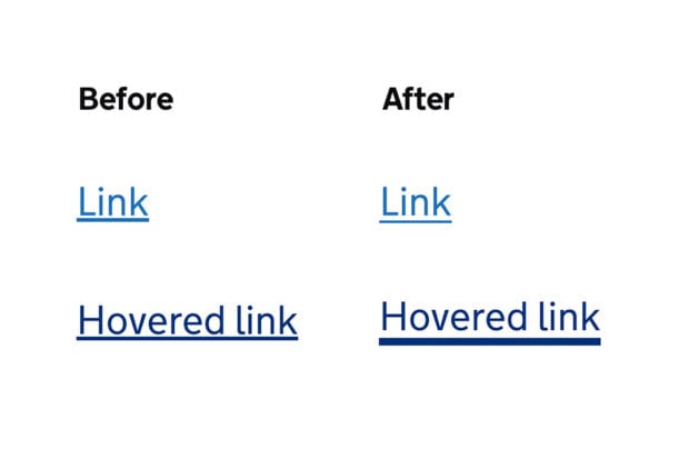
Link text is usually underlined, added with CSS styling using the `text-decoration: underline` property. The underline tells users that ‘this is a link’ and this is widely understood on the web.
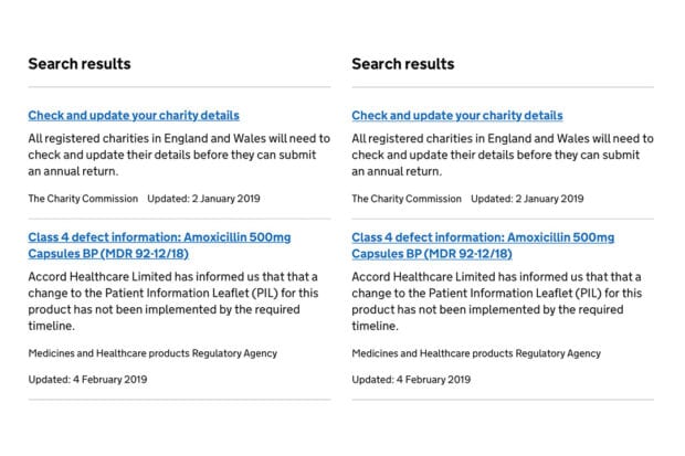
But this underline can look quite different across different browsers. Most browsers make the line too thick and too close to the bottom of the text. This can distort the overall shape of the words, which can make them harder to read. This can become a problem on pages with lots of links, like search results or navigation pages.
We looked at different workarounds to the default styling. These were heavily inspired by this CSS tricks article about styling underlines on the web. After weighing up pros and cons we settled on an approach that would enhance the experience for lots of users without adding too much code or being too hacky (and over-complicated).
We’re adding some extra CSS to links to make underlines consistently thinner and a bit further away from the text:
text-decoration-thickness: 0.0625rem;

text-underline-offset: 0.1em;
Although these CSS properties have existed for a while, browser support for them has recently improved. Now about 85% of users should be able to see them. We see it as an enhancement – for browsers that don’t support these properties, the normal underline will still work as before.
Making hover states clearer
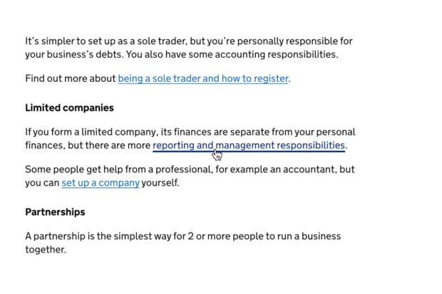
In 2019, an accessibility audit of the Design System found that some users might miss the visual cue when hovering over links. Whilst this doesn’t fail the Web Content Accessibility Guidelines (WCAG) 2.1 AA standard, it is a usability issue that disproportionately affects users with impaired vision.
We started by looking at how other websites treat hover states. As well as a change in colour, it’s common to remove the underline on hover (or add one if the link doesn’t have one). But we found that might not work so well whenever the link colour needs to be the same as the rest of the text – for example, white text on a blue background.
So we decided to make the underline thicker when users hover. This draws much more attention to them and echoes the way we treat focus states . We used the text-decoration-thickness CSS property to change the width of the underline - this only recently received wide support across browsers.
Getting input from the community
With all major changes to the GOV.UK Design System, we get feedback from our working group. The working group is a multidisciplinary panel made up of people working across government. They help us sense-check our designs and make sure they’ll work for teams in all departments. The working group reviewed 2 iterations of the changes to links.
Early on we were concerned that the thicker underline is not currently a common convention for hover states. But we felt it solved the problem we identified and the working group backed the approach. Since then, we’ve also noticed similar styles starting to be used in parts of the BBC News and Guardian websites; so it may become more widespread in the future.
Releasing the changes
It may take a while to see these changes being used across all services on GOV.UK. We’re releasing them behind a ‘feature flag’. This means service teams using the GOV.UK Design System will need to opt-in to use them at first.
We did this because there are a couple of very specific bugs in some browsers that will affect some services more than others. Once browsers have fixed those bugs and we’re confident the new styles will work for most teams, we’ll switch the feature on by default in a future release.
If you’re working on a government service and want to use the new link styles and hover states, upgrade to the latest version of GOV.UK Frontend. Please get in touch with the team, or comment below, if you have any questions or feedback.
GDS is hiring designers at all levels throughout 2021 to 2022. Find out more on GDS Careers page.

2 comments
Comment by Frankie Roberto posted on
Great work!
How about enabling the new link styles on this very blog? 😀
Comment by Terry Price posted on
This is a really good idea, Using border-bottom instead of underline really helps with legibility.
Would be good to show in this article an example where a few descenders are present to highlight the goodness this idea brings.
This is the level of craft I really like, well done.