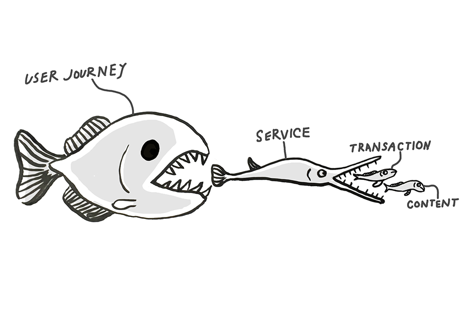
One of the things we use a lot on the Finding Things team are user journey maps.
A user journey map is a way of showing a user’s journey through a service over time. It may include many transactions and different services. It starts where a user’s need for that service arises, and ends at the point where they stop using the service.
They show all the things that are happening, and how all the back end systems work together to create the user experience across the journey.
We find that mapping the user journey helps us contextualise what we’re designing from the user’s perspective, and keep that point of view as the focus of our design.
There’s many ways of organising user journey maps, and you’ll hear them called different things: service blueprints; use cases; storyboards; and many more.
Personally I’ve never found it that useful to stick to any fixed rules about what to include in a user journey map. It’s a flexible format, and it’s up to the project team to decide what’s most useful to include.
Why are user journey maps useful to us in government?
The process of mapping user journeys is particularly useful because:
- the things being built across government will usually be a component of bigger services, which are also a part of a user’s broader journey
- they show you how your service or transaction fits into this bigger service and highlight what other things might need to change, and who you need to be talking to in order to make those changes happen
- they help you to have those conversations about what needs to change because you can print out massive user journey maps and stick them on a wall
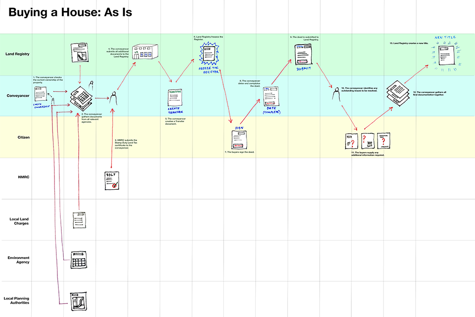
They can get complicated...
Sometimes it’s hard to fit something into a straight-up linear journey. There may be offshoots, cyclical bits or too much variance in the steps and activities from one user to the next. Having said that, trying to make a clear user journey diagram out of it can be a useful way of understanding the problem, or how you should be approaching the problem.
This user journey captures all the government services that interact with your pension, from the day you get your national insurance number to the day you die.
As you can see, it get's a bit complicated.
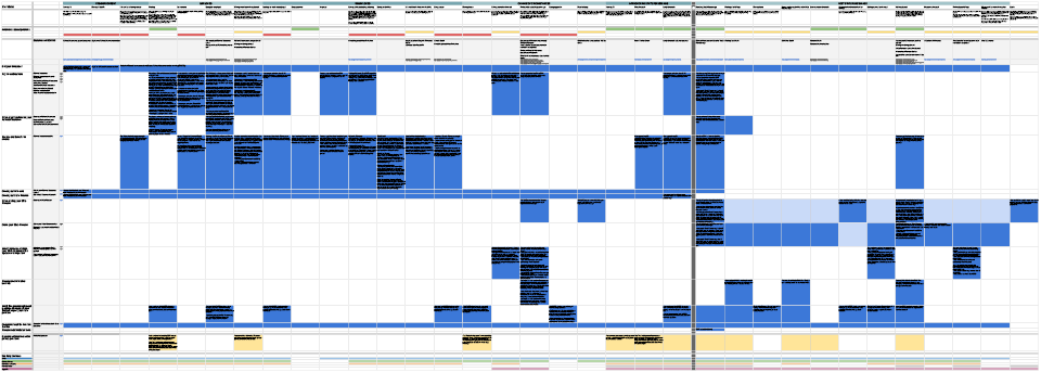
From putting this together we learned that there are very few fixed points in this journey that all users will share - it spans too much time, and too many possibilities.
Through exposing this in the user journey it helped us to focus our work on tackling smaller, more specific user scenarios. The outcome will be a set of digital transactions and content that are grouped into services that serve broader, life phase based user needs such as “planning for retirement”.
In the next post, we’ll look at practical advice on how to create user journey maps.

1 comment
Comment by Adam Lawrence posted on
This is a great article, thanks!
But (of course there is a but!) I get uneasy when you equate user journey maps and service blueprints. And I think that unease links to this part of your article:
>> "Sometimes it’s hard to fit something into a straight-up linear journey. There may be offshoots, cyclical bits or too much variance in the steps and activities from one user to the next."
I would argue that at its most useful, a user journey map is a representation of one useful user's experience of one useful incidence or cycle of a service. (Or it is a very high level representation of the steps which basically every user takes*.) It does't represent all the possible options, because that's not what it is for.
A user journey map is a representation of an experience, whereas a service blueprint shows the process necessary to create that experience. (Often the user journey map is just one lane of the blueprint). The distinction is important, because a user journey map is a great tool to communicate with everyone on an empathic, instinctive level, where a service blueprint or (horrors!) a process diagram is far less approachable. I use both journey maps and blueprints - but I always start with the journey map to make people think about the user experience before they are sucked back into the familiar world of their process.
So why is a user journey map such a useful tool, and why does it make sense to keep it simple? We lead our life on one timeline, and a journey map shows that well. That's why I always recommend against representing alternative paths ("offshoots") or repetitions ("cyclical bits") in a user journey map. Sure, the user may have two doors to choose between, but she only goes through one of them today - so the map should show the moment of choice, but then only map the journey through the door she chooses. And if she repeats something, she repeats it at a later time, with her expectations changed by the first instance - so it needs to be mapped again, as a new part of an ongoing experience, not just a "loop" arrow.
This means when I am working on a service, I will usually need several user journey maps to cover the commonest cases. Each of those can be expanded into a service blueprint, but none of them ever attempts to show the complexity of the whole service - there are far better tools for that, like business process modelling or similar techniques.
I find a collection of a handful of simple journey maps to be much more useful than one very complex one, especially when we are in a process of cocreation with specialist and nonspecialist participants. Like many service design thinking tools, they are mind hacks, and are most useful when they slice up that huge pile of information into chunks we can instinctively digest, empathise with and work on.
Of course it is a tool, so, as you quite rightly say, teams can always hack it any way they like. But I really recommend the simple approach which reflects our perception of the world, and is easier for us to work with. 🙂
Thanks again for a great article,
Adam Lawrence
CoInitiator Global GovJam
http://www.govjam.org
* eg something like the basic steps of
Become aware > Get information > Commit > Pay > Use > Have a problem > Share the experience > Leave or return