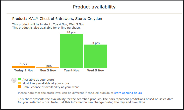
I was looking at the Ikea website at the weekend and noticed this smart design pattern.
Many websites tell you whether an item is in stock and many tell you whether a product is available in store. But this tells you how many are in stock today and how many will be in stock tomorrow and the two days after. It's clever and useful. (Should you wish to check the current availability of Malm drawers in Croydon Ikea you can here.)
It allows you to make decisions based on data rather than giving you a binary answer and effectively making the decision for you. In a small way it's empowering.
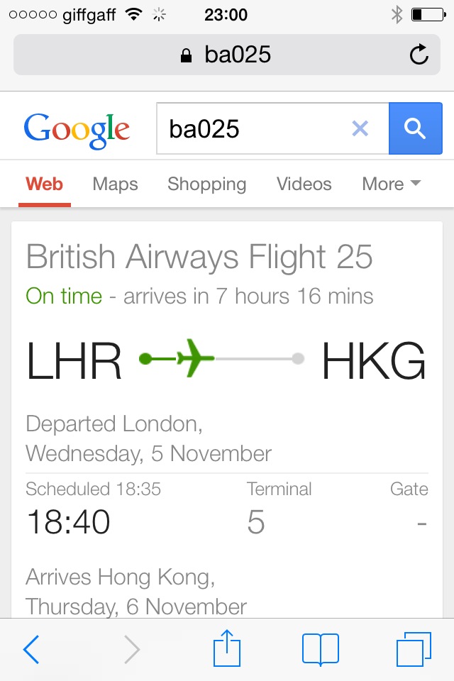
It reminded me of this pattern from Google. Search for a flight number and you get this:
That's smart and useful and extremely easy to read. Works really well on a mobile. It's visually pleasing too.
Both of these are what Matt Jones would call glanceable. In a blog post from a few years ago Matt wrote, "the best interaction and information design is stuff that can be glanced-at."
Looking at these, even though it was a Sunday and I was contemplating a trip to Ikea, I started to wonder how we could use this in government. In what scenarios would users find this useful, in what scenarios would users find this empowering. In a brief conversation with Richard Pope he suggested it could be used with some sort of tracking code to quickly check progress of applications. Luckily Henry has already started to think about this in his blog post 'When will I get my thing?'.
As a design team we sometimes note things like this. I'll try and post some of them up here.
I’m Ben, Director of Design at GDS. You can follow me on twitter @benterrett


2 comments
Comment by Jose Rodrigo posted on
Neat! for public services you can imagine a pattern telling you an expected level of queue or congestion in a particular site (hospital, surgery); or expected delay in receiving a delivery of a service (driving licence) if you apply for it at a particular date.
Comment by Anna PS posted on
If you go to Euston station, you'll see London Midland signboards with heatmaps, showing which trains are busiest at rush hour. Very useful when you're choosing which ticket to buy.